
Product listing pages (referred to commonly as PLPs for the remainder of this article) are the second most important part of an ecommerce site. They should, broadly speaking, account for the largest percentage of your website traffic as a page type. Your goal here is simple: help the user find a suitable product as quickly as possible then progress to its product detail page (with some exceptions explained in detail).
If you thought that ecommerce homepage design was a balancing act, then PLP usability and optimization is some serious plate juggling. Let’s start by looking at what kind of information and signposts a prospective customer might expect to see in this reasonably exhaustive wireframe – please adapt or improve it as you see fit. I’ve structured this article in a roughly top-to-bottom order of the elements within it.
A breadcrumb trail gets its name from the Hansel and Gretel fairytale, in which the children leave a trail to follow their way back home. Given that the breadcrumbs are eaten by birds resulting in the children getting lost in the forest, it’s a poor technical metaphor but hey-ho. On ecommerce sites, breadcrumb trails fulfil two important user goals
It’s sadly common for many retailers to completely suppress the breadcrumb structure on mobile devices, leaving users little choice to take a chance on the menu structure via the hamburger icon.
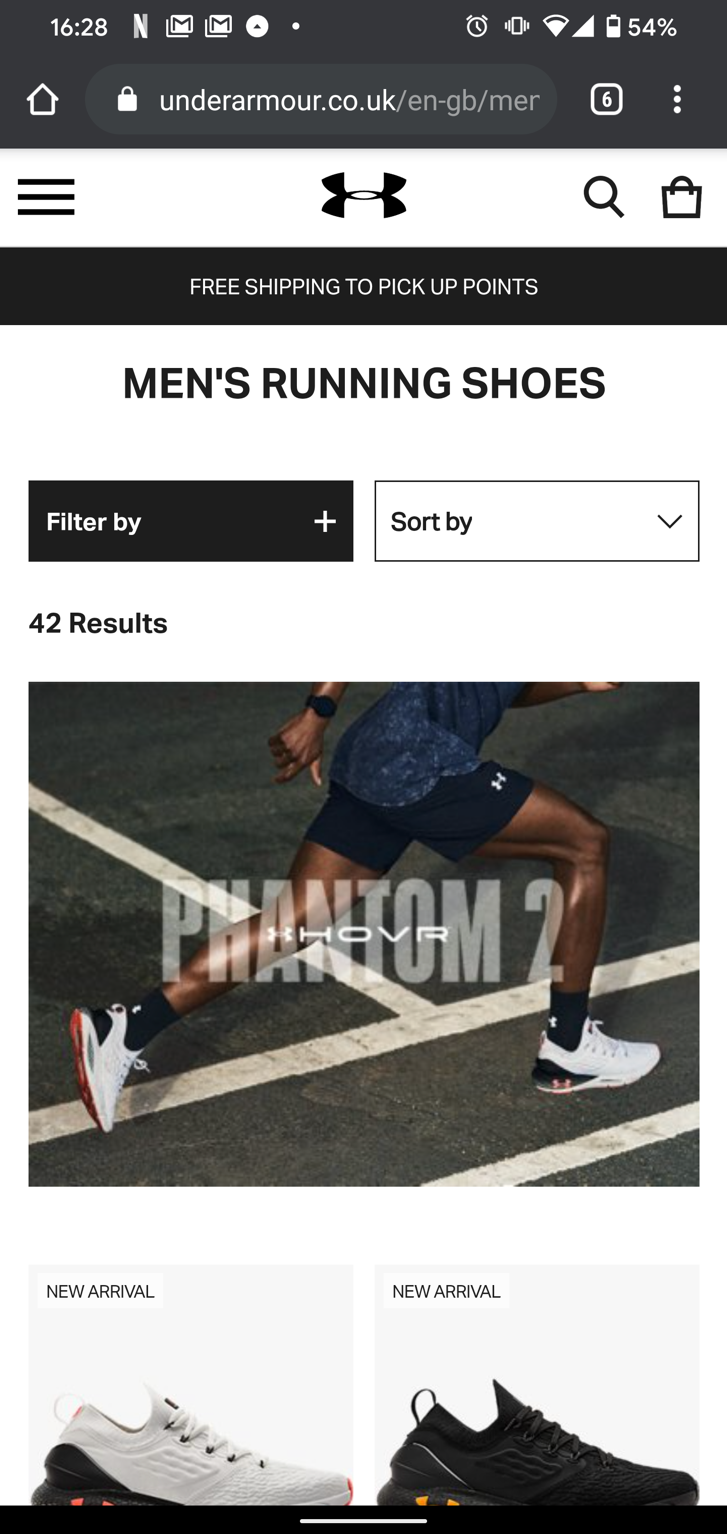
In this poor showing from Under Armour, I’d navigated from the menu > Men’s > Shoes > Running Shoes. Imagine if you’d landed on this page and wanted to navigate to a different category.
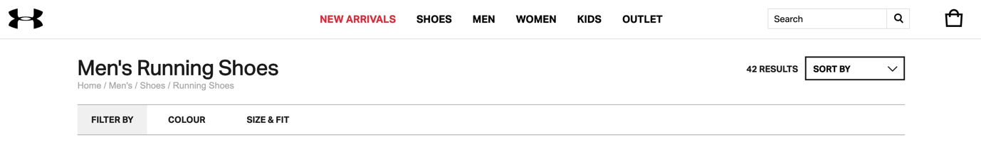
Whilst they’re present on the desktop version of the site, they’re super easy to miss in such a light grey on a white background. This is very much a lesson in not what to do.
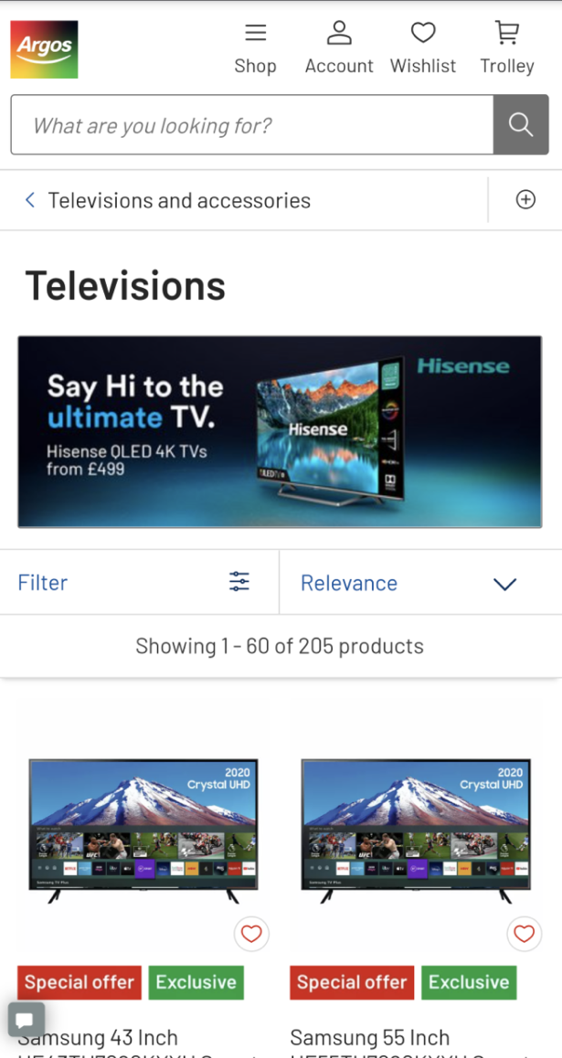
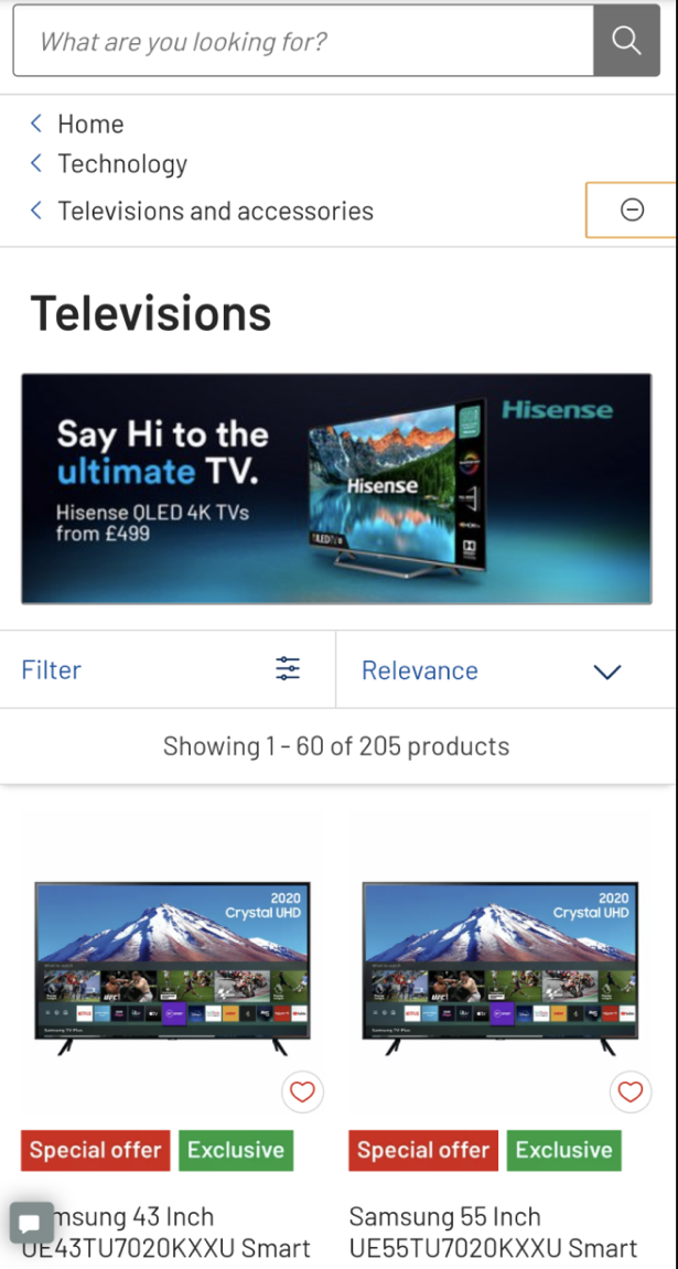
This is far better from Argos. The caret “go back” symbol next to Televisions and accessories makes it abundantly clear what happens next if the user interacts with it. What’s more, when you click the add icon to the right, it displays the full hierarchy of the category structure.
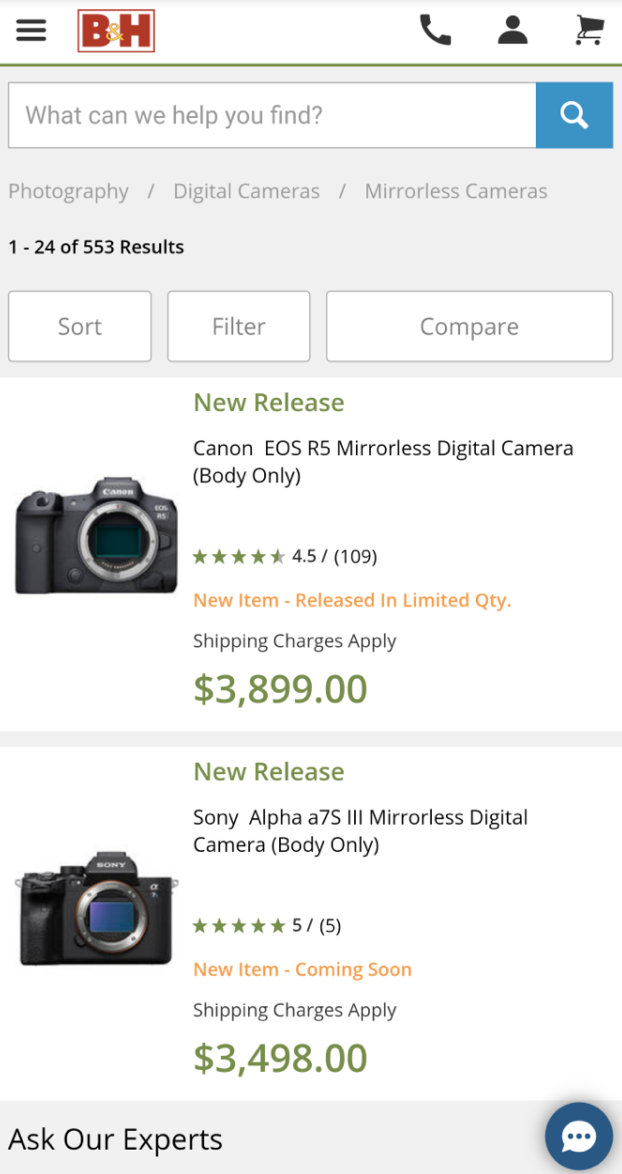
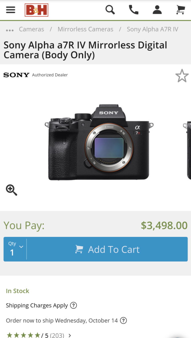
In a smart play by B&H Photo Video, the PLP displays the full breadcrumbs when there’s sufficient space in the viewport. Once you reach a Product Detail Page an ellipsis icon kicks in and on tap it reveals the entire hierarchy.
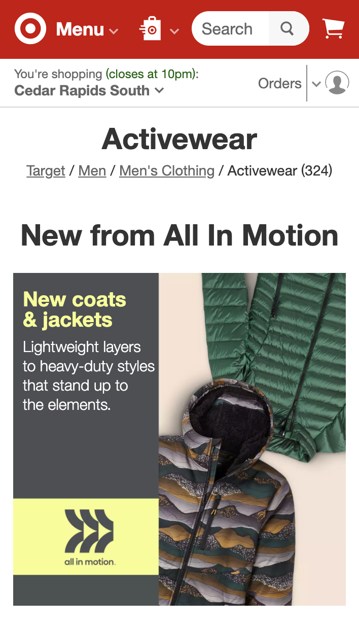
It’s also sensible to make the active list abundantly clear. In this example from Target, the links to navigate elsewhere in the hierarchy are clearly underlined in grey, whilst the current page is slightly darker with no underline. Bonus points for displaying the number of products next to the list name too.
Let’s start with SEO here. No matter how authoritative your site is from an organic perspective, if Googlebot only has a grid of product titles and images as a hint, you simply will rank lower than you could. As a result, it’s a good idea to include a rich introduction to what users can expect to see on in a given product list and why they should buy for you.
It’s important to note that many retailers suppress this content on mobile devices, either so it can’t be found at all or is only accessible via a Read More link. When Google completely moves to mobile first indexing in March 2021 (originally supposed to be September 2020, but given the pandemic Google kindly delayed it) it’s a good idea to monitor your mobile organic landing page traffic should you suppress the content completely.
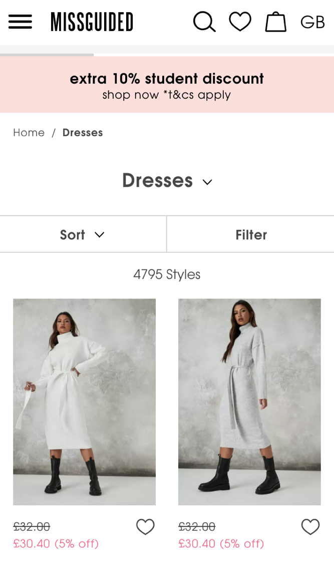
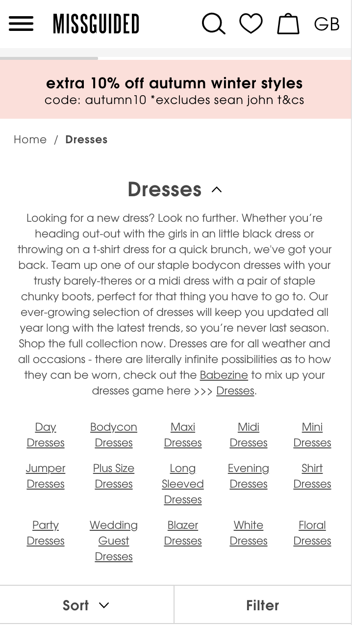
On the mobile version of its Dresses PLP, Missguided has keyword-rich descriptive copy for those who care to interact with it by tapping the downwards caret icon. The sheer volume of the dresses sub-category links is overbearing on mobile viewports, but I’ll come on to why they do it shortly.
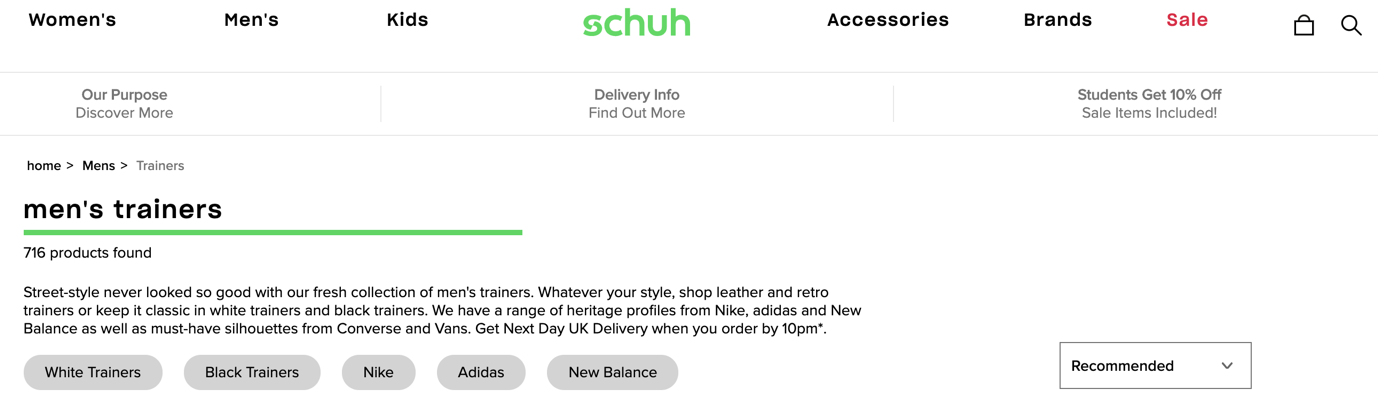
In this example from Schuh, the copy sets the scene for the products users will find and they highlight that UK Next Day Delivery is available on orders placed up to 10pm. It’s worth noting that on the mobile version it simply has a Read more link for the copy, displaying the category name, number of products present and like Missguided, some deeplinks to core product categories by default but these links point to filters rather than sub-pages.
Before I dive in, let’s look at the search volume of one of these categories, using Missguided and ‘black dresses’ as an example.
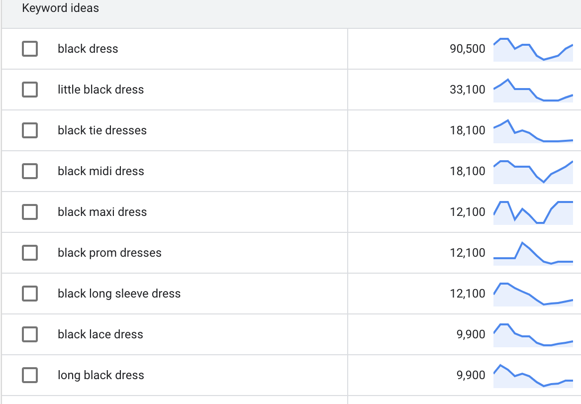
There’s way in excess of 200,000 searches per month for black dress permutations just for the top 9 terms. Factor in ‘longer tail’ searches that get far fewer searches per month but have a much higher propensity to buy, you’re probably closer to half a million.
Internal linking is a vital part of any SEO strategy – the more authority flowing here from other pages, the greater the likelihood of ranking.
Some usability resources advocate best practice is to offer these results by filter only, which might be true but at a huge opportunity cost. At a glance, these are:
SEO should be a high priority for any retailer – get the above wrong and you’ll miss out.
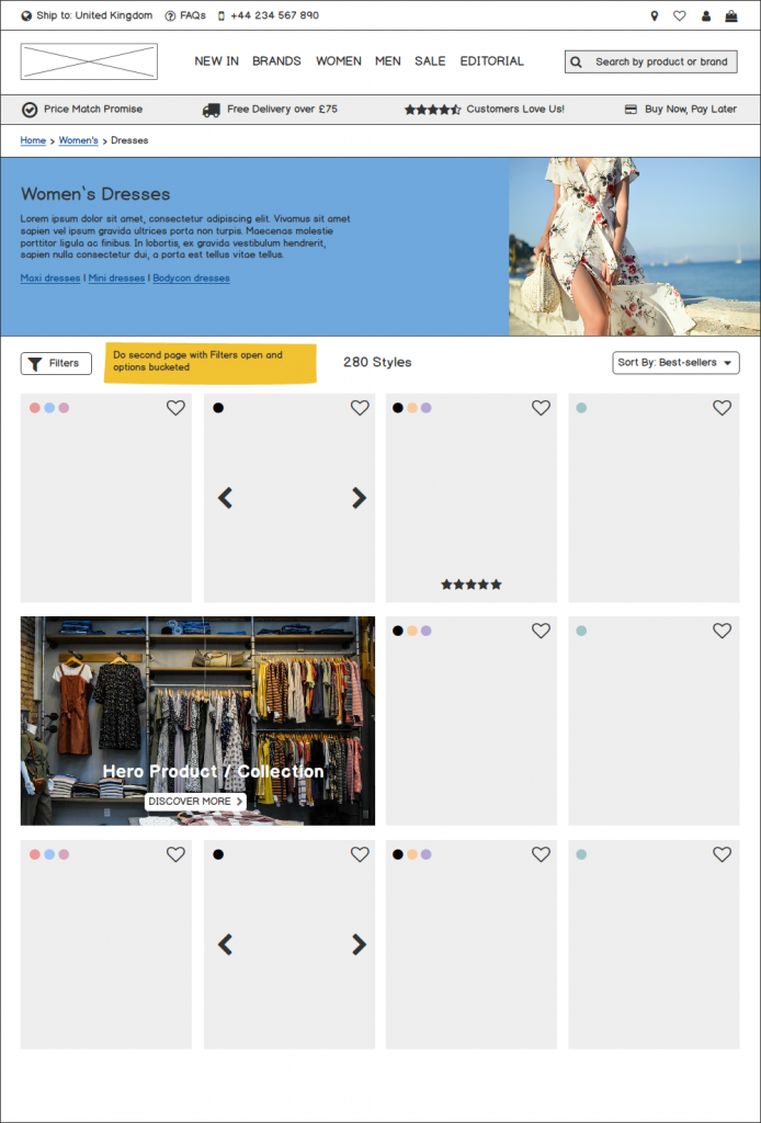
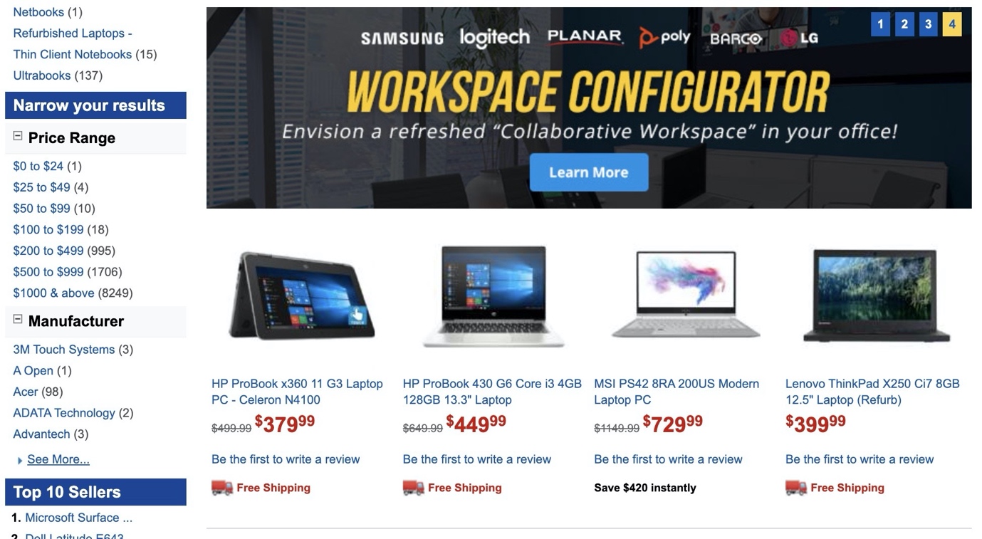
If a user arrives on a product list page that is high up in your hierarchy, chances are your products could number in the hundreds or even thousands. As a result, this number needs to be ultra-clear as it can influence the action a user will take next. For my second and hopefully final fairy tale analogy, think about it in the sense of Goldilocks and the Three Bears:
If the list is too small, users may attempt to navigate up the hierarchy of your site to a larger category. If there’s too many products, users may opt to try another category in your navigation or opt to use your filters to narrow the scope. Just enough is the sweet spot for users to scroll, evaluate and ultimately click a product.
To understand how relevant or useful a product list is, it’s vital they know how many products they’re evaluating in order to achieve any of the above outcomes.
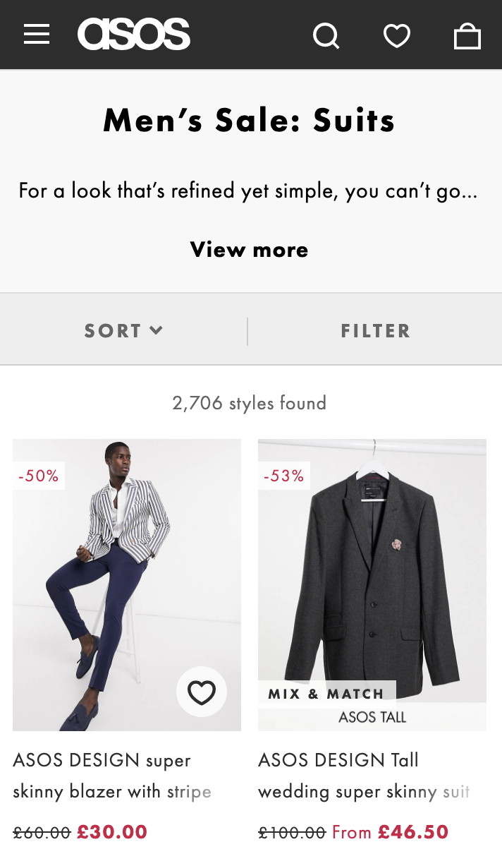
On the ASOS Men’s suits page, there’s no mistaking how many products are present.
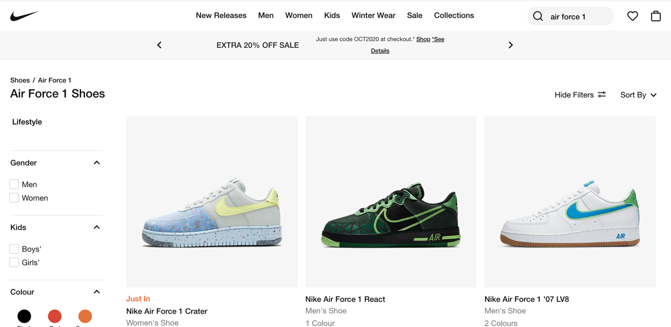
No such luck on the Nike site on desktop or mobile; this makes for a very confusing experience in conjunction with the infinite scroll on loading more shoes. It’s not going to be a conversion dealbreaker, granted but all of this friction compounds.
This can be slightly confusing as both terms are often used interchangeably to describe the same thing in an ecommerce setting. Filters will take a set of objects and eliminate any that do not meet that criteria. Faceted navigation will include filters for many different attributes as part of a given set. Baffled? Let’s look at Nike again as an example.
And so on. In apparel and footwear, it is of course common for products to have multiple attributes for each facet (i.e. a shoe could have 15 potential sizes) so once again there’s a balancing act between too many subsets and not enough.
Historically the convention was for filters to be placed in a left-hand sidebar and whilst still common, it’s less helpful in a mobile first world.
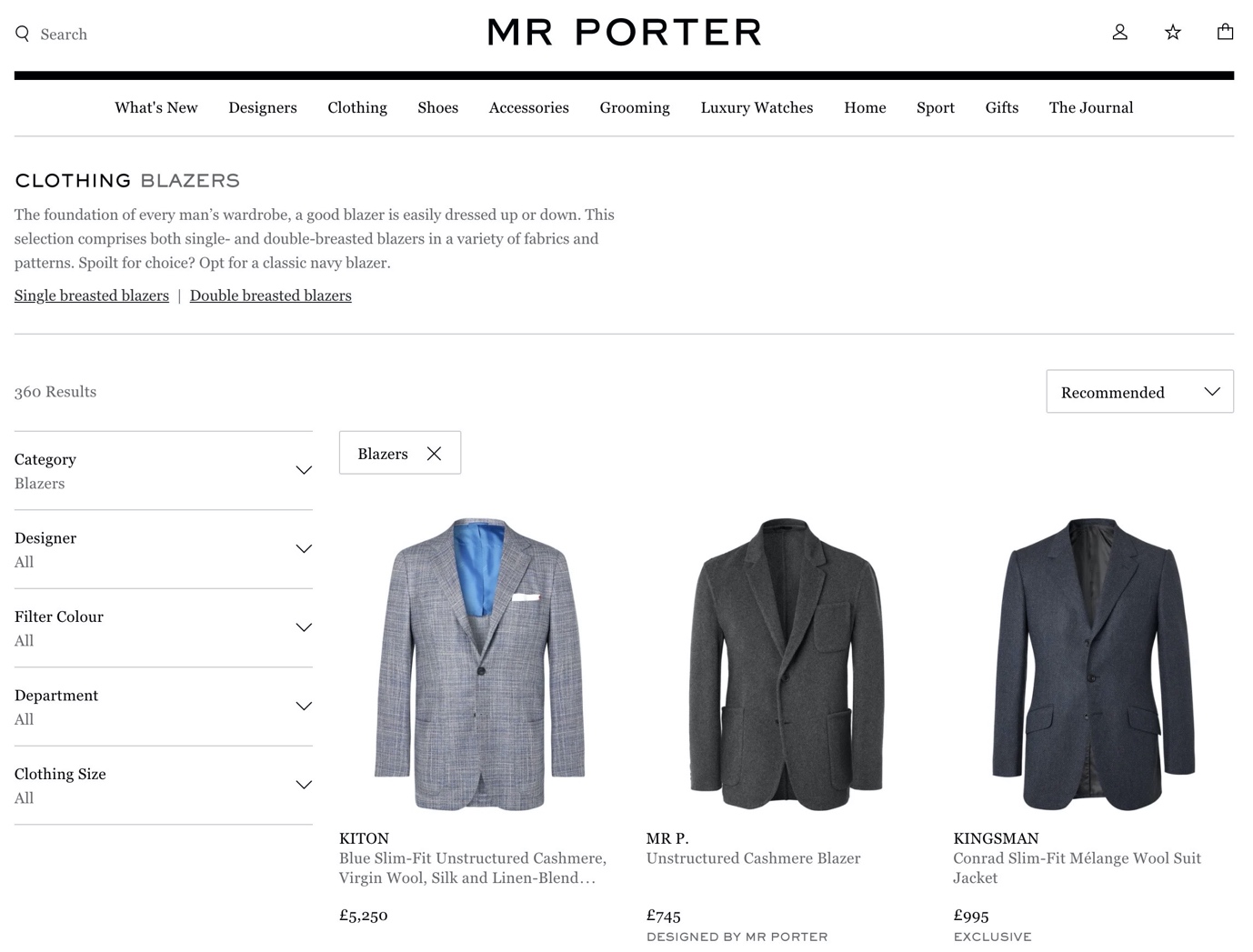
Luxury menswear titan Mr Porter has all filters left-aligned, but it’s a tad confusing when they’re all collapsed by default (and I’ve bought from here a lot over the years).
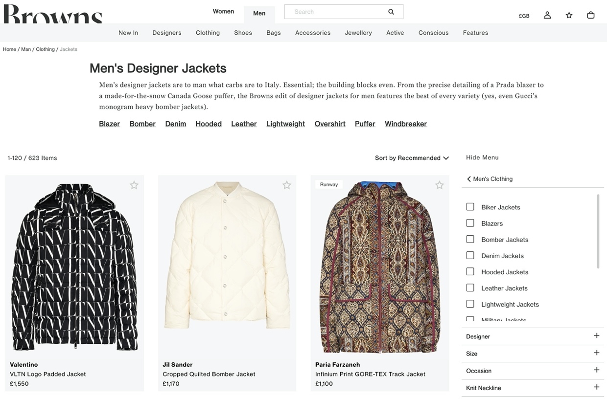
Browns Fashion opts for a right-handed placement, but hidden under the dubious heading of ‘Show Menu’. Not sure about this one personally.
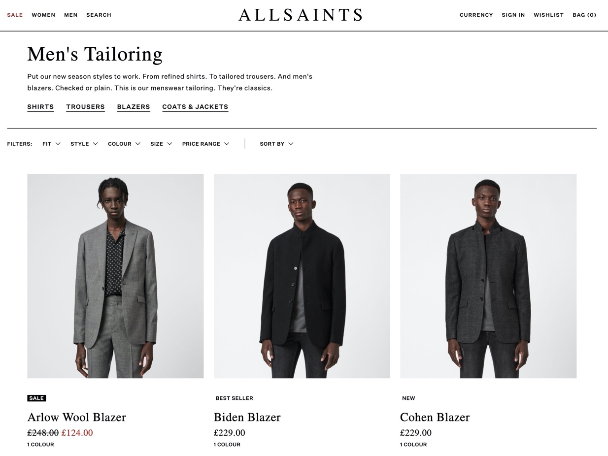
All Saints opts for horizontal desktop filters, which is a much easier implementation when you have a smaller bucket of filters to play with than multi-brand, multi-category retailers. Product thumbnails are also much larger with no sidebar as an added benefit.
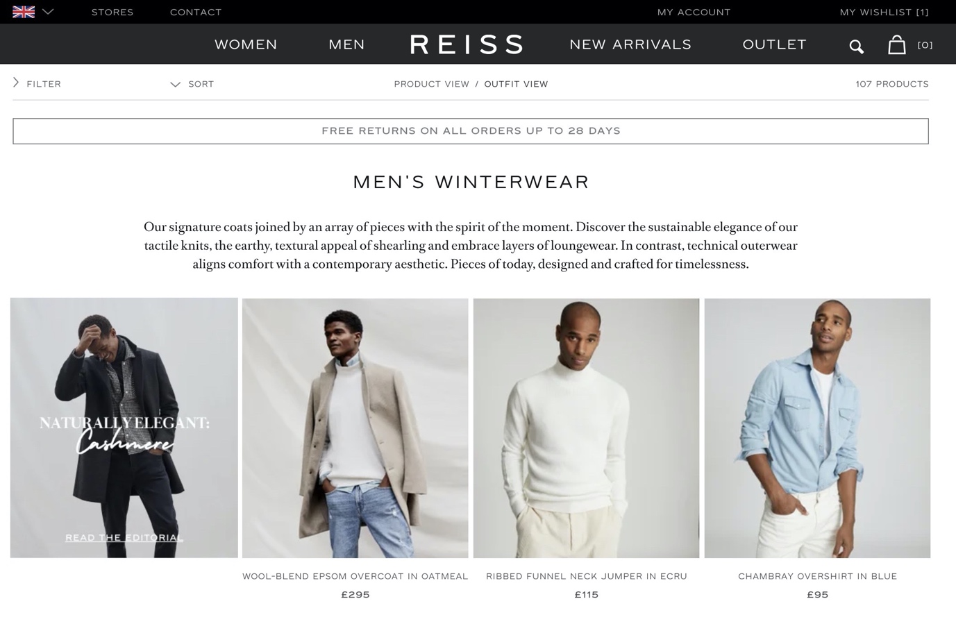
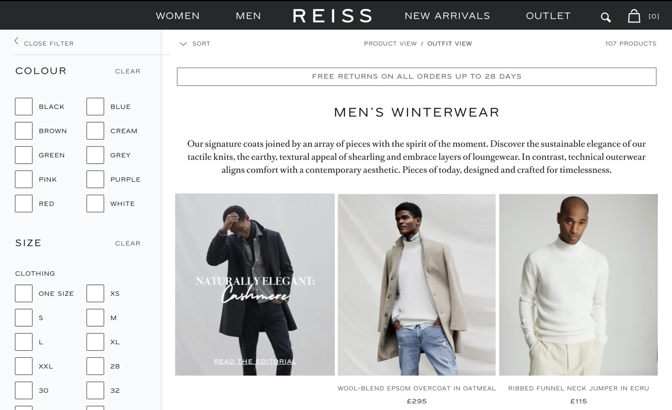
Reiss, on the other hand somewhat buries its filters in the top left-hand side which becomes a sidebar once clicked.
Now, onto mobile filter UX. This is a balancing act in making your filters obvious enough to be interacted with whilst ensuring it doesn’t detract from product discovery.
The most common pattern is one collapsible block of Filtering on the left and Sorting on the right:
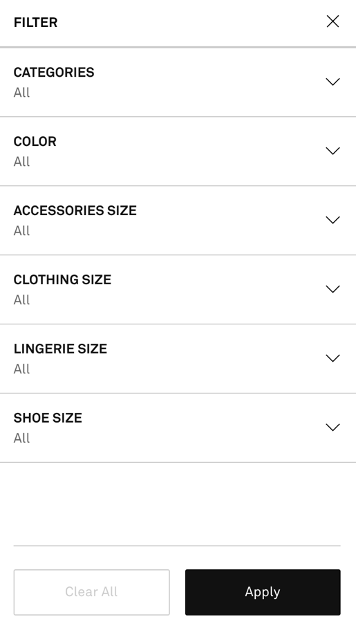
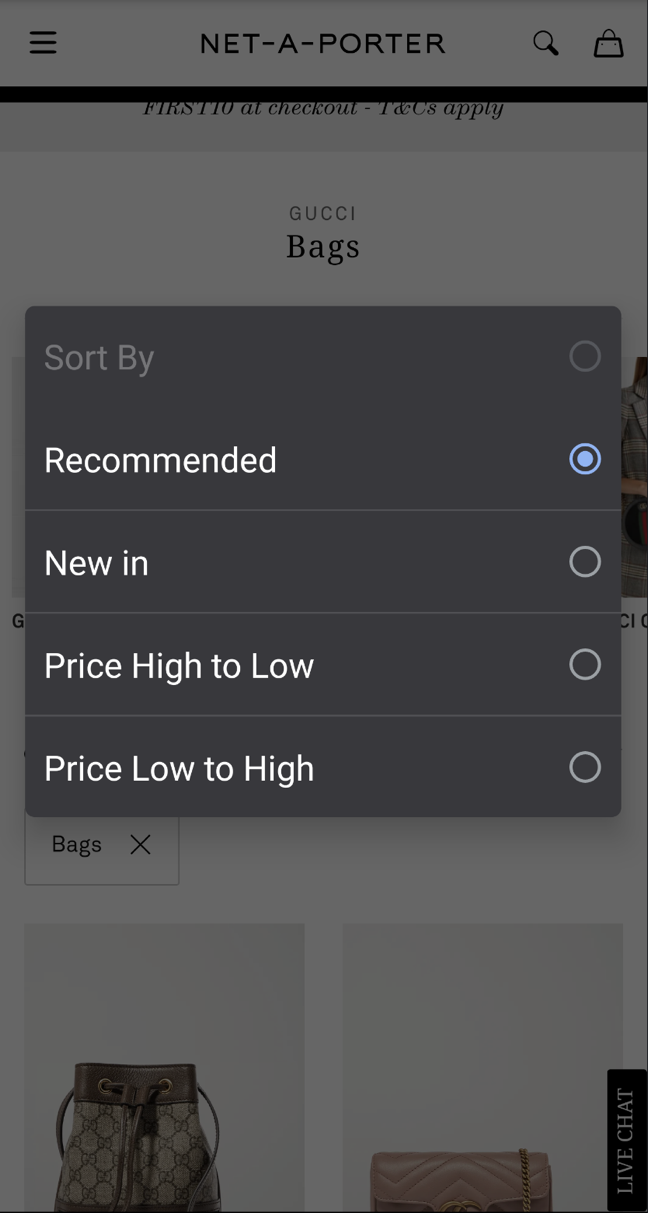
In Net-a-Porter’s case, when you tap on the filter it expands across the entire viewport. When you tap into a specific facet it doesn’t show you how many results it will yield, but is otherwise a nice implementation. The sorting uses input fields that use the device / browser’s default styling (in this case a Google Pixel 4XL).
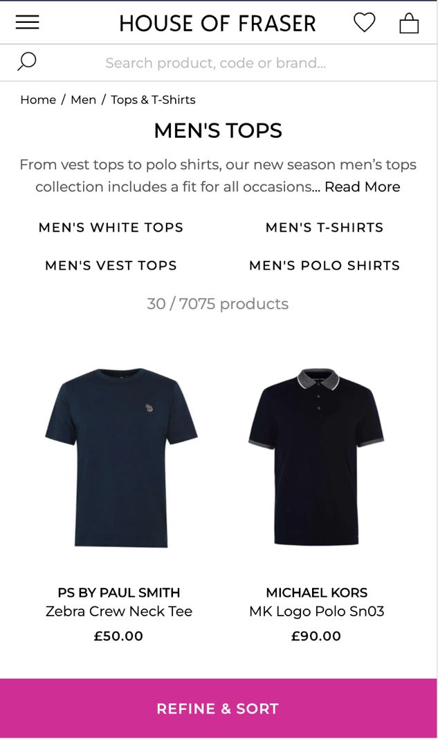
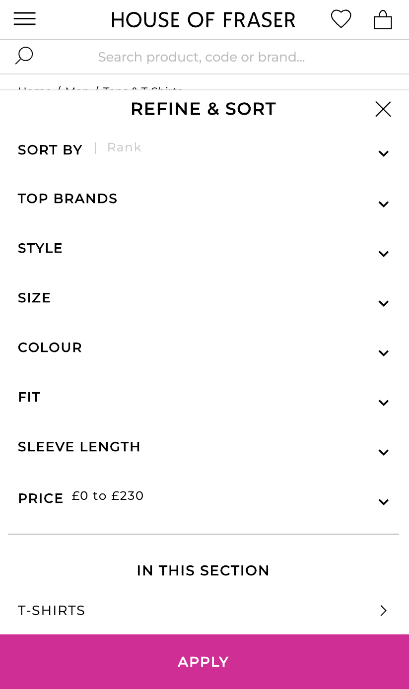
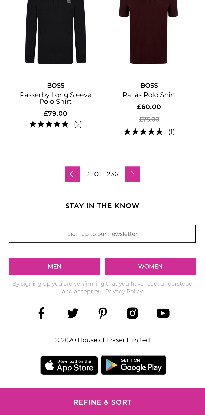
House of Fraser opts to affix one block at the bottom of the viewport with Refine & Sort combined. This works well given the contrast of the button – if you’re concerned about space this approach may work for you. The default Sort By option ‘Rank’ is an odd term, but I’ll come to Sorting options and labelling shortly.
Have you ever heard of the Stroop effect? In this experiment, participants had first to read written colour names independently of the colour of the ink. Then, they had to say the ink-colour of the letters independently of the written word (in other words, if the word ‘purple’ was written in red font, they would have to say ‘red’ rather than ‘purple’.
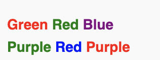
No easy task, right? So why give your users a similar level of cognitive load trying to work out colours in text form? This doesn’t need to be a pantone reference-level of accuracy either; you just need your users to take this first initial step.
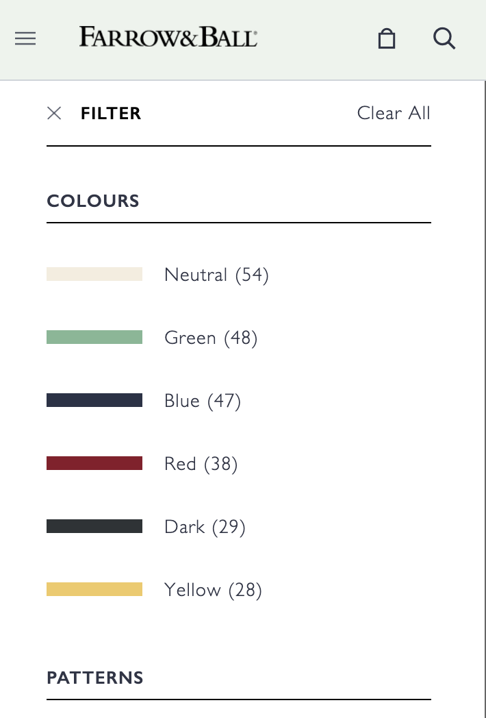
No mistakes here from Farrow & Ball, colour names have a swatch for easy identification. If you’re selling apparel, you wouldn’t want to use Dark and Neutral as classifications but I suppose paint isn’t so… black and white
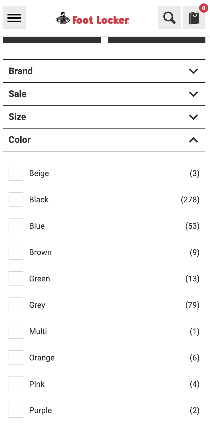
Foot Locker on the other hand will put you through some mental gymnastics to make a call on any colour filter interactions.
It’s not just colours, specific product shapes can benefit from visual cues to support a faster decision-making process.
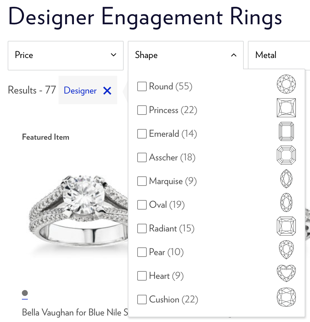
Whilst somewhat niche, Blue Nile’s diamond shape filters help the users quickly identify which fancy cut they would like to see.
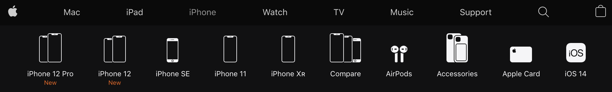
A more obvious example, courtesy of Apple where the illustrations represent each device model or accessory.
This is less important if you’re a smaller merchant, but if you have a large number of SKUs it’s helpful to display the number of results someone will see prior to selecting a filter.
Fashion and apparel retailers fall foul of this all the time. I buy almost exclusively online and whilst brand and colour filters help me narrow decision-making, lazy product type filtering is a constant thorn in my side. Exhibit A:
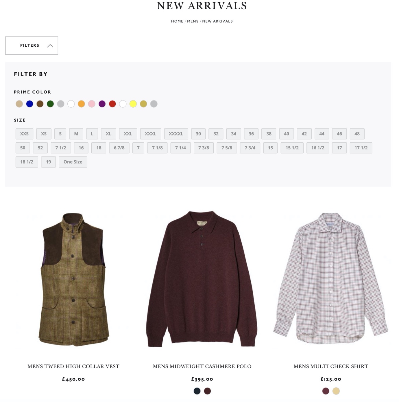
On the Purdey site, the Men’s New Arrivals page doesn’t group any of the sizing options under specific filter sets, nor can you filter by product type at all. Is a shirt an S, M, L or a 15, 15.5 and 16? Is 36 a chest size or waist size? This could be easily addressed simply creating attribute sets like so:
And once you have those product types, the sizing options are normally consistent, so under a Size heading, you have sub-attribute sets like so:
Given the lack of any order or grouping, I’d go as far to say that Purdey would be better off removing the filters completely. Let’s take a look at how this could be massively improved.
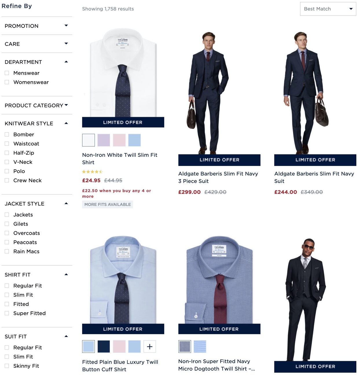
This is great from TM Lewin (note that I have deliberately opened some of these filter options to illustrate my points here – they are all open by default on this sale page)
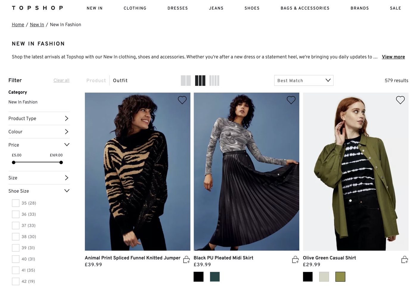
Another smart play from Topshop, with comprehensive product type filters, clothing sizes and shoe sizes separated supported by Brands, Colours, Fit Type and Fabrics.
Whilst Topshop does stock some other premium brands, the overwhelming majority of its offering is an in-house label, so this isn’t relevant to them. If however, you are a retailer that stocks a high number of brands it’s wise to offer a text-based autocomplete so users can type what they’re looking for:
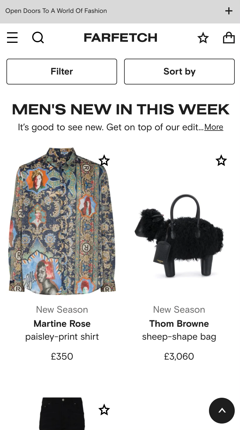
I demo a short example of this from Farfetch; users can scroll through all 151 brands on its Men’s New In page or start typing their desired brand and autocomplete will return matching options. Again, this is an edge-case but you could apply this to all manners of filtering or on-site search terms.
For shoppers with specific budgets in mind or if you have some very high-ticket products that are sold infrequently, offering pricing scales to filter products can be helpful if done properly.
Shit: De Beers
Again, much more useful during sales or promotional periods if accurate. However, this will largely depend on your sales volume and how often your platform looks up stock quantities. If done effectively, it can salvage sales you might have otherwise lost due to dead ends and frustration.
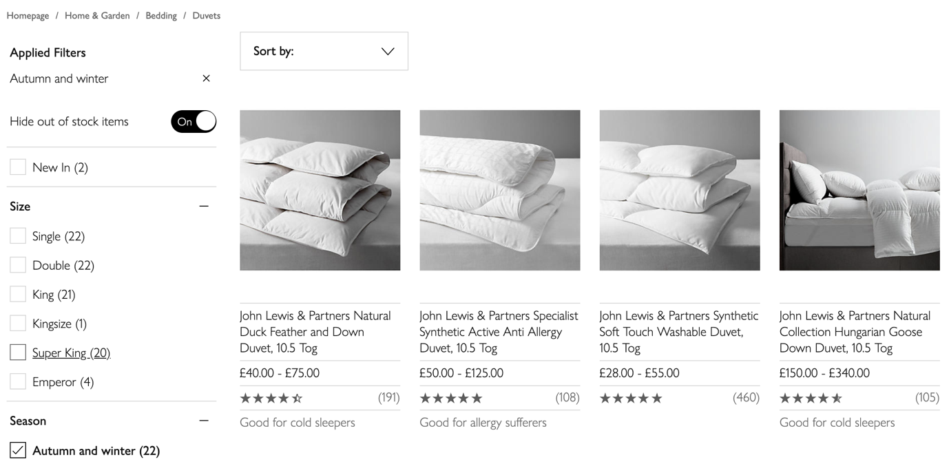
John Lewis sensibly gives ‘Hide out of stock items’ a lot of prominence.
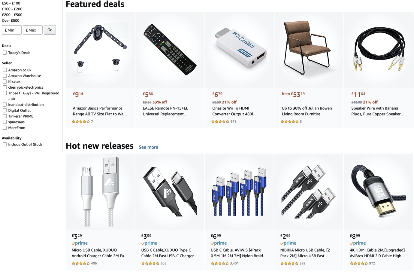
Amazon on the other hand excludes out of stock products by default with a filter to include items currently available.
People are sheep. Whether it’s an item of clothing, a power tool, a Christmas gift or an Airbnb listing there’s a good chance at some point your customers will be asking ‘what do other people think?’
There’s a large number of retailers who do very well in acquiring product reviews but don’t allow users to filter on ratings. I’ve seen product reviews completely transform sales for brands and non-sellers become best-sellers with a dozen or so stellar reviews. The more eyeballs you get on them, the more money you’ll make.
If you’re not currently soliciting reviews it would be a good idea to start doing so, but I’ll cover a strategy for that in a separate article.

Reebok has various shoes with reviews reaching a 4-figure count, but there’s no option to filter by review rating on the product listing page. Potentially a missed opportunity?
Macy’s gets this right and it’s smart to include only 3 stars and up. Any products with 2 stars or below would suggest an issue with far bigger implications beyond filtering.
Some ecommerce platforms cannot handle this particularly well. If you can (and it’s useful to your customers), avoid faceted navigation that operates on mutual exclusivity, or in other words you can pick one facet but not combine it with others.
Imagine you’re in the market for a new laptop. You have a minimum budget of $400 but a maximum of $700. If you want to see laptops that are $200 to $499 and $500 to $999, you won’t be doing that at Tiger Direct. You can only select one price bucket facet.
Now at Curry’s PC World, you have the option to choose multiple facets. Far more helpful, no?
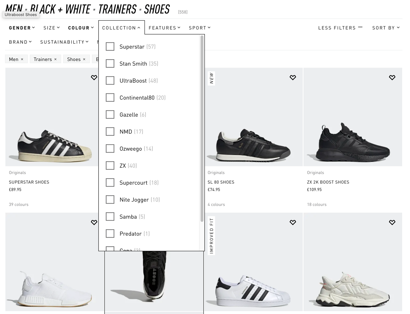
Adidas is also a mixed bag. You have the ability to filter by multiple colours, but what if you wanted to see both Superstars and Stan Smiths? One at a time, unfortunately.
Given that I’ve constantly referred to this page type as product list you might be wondering where list comes from. Well historically, many ecommerce sites had list layouts by default and grids were far less popular. The inverse is now true for a number of reasons:
Electronics on the other hand, where there’s many features comparable between multiple products are still better suited to list layouts as evident by AO’s approach:
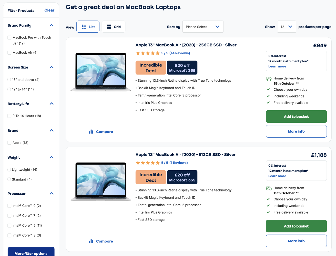
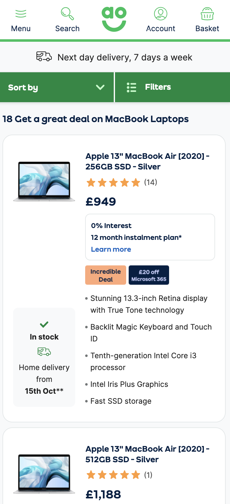
AO.com defaults to list view on desktop devices but offers users the option to switch to grid view should they so desire. On mobile list is the only option.
Unless you have valid reasons about your product details being easier to scan and evaluate, you probably don’t need to be too concerned about offering this to your users.
This is another feature that was common in earlier iterations of ecommerce platforms that has declined in popularity due to the rise of mobile. That said, if your desktop users are keen on expanding their original set of products for evaluation you might benefit from it. It would be advised to track its usage in your analytics to see if it’s really helpful though.
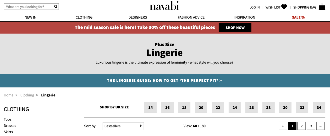
Women’s fashion retailer Navabi defaults to 60 products before pagination will begin, with 180 being the other option.
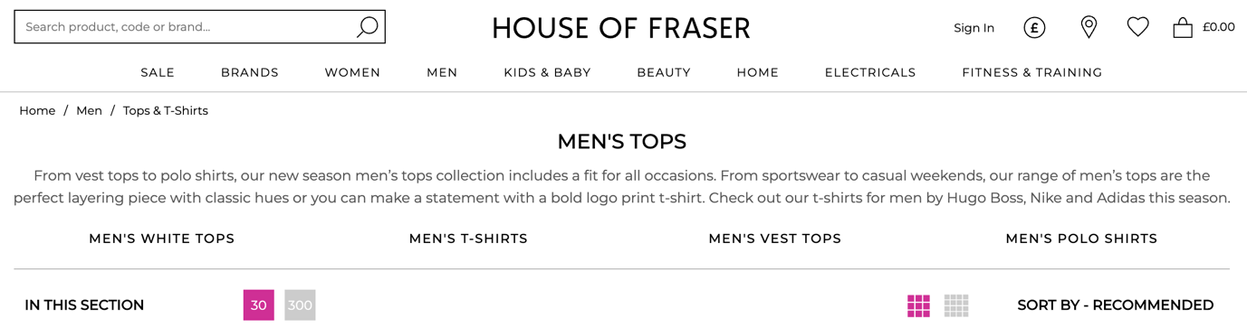
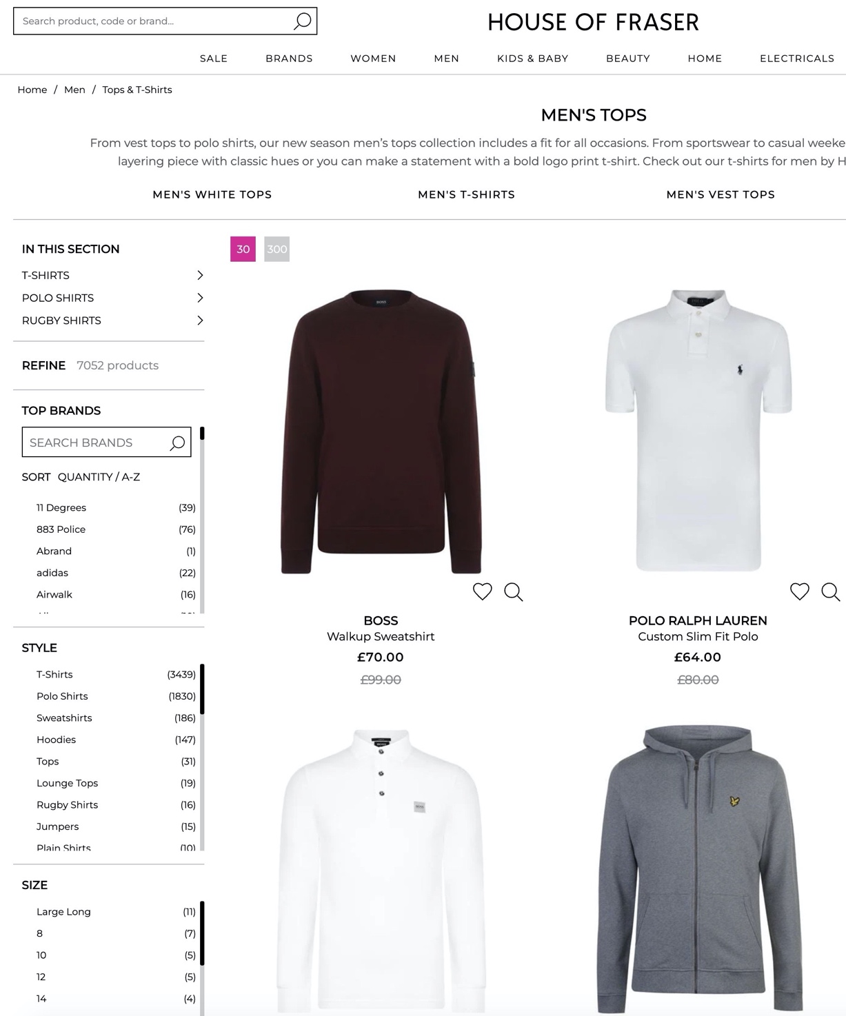
House of Fraser defaults to 30 before switching to a slightly excessive 300, but I suspect they see more success with a larger scope for users to then filter.
It’s worth mentioning that offering a desktop change to the default number of products displayed on a product list is only real helpful when you use pagination to view new sets of products. I cover Pagination, Load More and Infinite Scroll in more detail below.
This has been a bugbear for me since I entered ecommerce back in 2008. It has barely changed in this entire time yet my own testing and analytics has reinforced the value it adds and the friction it removes when done properly.
The proliferation of mobile traffic has actually made matters worse as some retailers bury it somewhere unexpected or remove it completely.
Before we look at some examples, let’s define a comprehensive list of sorting possibilities:
Some platforms (and I’m looking at you Magento) have some really odd naming conventions for ‘out of the box’ sorting. Make sure you change anything like Default, Best Value, Position – make it meaningful, useful and customer-centric.
Examples: Bad, Good, Better, Best
Thankfully due to internet speed improvements, browser and ecommerce platform capabilities, there are more elegant solutions beyond pagination. This doesn’t necessarily mean that pagination is bad, but consider this:
With sorting and filtering given ‘above the fold’ screen precedence it’s not often you see pagination above the product grid anymore, so you are running the risk of users having to scroll to the bottom of the product grid just to interact with it.
If users do not, your filters are the only way to offset a needle in the haystack scenario.
If you do opt for pagination, it’s helpful to offer desktop users the ability to change the number of products shown by default. Remember when we looked at House of Fraser earlier? They allow the user to switch from 30 products to 300.
Just to be clear: House of Fraser’s Men’s Tops and T Shirts category has 7052 products in it. If your site has a relatively small number (i.e. under 100) of products per product listing page, this isn’t something you need to emulate. You would benefit far more from optimizing your filter presentation and the number of items in it.
Nail your page load timings and server response times if you take this approach (lazy load images etc)
If you have multiple images of your products, it can be a good idea to allow customers to preview these without the commitment of clicking through to the product detail page.
A common method of doing this on desktop devices is by showing an alternative on hover:
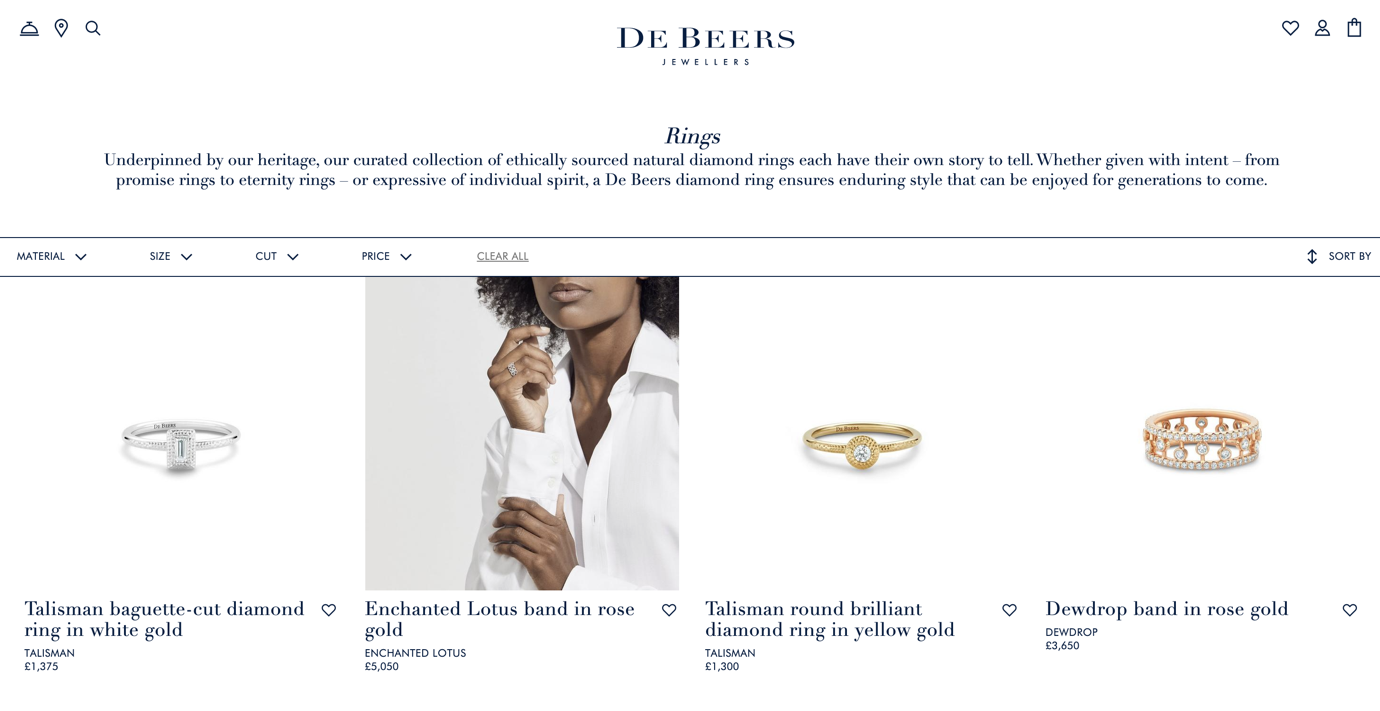
Hovering over a product on De Beers changes the product packshot to the model view.
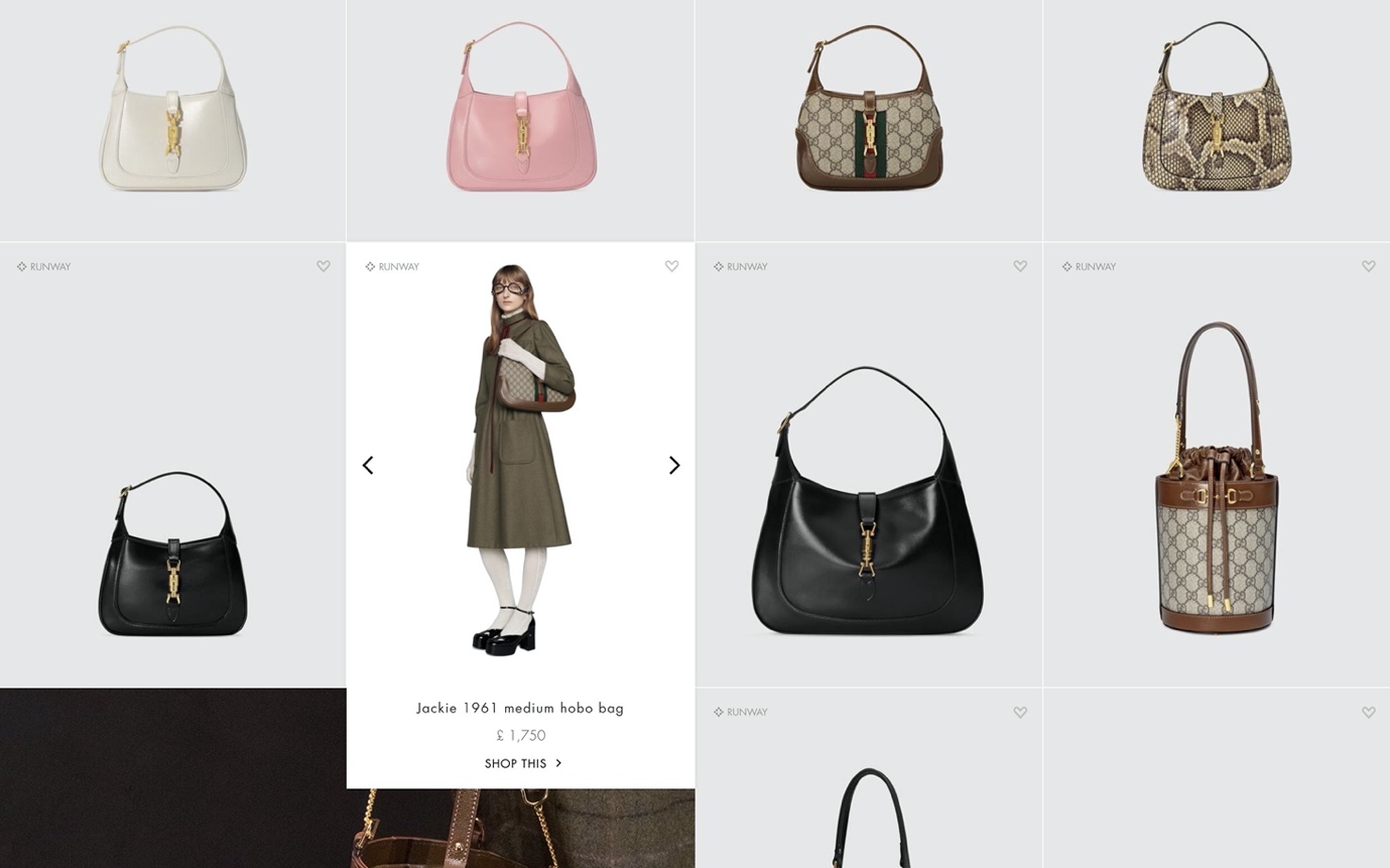
An elegant and less is more approach from Gucci: by default, you only see product imagery and on hover you see a model product view with title, price and call to action.
Now this is all well and good on desktop, but what about alternate views on mobile with no hover state?
Generally speaking, a lot of the fashion retailers I’ve worked with have seen their users tend to add a bunch of items to their wishlist, visit the wishlist page, discard the ones they don’t want and add the remaining products to their bag.
If your platform offers wishlist functionality, enabling your users to do so on a PLP can speed up a curated approach to purchase rather than having to manually click into each product’s dedicated page.
Also, add to wishlist in an expression of purchase intent which is ripe for remarketing or browse abandonment emails should it not directly lead to purchase during this visit.
Sidenote on wishlists: do not insist that users need to register just to create a wishlist. It will needlessly deter them. Where possible, allow guest wishlist creation but incentivise the wishlist-specific benefits of creating an account. These could be things like unlimited wishlist duration, saving multiple wishlists or the ability to share it by email or social media.
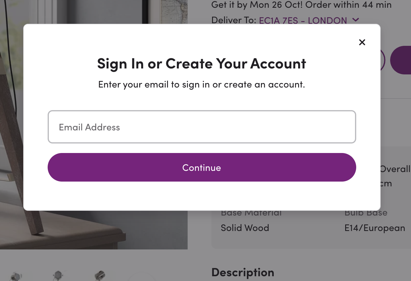
Wayfair insists on registration when you add to wishlist without any context on any possible account creation benefits. Don’t do this.
If you’ll forgive the awful name (drop a better suggestion in the comments please!), but there are quite a few variables here dependent on a retailer’s vertical and strategy.
I don’t want to go too off-tangent (as I could write separate articles on all of these topics), but if you’ve never read Influence: The Psychology of Persuasion by Dr Robert Cialdini I strongly recommend that you do. It’s the only book I own in print, Kindle and audiobook format, make of that what you will. Many of the techniques in this book have played a big part in how retailers use psychology to drive revenue-generating outcomes. There’s a lot of crossover between these badges and each of the six principles, so just quickly…
People feel an obligation to give back to someone when they’ve received some kind of behaviour, gift or service first. And you can use this in ecommerce too. It’s slightly harder to achieve when someone has never bought from you but free gifts and samples with purchases are common tactics here. It’s less common to see this on product listing pages but it’s definitely more common on product detail pages and in the shopping cart.
The less something becomes available, the more desirable it becomes. Whether this is a desirable brand’s limited edition run of a collector’s product, a hotel with only 1 or 2 rooms available on your chosen dates or simply a replenishable product running low on stock, scarcity motivates people to take action.
Cialdini explains this as how we perceive others based on their job titles, accreditations or testimonials. In an ecommerce since, this could be any specific rewards or accreditations a product has received.
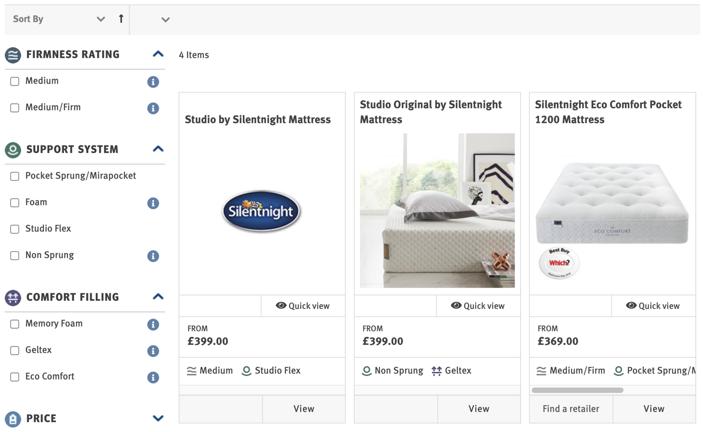
Bed and mattress retailer Silentnight display a ‘Which? Best Buy Award’ next to one of its mattresses. As Which is a fairly authoritative informed consumer choice resource, users would look upon these favourably.
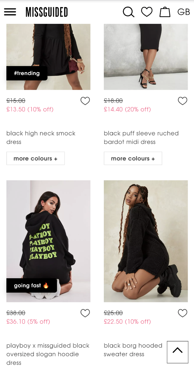
Missguided is leveraging both social proof and scarcity here. Whilst trending is harder to quantify it can be enough to invoke curiosity to look at the product in more detail. Going fast isn’t quite ‘only 2 left in this size’ territory yet, but that’s the job of the product detail page.
This is mostly applicable to fashion / apparel / accessory retailers, but should be helpful nonetheless. Some retailers will opt to display its products in packshot form (where products are photographed on the same transparent background with the same cropping consistency etc) whilst other retailers will default to PLPs of the products on a model.
Is one better than the other? This is actually an ideal AB test to run, where you will determine which method actually gets more people to progress to the product detail page. It might be inconclusive or senior management may insist on one over the other for brand direction and aesthetics. And if that’s so, why not offer users the ability to toggle between which one they prefer? That’s some common ground, right?
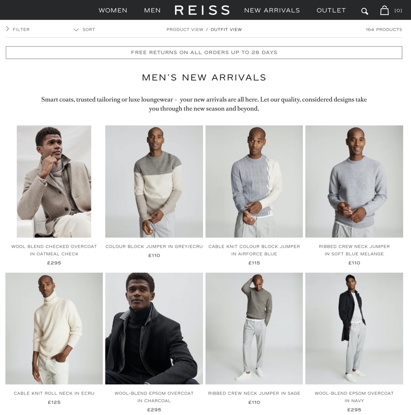
Reiss defaults to outfit view but just below its logo you can switch to product view (desktop only though).
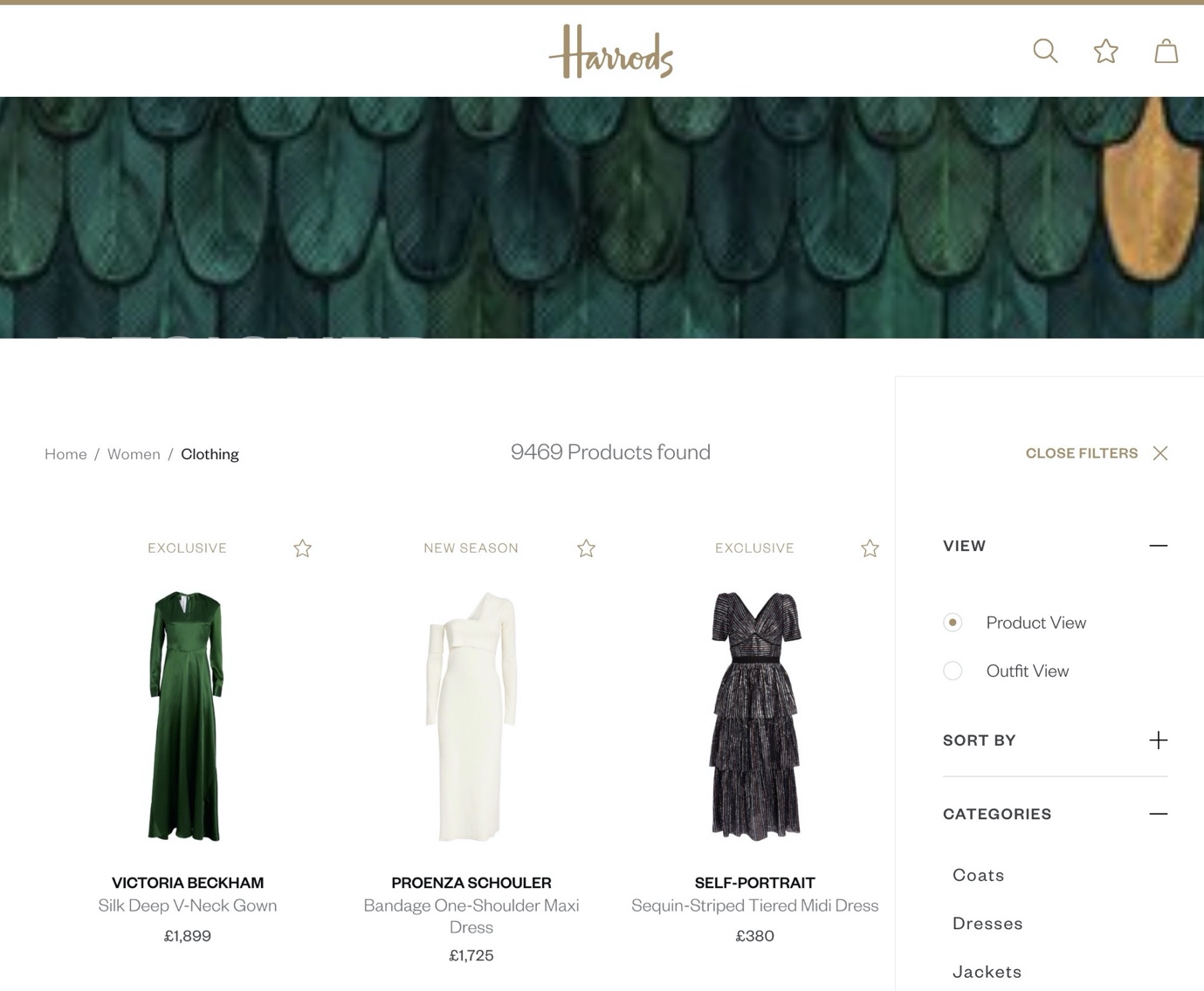
Harrods meanwhile defaults to Product View, then Outfit View is available as a filter option.
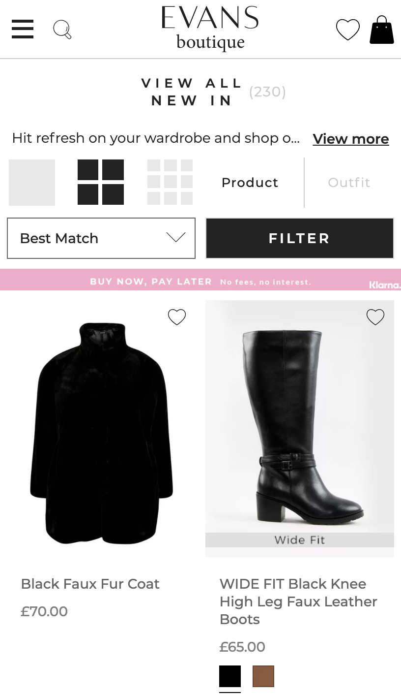
Evans defaults to product view, but does actually give mobile users the ability to switch to outfit view. It’s very easy to measure the conversion / transactions from people who use the toggle – test it, if it reaps dividends then try testing a different default – you’d be surprised how much you could learn.
I promise this is the last time I’ll say it, but people are sheep. And if you’re not factoring in customer ratings and reviews into your conversion strategy, you are leaving dollars on the table. Ponder on this statistics courtesy of SaleCycle:
With this in mind, it can be a good idea to show a product’s number of reviews and average rating on the product listing page to encourage them to click through (or at least pick one product with reviews over one without any).
Earlier on, I highlighted the importance of allowing users to filter on customer ratings. Same data source, different presentation – Reebok could benefit from displaying the customer ratings next to each shoe. Whether they’ve tested this or overlooked it I can only speculate.
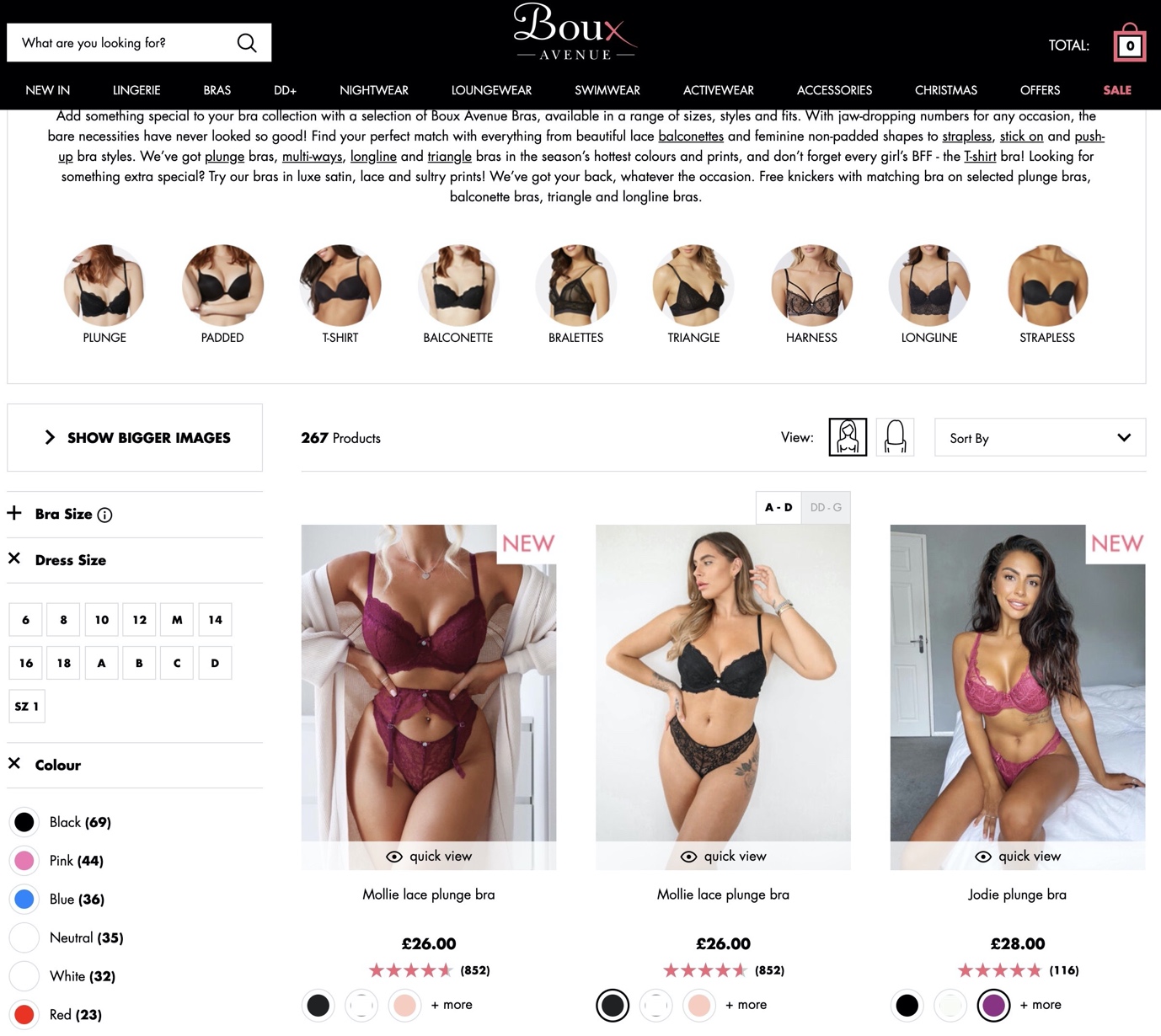
Ah, this is better. On the Boux Avenue Bras PLP, the average rating of each product is clearly displayed alongside the total number of reviews. This can mitigate any user hesitation whilst invoking curiosity to see what other customers are saying. If these ratings weren’t there, I know which one version I’d be more inclined to click.
I should point out that the tool Boux Avenue is using has a lot of sophisticated features that come with a hefty price tag (https://www.bazaarvoice.com/). If you’re just starting out or budgets are tight, please comment with your ecommerce platform and I’d be happy to point you in the right direction.
Now, this one is divisive. I’ve met numerous parties blindly recommend brands implement quick view without ever having any AB test numbers or evidence that it improves conversion. I’ve also seen instances of it actually reducing conversion.
Let’s think about the bigger picture for a moment. If your overall product listing page is poor, quick view can potentially cause more problems. Before considering implementing quick view, ask yourself if the fundamentals of your product list page are good enough first. Then please read this and decide if you really want to implement it.
The main issue with quick view is they can be misinterpreted as product pages. Most implementations typically consist of:
In the absence of other key product details, specifications, additional images, reviews and video you run the risk of users not clicking through to the product. And if those users can’t get the critical information they need at this point of friction they may conclude it doesn’t exist.
On Yours Clothing, there are so many details crammed into quick view that anyone could easily think this is the main product detail page.
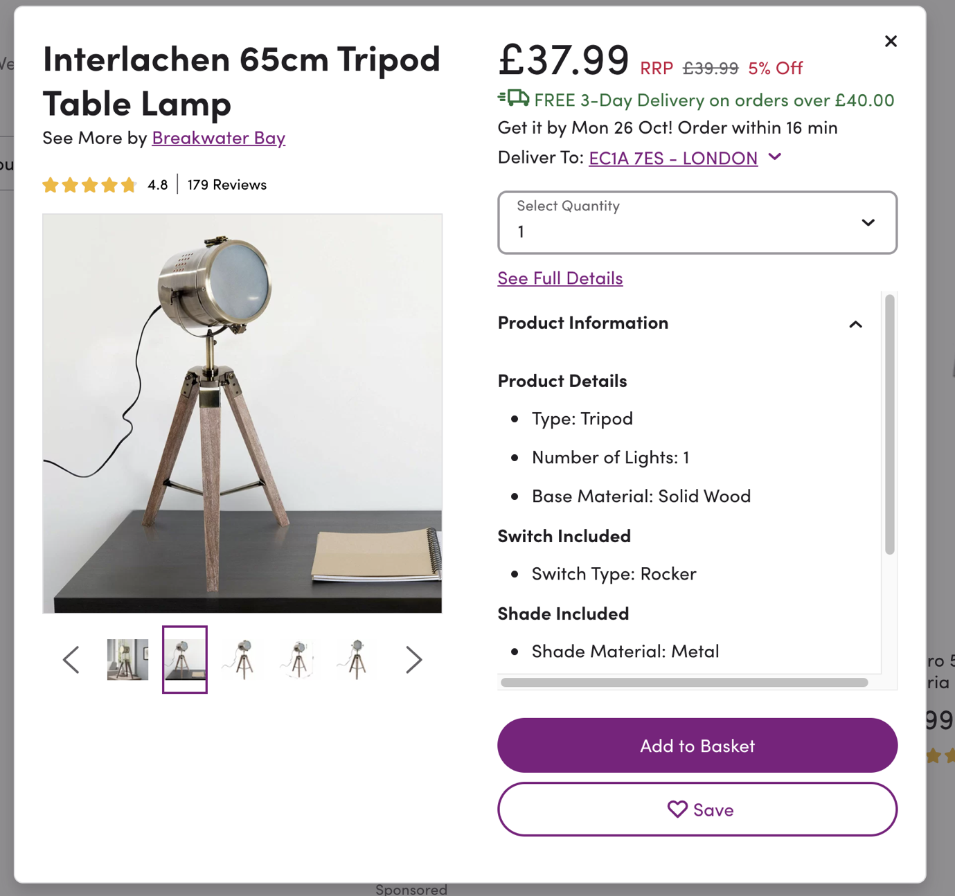
Wayfair is even more confusing: with so many purple links and CTAs flying around, it’s very easy to miss the See Full Details link.
There’s also a risk that people click them by accident. Where some quick view implementations are based on ambiguous icons rather than more obvious buttons, less savvy users may also be under the impression that there’s no more details beyond what they see in the overlay.
Finally, in either of these two scenarios people may also click the back button and with no change in URL state, you may send them back to a previous page or worse, Google. Think they’re coming back in a hurry? Good luck.
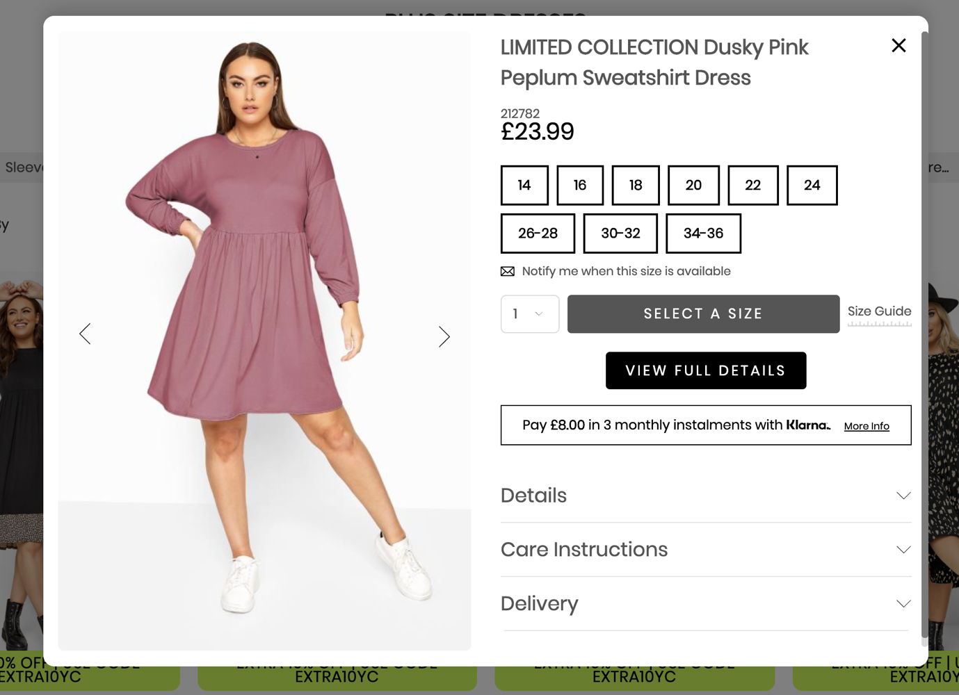
Now this is much more useful. Rather than the non-committal halfway house nature of quick view, quick buy does exactly what it says on the tin – users can add to bag without progressing to the product detail page. There are a few sensible approaches.
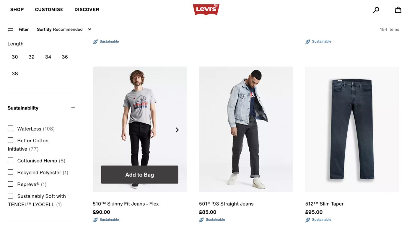
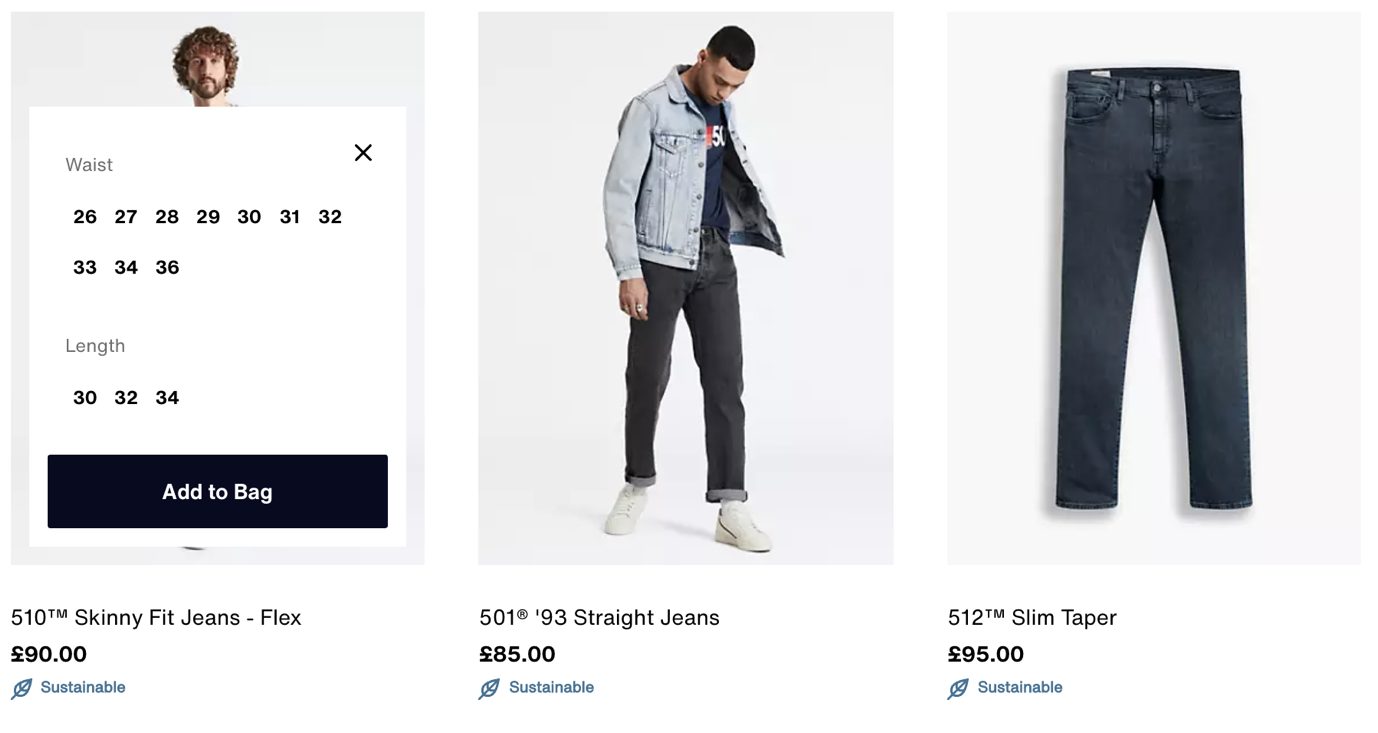
I’m a big admirer of Levi’s implementation here. When you click Add to Bag you simply have to select the waist and length of your chosen jeans before clicking Add to Bag a final time.
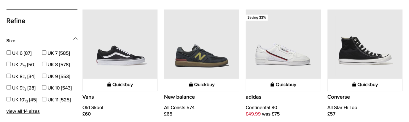
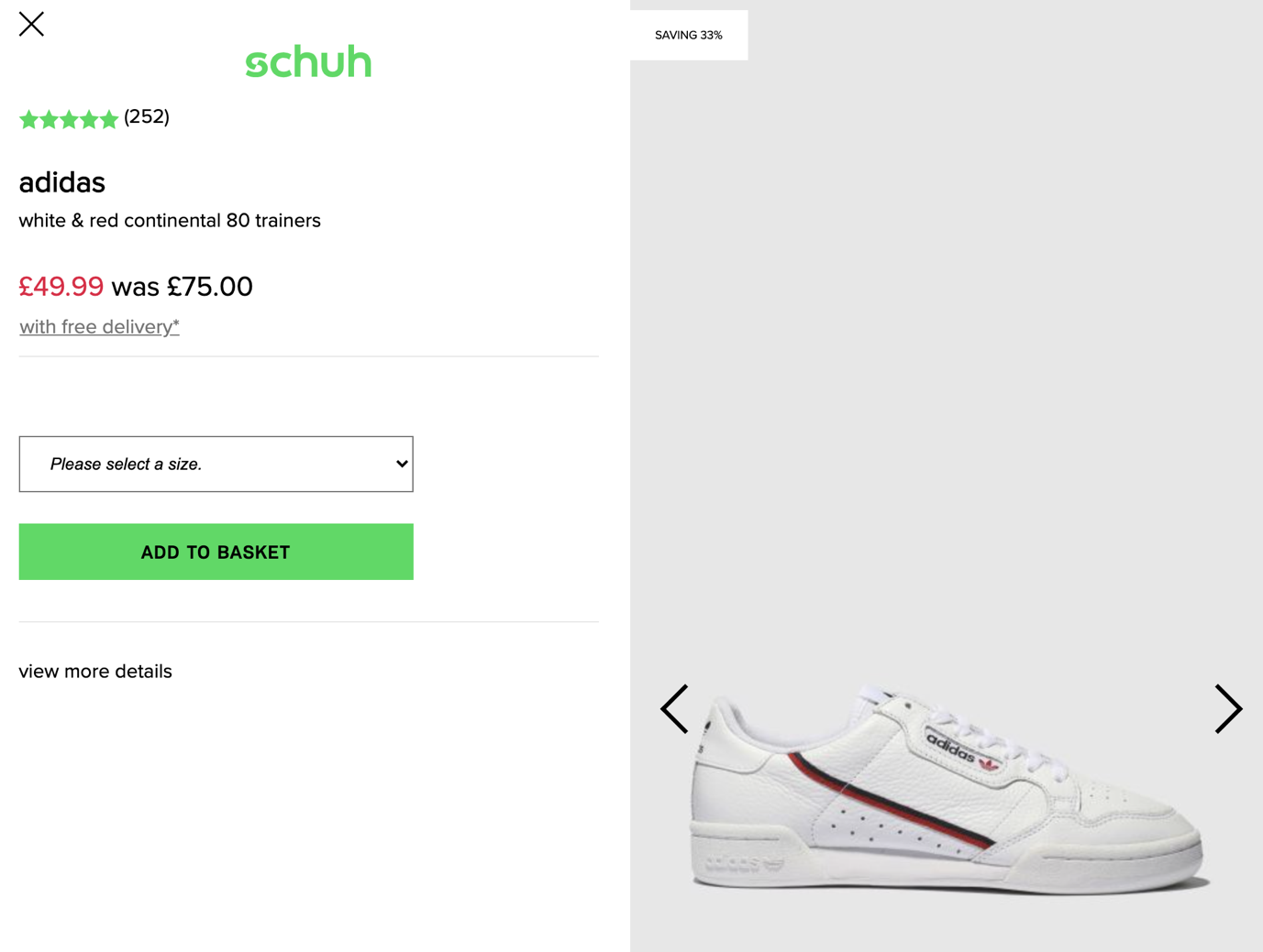
In a slightly more separatist approach from Schuh, the call to action is explicitly labelled as Quickbuy and on click, you have what is essentially a quick view layout. The context and labelling is the only difference.
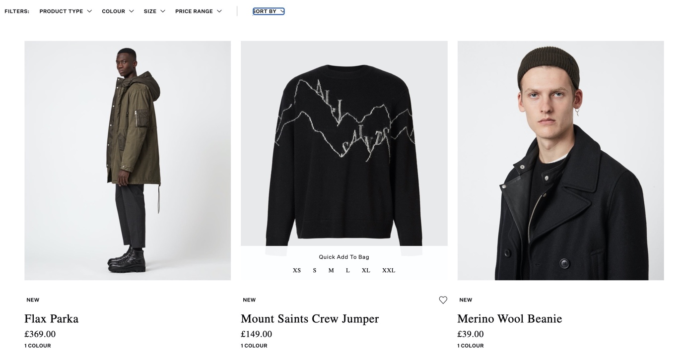
On All Saints, quick add to bag appears on hover and when a size is clicked the product is added to your bag, skipping the confirmation click Levi’s asks of the user.
Luxury brands tend to use these for breaking up the monotony of PLP grids, but in some cases they’re not actually linking anywhere which feels like a wasted opportunity (and in my years of numerous testing, things that look clickable will be clicked regardless of whether they link anywhere or not).
This technique can however easily be used by any ecommerce site in any industry.
Gucci’s lifestyle imagery doesn’t link anywhere.
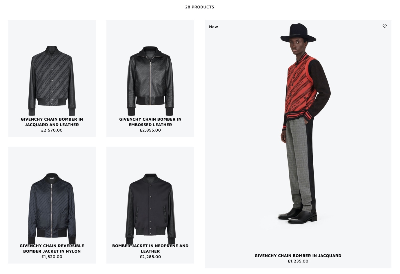
Givenchy uses this technique with a larger grid to give products more prominence.
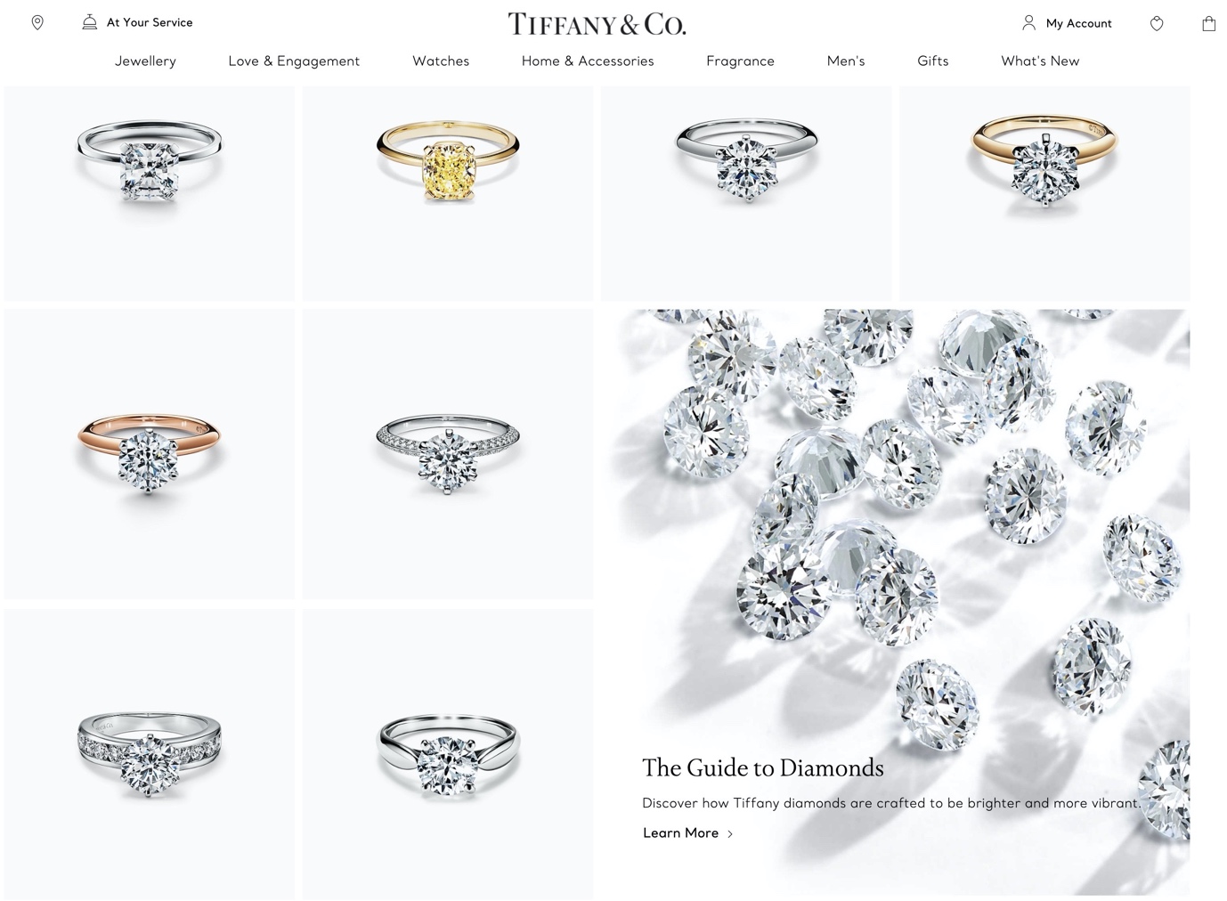
My favourite example is courtesy of Tiffany’s engagement rings product list page. It cross-pollinates authoritative editorial content in a complex buying cycle with more service-led value propositions as you scroll.
Please note: should you implement this technique, ensure that they do not display when sorting or filtering is applied – when users take this kind of action, adverts or promos become hindrances rather than helpful.
This is an interesting emerging trend. Whilst video has been very common on product detail pages (and on homepage campaign video) for many years you don’t tend to see them used on product listing pages.
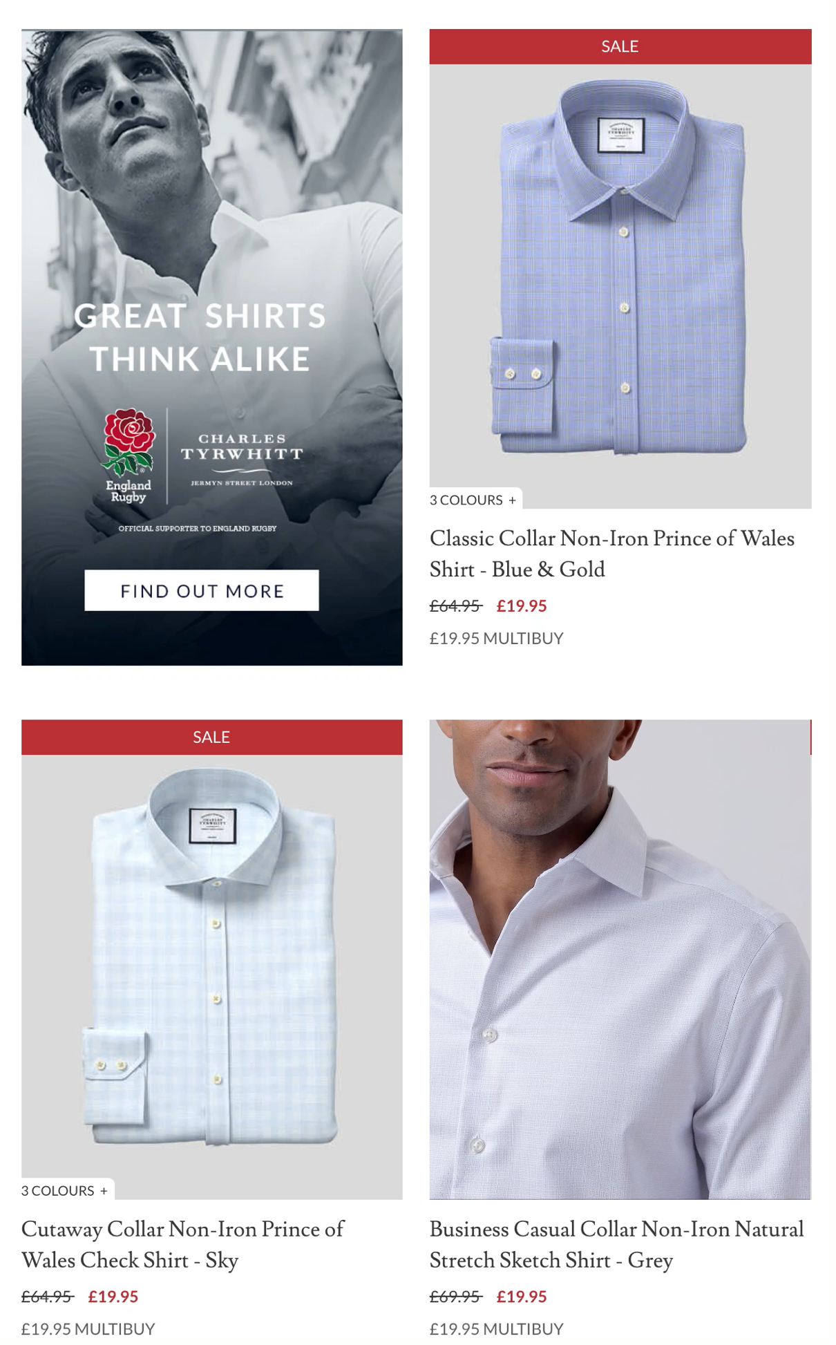
Shirtmaker Charles Tyrwhitt selectively uses autoplay video on key products to drive engagement.
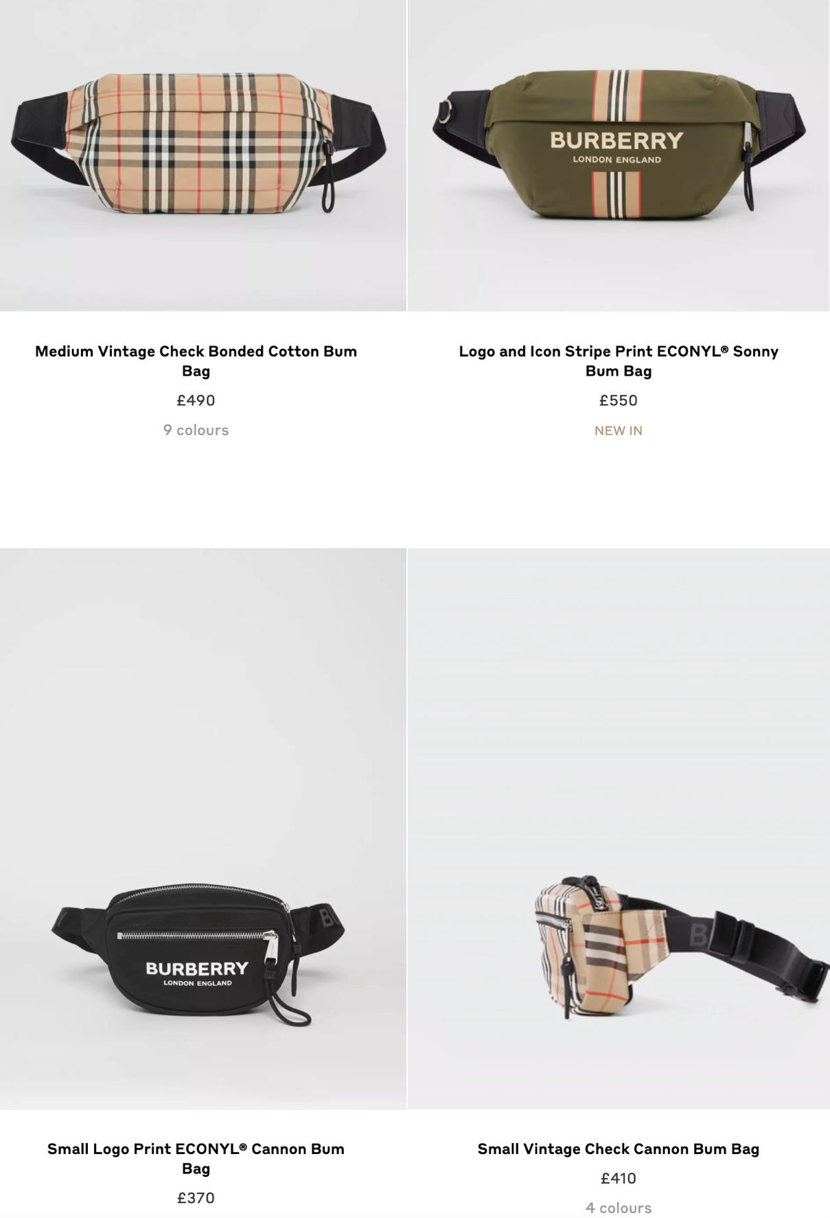
A similar play from Burberry, but rotating product only not on a model.
Another no-brainer here. It would be a very frustrating experience for users to click through your prominently-surfaced products only to find many are unavailable. In fashion and apparel this is a little harder with multiple sizes to choose from but it can still be achieved.