In the mid-nineties through to the early 2000s, Jakob Nielsen wrote a weekly column on web usability known as the Alertbox. In 2002, he had this to say about homepages:
“Homepages are the most valuable real estate in the world. Each year, companies and individuals funnel millions of dollars through a space that’s not even a square foot in size. For good reason. A homepage’s impact on a company’s bottom line is far greater than simple measures of e-commerce revenues: The homepage is your company’s face to the world.”
A lot has changed in those 18 years. Far fewer visitors will land on your homepage and many of your visitors may not see it at all. So you might ask, is my homepage even important anymore? Well, one thing remains true: your homepage is your company’s face to the world.
This article will give you an exhaustive view of all the possible ingredients that could make up your homepage, all supported by good, great and not so great examples. Some will not be applicable to you. Others, I hope are applicable but you’re perhaps not leveraging them as much as you could and this provides some inspiration.
Steal this free wireframe
Final note: I am briefly covering some site-wide elements that play a significant part in homepage product discovery but are also critical elsewhere in the customer journey.
A number of factors can determine your % of homepage traffic. Your new vs returning users split, ranking organically for high volume generic keywords, TV, out of home, radio, word of mouth etc. In any case, it’s likely to be your largest minority of users and the more effective it is for returning visitors, the greater their lifetime value is to your business through repeat purchases. For homepage traffic, product discovery paths essentially fall into three buckets:
- Category navigation
- Search
- Paths of curation and inspiration (this is more valuable for repeat visitors / customers, but we’ll get into that later)
Never aim for a ‘one size fits all’, but it’s absolutely a balancing act in determining your priorities. But before we get into the nitty gritty of category navigation, a quick word on the role of your logo.
Should your logo always link to the homepage?
Historically, the answer to this was always an astounding ‘yes’ and for many websites it should still be a resounding yes. There are however two prominent exceptions:
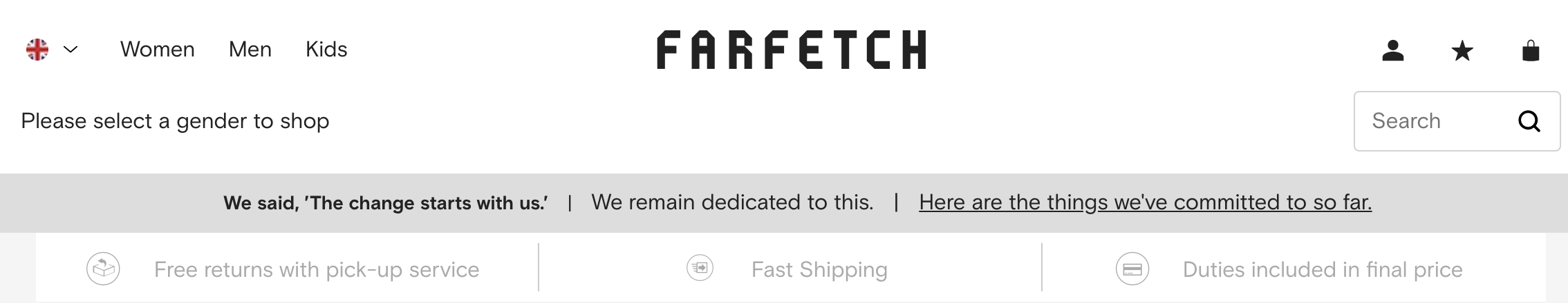
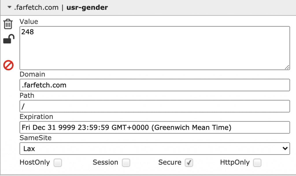
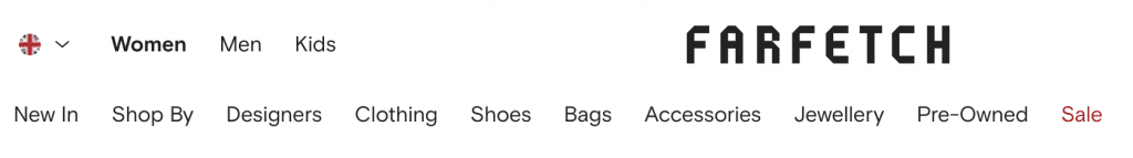
Farfetch pulls no punches, immediately asking you to select a gender to shop. Once you have done so, it sets a cookie specifically remembering your chosen gender (for 7079 years no less, at the time of writing).
Now, Farfetch is smart. That Balenciaga bag you’ve had your eye on is $1,400 and you might need a little more convincing to part with your money. You leave the site.
When you’re a little more in the mood, you decide to revisit the site, typing farfetch.com directly into your browser. It remembers you, transporting you directly back to the women’s page as opposed to you having to remember what you were doing at the homepage:

The key benefit here is that the navigation displays womenswear categories, shop by brand, pre-owned and sale all by default.
ASOS, whose customers are perhaps a little more impulsive to buy on the first visit, experience the same redirection behaviour but the cookie life is set to a much shorter two hours. Whilst many users are aware of the convention that clicking your logo will return them to your homepage you may well have a case for overriding this.
The ‘offer bar’
As it’s become easier for retailers to control and update specific site elements (through business intelligence tools, tag management etc), it’s now commonplace for retailers to use an offer bar to communicate various messages such as:
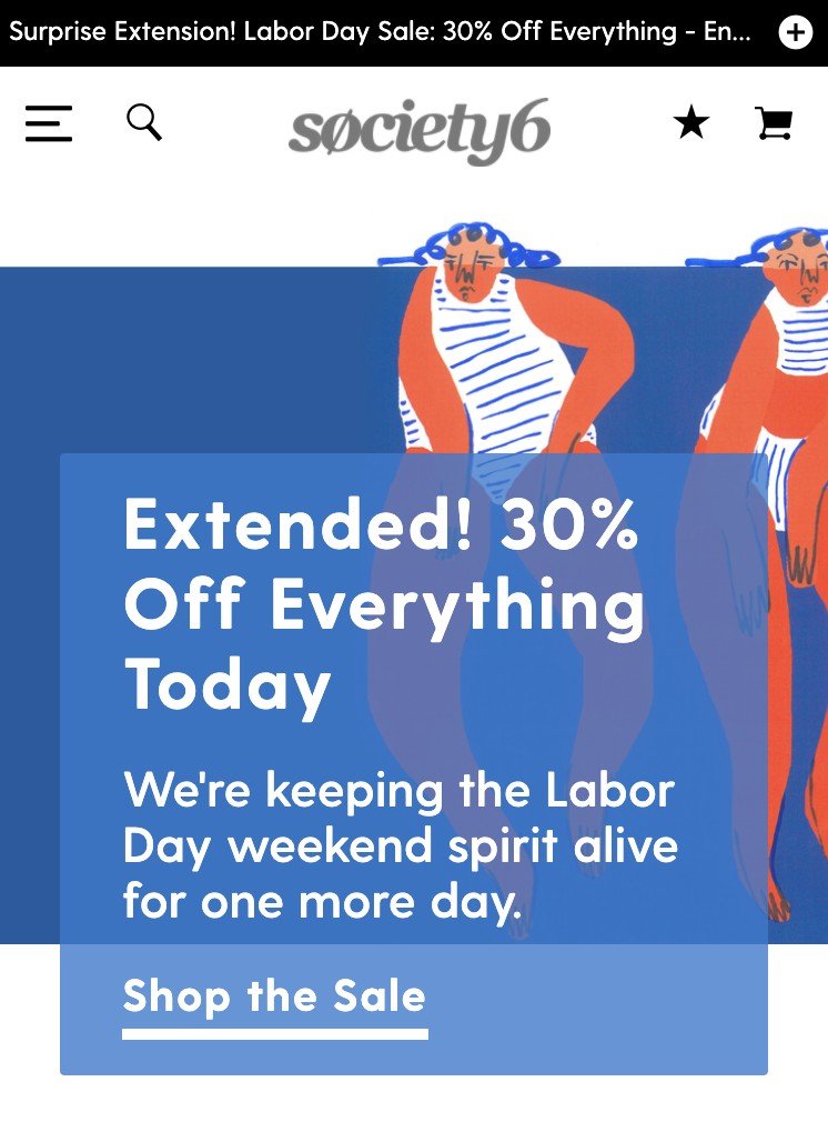
- Seasonal sales – many US retailers did this over the Labor Day weekend
- International shipping propositions (more useful for US retailers with UK traffic as an arbitrary example, where GeoIP can easy personalise this)
- Loyalty programs (typically free express shipping for a small annual fee)
- Ancillary services (such as product personalisation)
It’s worth noting this differs to a trend that surfaced long before, which is the value proposition bar – we’ll take a look at those in more depth later.
Desktop and Mobile Navigation Visibility and Behaviour
As a simple rule of thumb, it’s critical to surface your primary categories in the main navigation. Hiding these categories under ambiguous headings such as Shop, Products, Catalog or Departments will be detrimental to your users’ ability to discover products. Far larger sites (such as Walmart, Target or Amazon) are likely to do this given the sheer volume of categories; specialty retailers have less of an excuse.

Patagonia stores its main categories under the Shop heading in the main navigation which makes product discovery via the navigation more tricky.
Consider using iconography to support your category labels
Icons or illustrations can help users to ascertain what categories they’re looking at when they have visual cues to make quicker decisions.
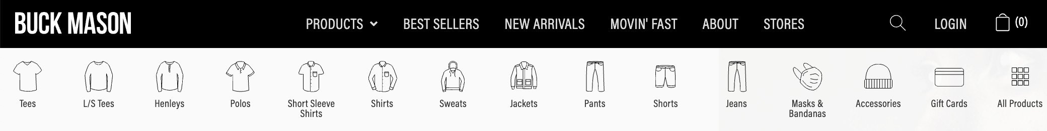
Buck Mason provides simple illustrations of each menswear category to achieve this
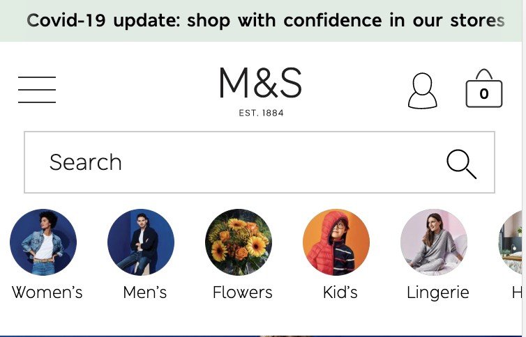
Mobile and tablet visitors to Marks & Spencer uses full colour photography for each category to achieve the same goal
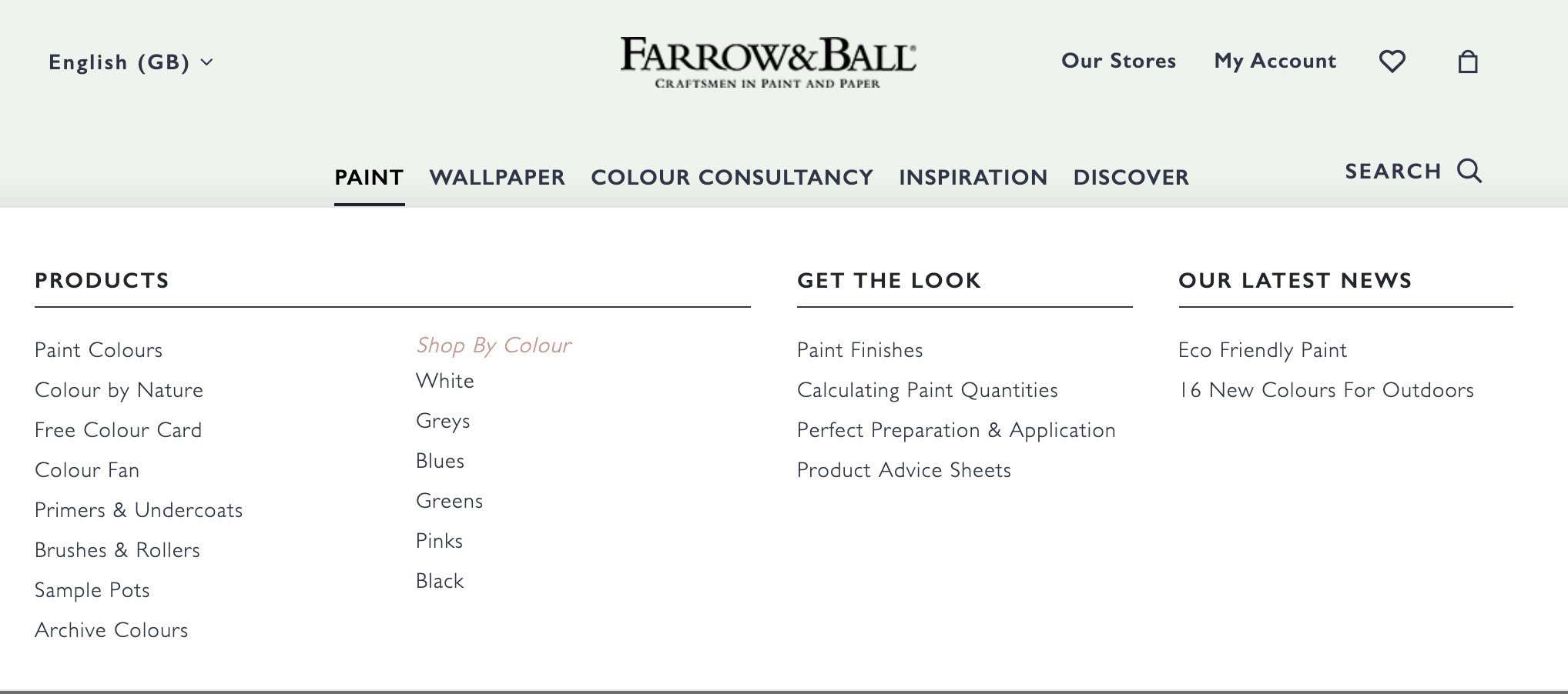
Farrow & Ball offers Shop by Colour in its Paint category but with no visual cues. These are however listed with colour switches as part of its filters on category pages. A missed opportunity perhaps?
Dropdown or fly-in menus?
The most common pattern for ecommerce sites is a horizontal menu that reveals its contents vertically on click or hover. Given many retailers now have a ‘mobile first’ ethos, it’s likely that this trend will die out with more brands opting for a ‘fly-out’ menu from left-to-right or vice versa.

Clicking on Prada’s menu icon reveals its core categories flying in from right-to-left
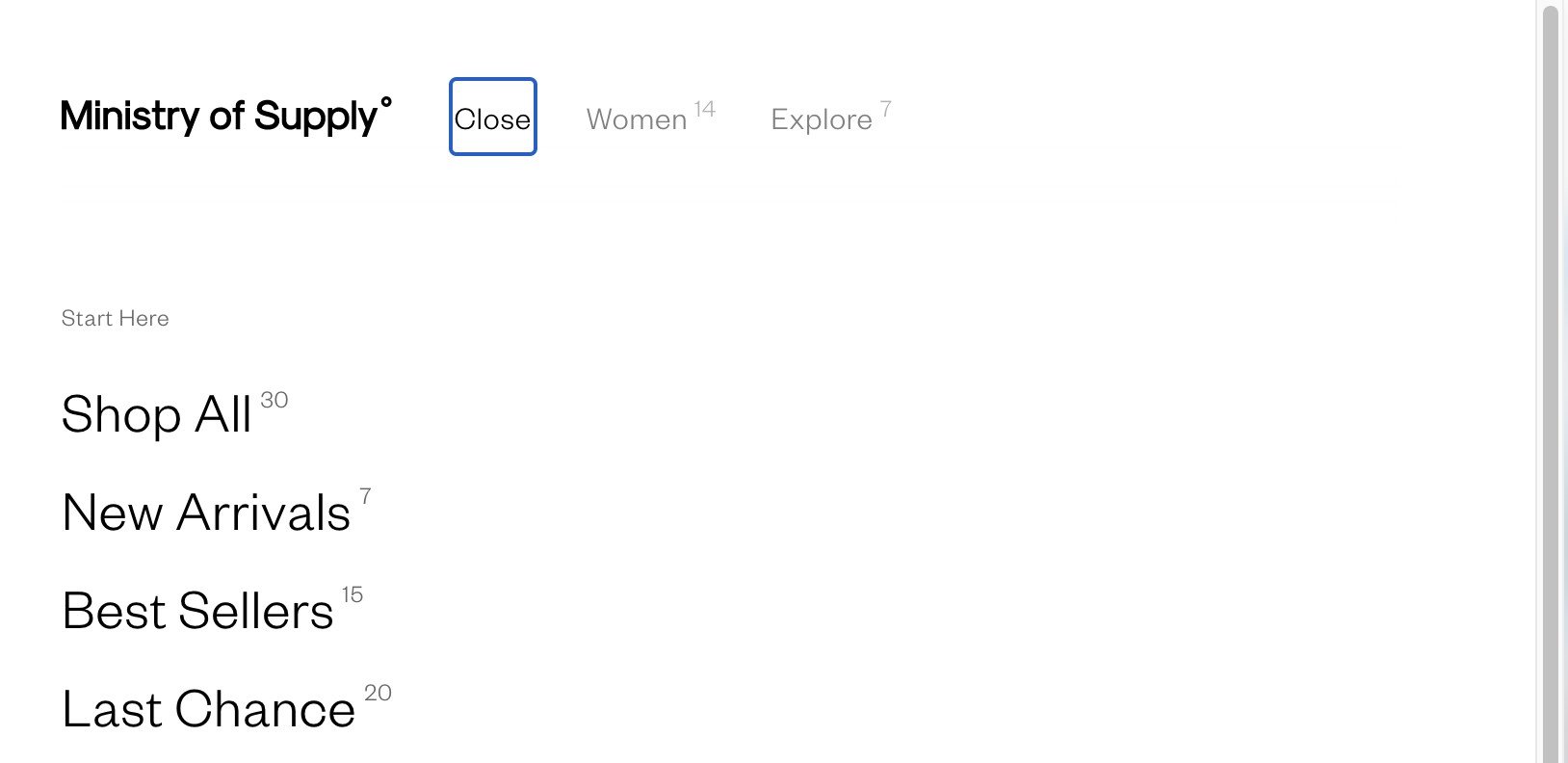
Ministry of Supply’s navigation is horizontally-aligned, but on click the sub-categories fly in from left-to-right
Out of view, fly-up or persistent navigation?
The most common method of navigation presentation was to display the masthead at the top only and it would only appear again when the user has reached the top of the page. In order to keep key elements of the customer journey in full view, this is dying out in favour of a ‘sticky’ approach.
Sticky, or persistent navigation simply means that menus, carts, search icons or anything else in the masthead remains permanently fixed to the user’s screen as they scroll up or down a page. It’s a design pattern that has been around for many years, but in ecommerce the adoption has picked up a little later.
There are three typical scenarios:
- Sticky at the top of the screen at all times
- The masthead / menu disappears as you scroll down, but immediately appears as the user scrolls or gestures back up
- Permanently persistent at the bottom of the screen (far less common)
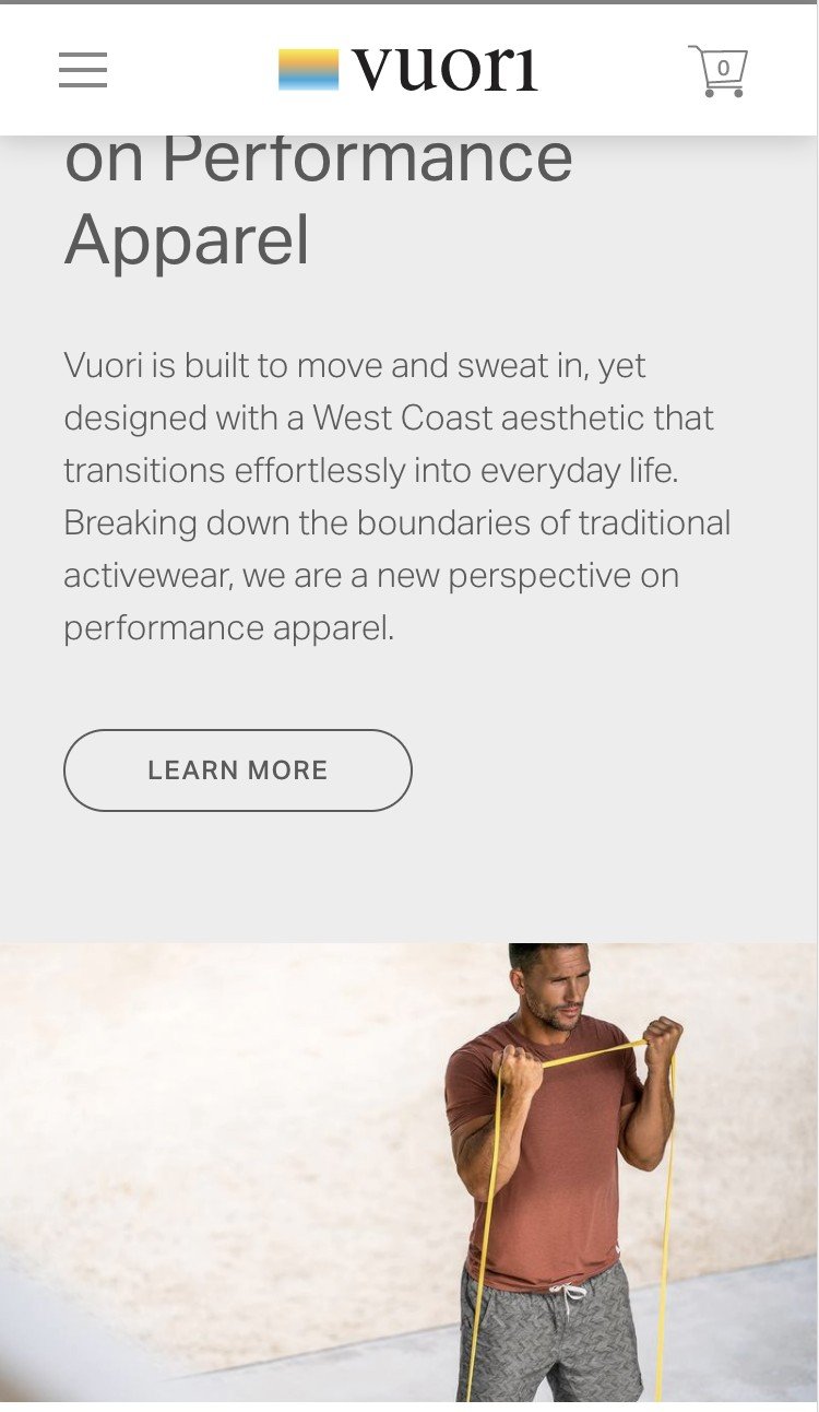
No matter where you are on the page, the Vuori menu, logo and cart icons are always present

On johnlewis.com, the navigation disappears as you scroll down, but after you scroll back up the navigation appears again.
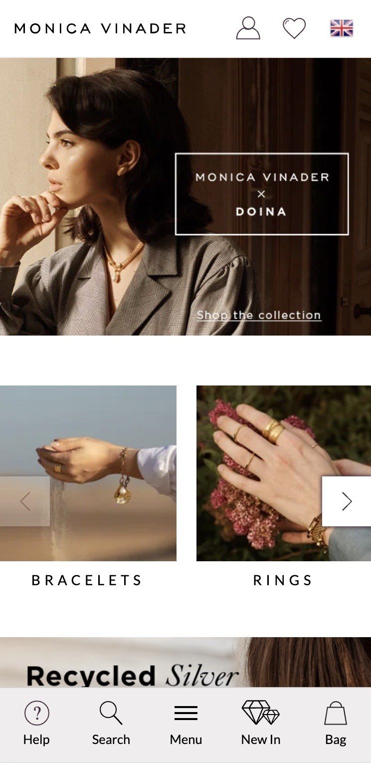
Mobile users on Monica Vinader have the primary navigation permanently affixed to the bottom of the screen.
In my experience, either a permanently sticky to the top or reappearing on scroll back up will reap dividends, particularly if you have a higher UPT (units per transaction). If you have the capabilities to A/B test these changes, that would be highly advised.
Click or hover for revealing menu contents
Most retailers desktop experiences will present users with sub-categories on hover, however click to reveal seems to be gaining traction. It has long been my preference to ‘click to reveal’ as I’ve observed in user testing that many users will click the first heading of interest to reveal its contents, but end up visiting that top level page. Not a great experience.
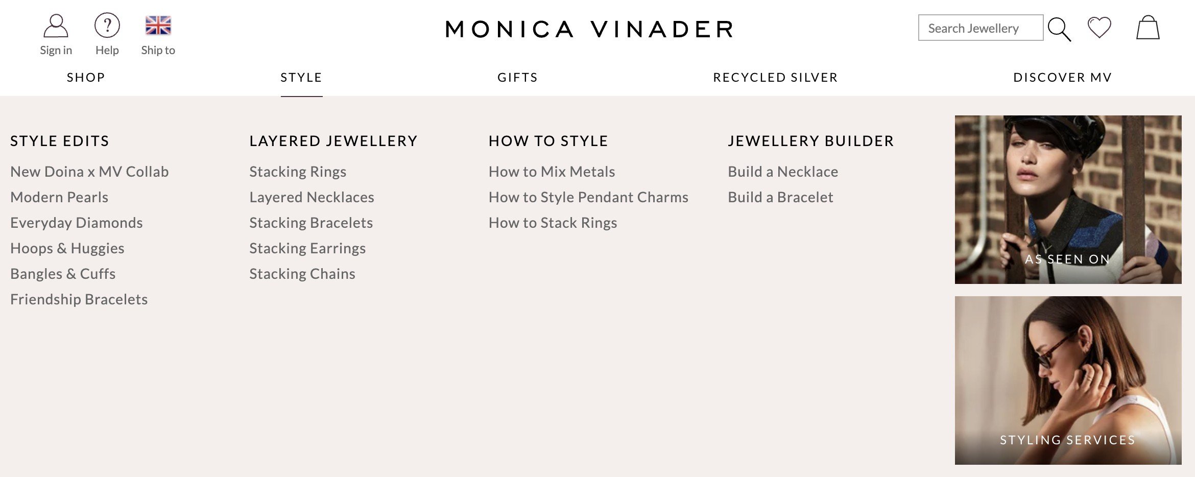
Monica Vinader’s desktop menu uses an ‘empty anchor’ to force the navigation to display on hover. In other words, clicking Shop, Style or Gifts doesn’t actually do anything.
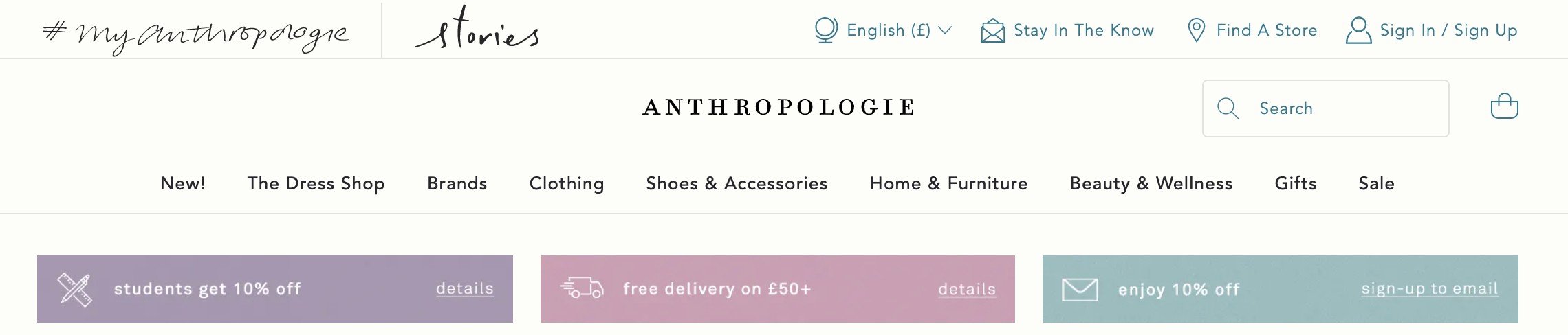
On the Anthropologie website, hover to reveal or ‘click to visit’ is inconsistent. All menu items display on hover with the exception of The Dress Shop and Brands
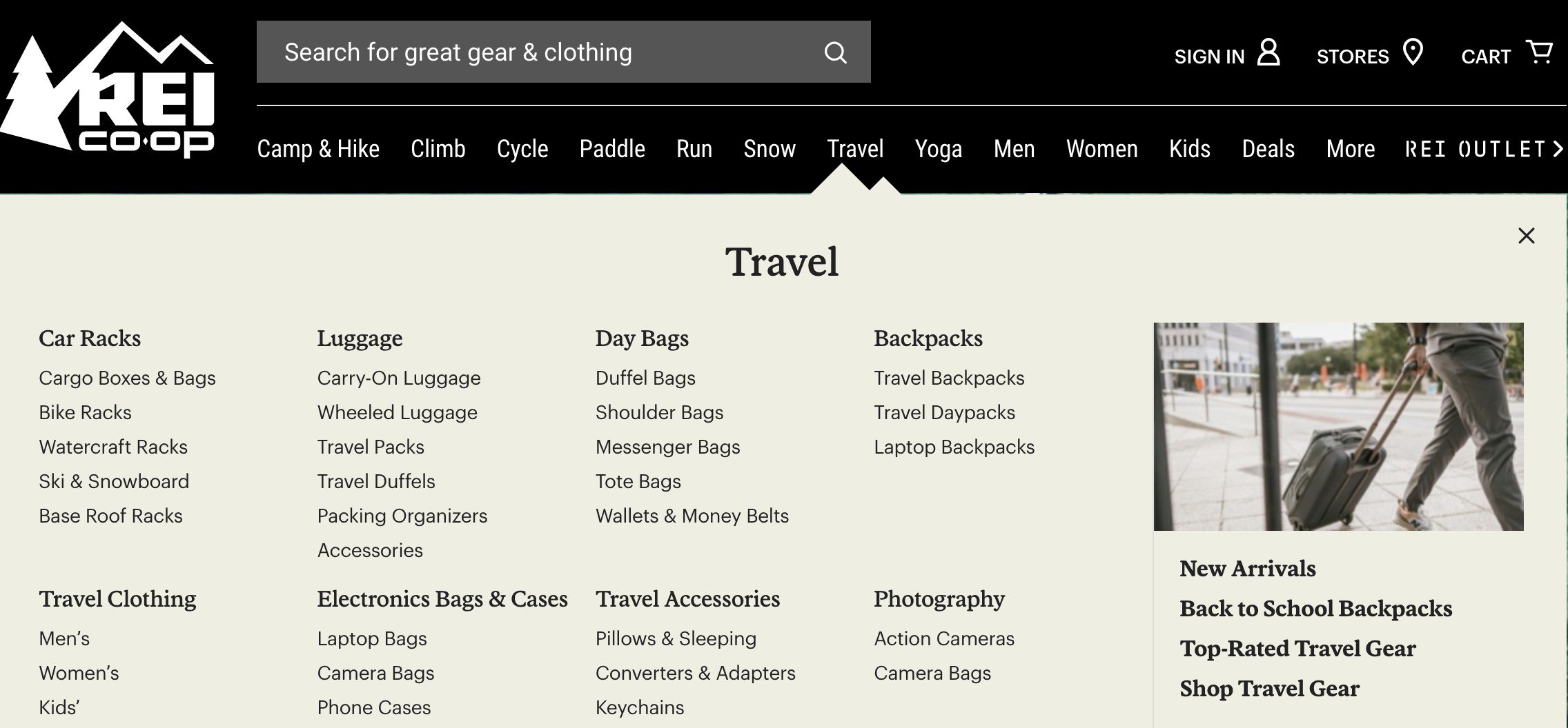
On REI, the primary categories only expand once clicked.
Improve focus on navigation by reducing opacity of other elements
It’s a good idea to allow your desktop users to focus on your megamenu contents, particularly if you have a lot of whitespace. A simple yet effective way to do this is by ‘greying out’ the non navigation parts of your site and reducing the opacity so it’s still slightly visible behind it.
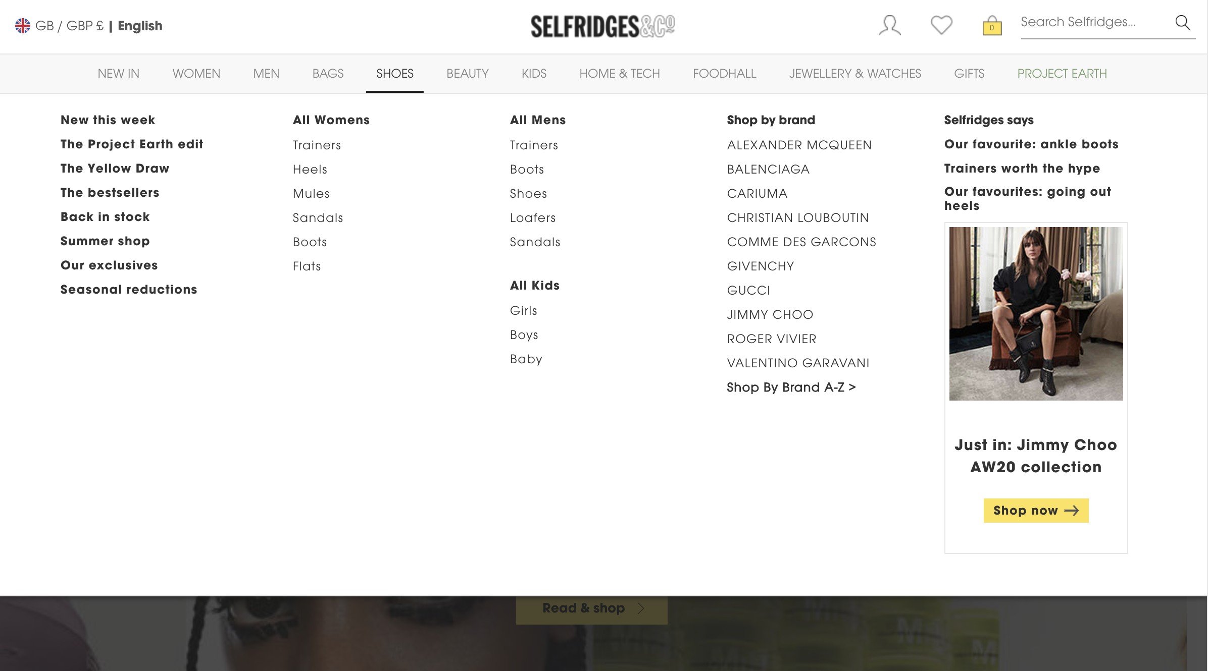
Selfridges does this effectively so its users aren’t distracted by the contents behind the navigation
Site search prominence
Unlike category browsing or the path of curation / inspiration, users of site search usually know exactly what they’re looking for and therefore have a greater likelihood of purchasing. That is, if the quality and relevance of your results are up to scratch. In the interests of brevity and focus I will cover synonyms, zero results, autocomplete and autosuggest best practice in a separate article.
A solo subtle search icon
Many luxury brands will opt for a subtle, solitary magnifying glass icon with no labeling and in my previous testing, this results in far fewer sessions with site search. That isn’t always a bad thing; brands that carry far fewer SKUs or those more focused on inspiration dilutes site search importance.
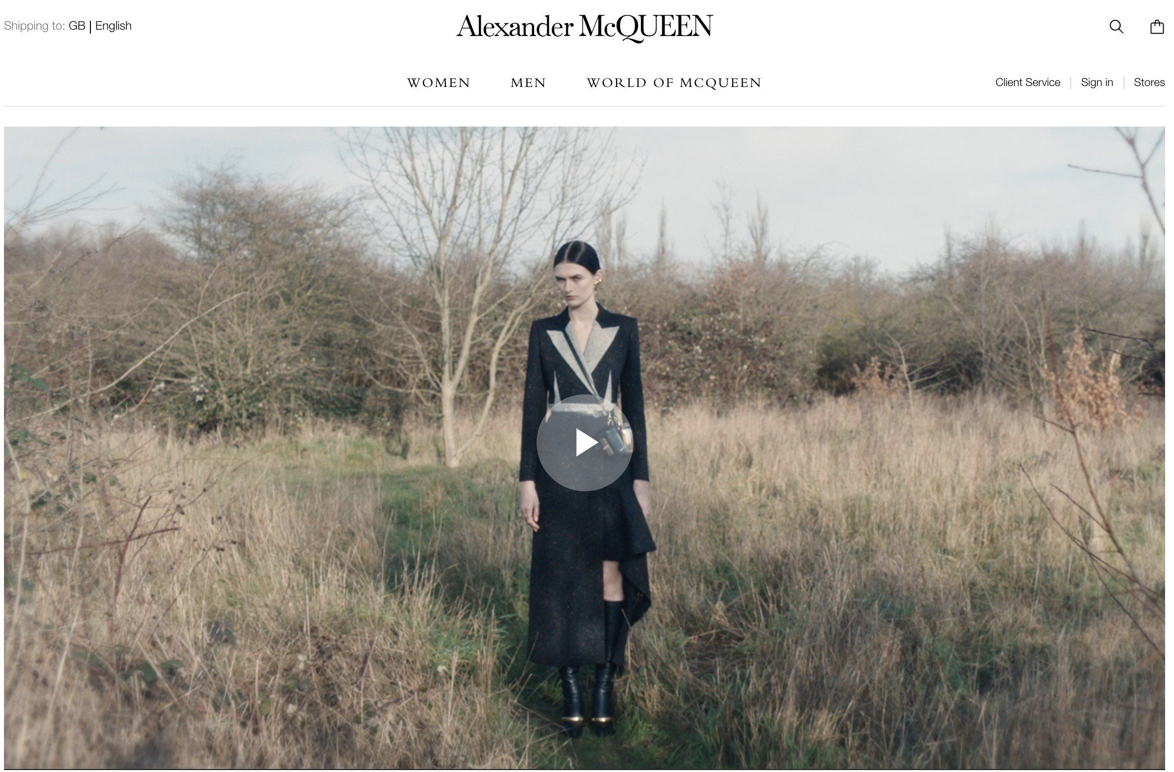
Alexander McQueen has its search icon subtly positioned to the left of the shopping bag in the top right hand side.
Historically, it was almost a given that site search would appear in the masthead with top right placement but that has become less of a convention.
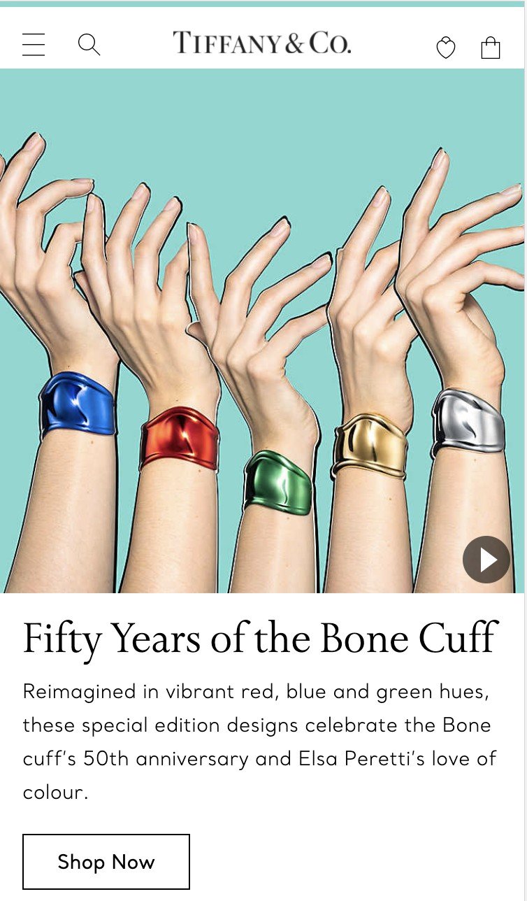
Tiffany position the search on the left hand side, next to the hamburger icon
Obvious always wins
Generally speaking, it’s a good idea that your site search is in a contrasting colour to the masthead or wherever else it’s positioned.

Net-a-Porter’s desktop search is part of the navigation, however with a solid white background it somewhat fades into the page elements that follow.

Runnersneed’s site search is fairly prominent, with a solid white contrasting to the grey background. The final darker grey border gives it additional focus
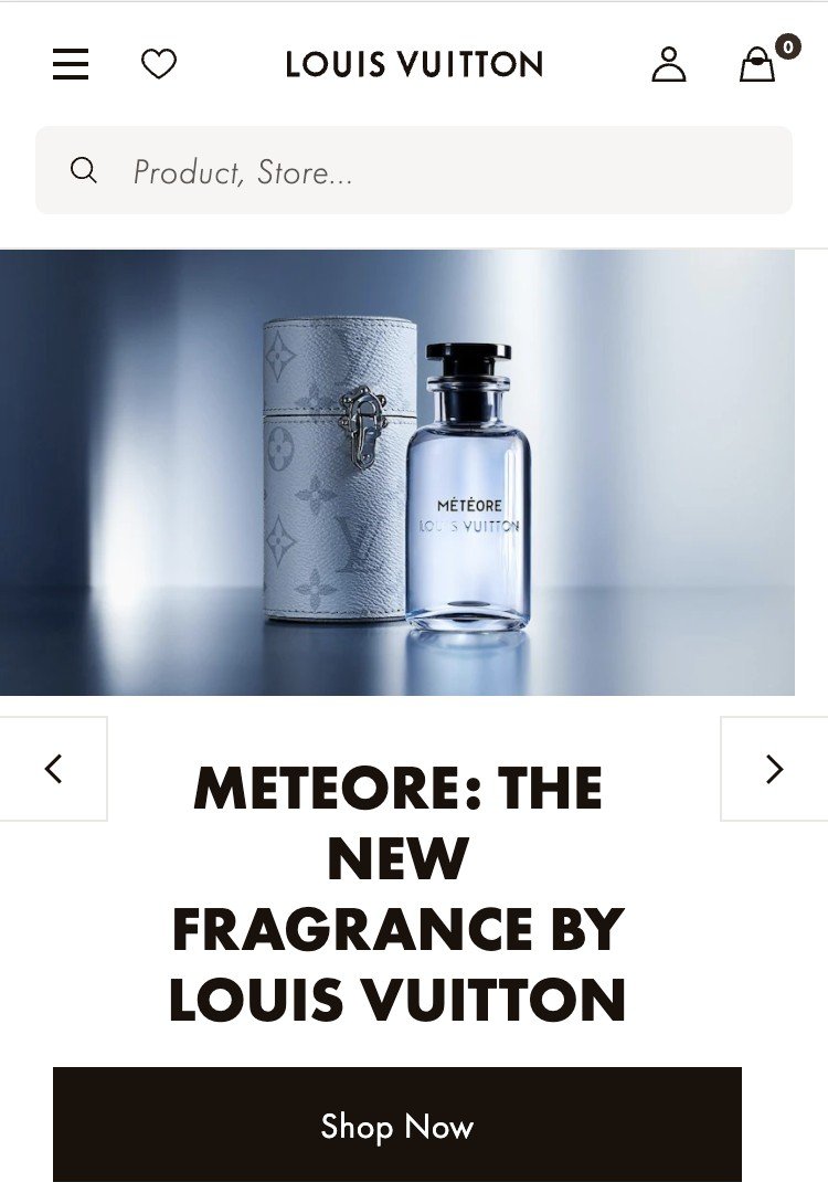
Louis Vuitton’s site search is a solid grey, appearing full width underneath the masthead to encourage higher usage.
Search placeholders can influence the terms people use
In the Runnersneed example above, the default labeling is ‘What are you looking for?’ This is quite ambiguous – Search by brand or product type (i.e. running shoes) could be more helpful.

ASOS does exactly like this – Search for items, brands and inspiration
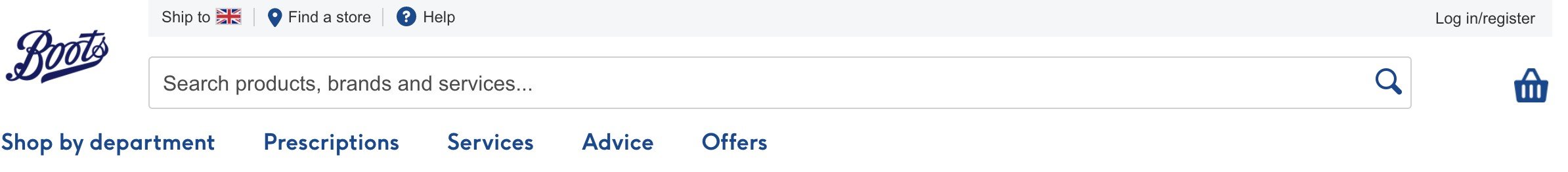
Beyond products, Boots offers Optician, Prescription and Hearing Care services – users now know if they search for something non-product related then their query can be catered for.
Why should I buy from you? The value proposition
A value proposition is a statement or series of statements that summarises why a customer should buy from you. For ecommerce businesses, these typically fall into the following buckets:
Price
The strongest value proposition from a pricing perspective is usually price matching, as in, ‘if you’ve seen it cheaper elsewhere, we will honour the same price if you buy from us’. This is great if you have the margins to accommodate it but otherwise it can be a fast race to the bottom.
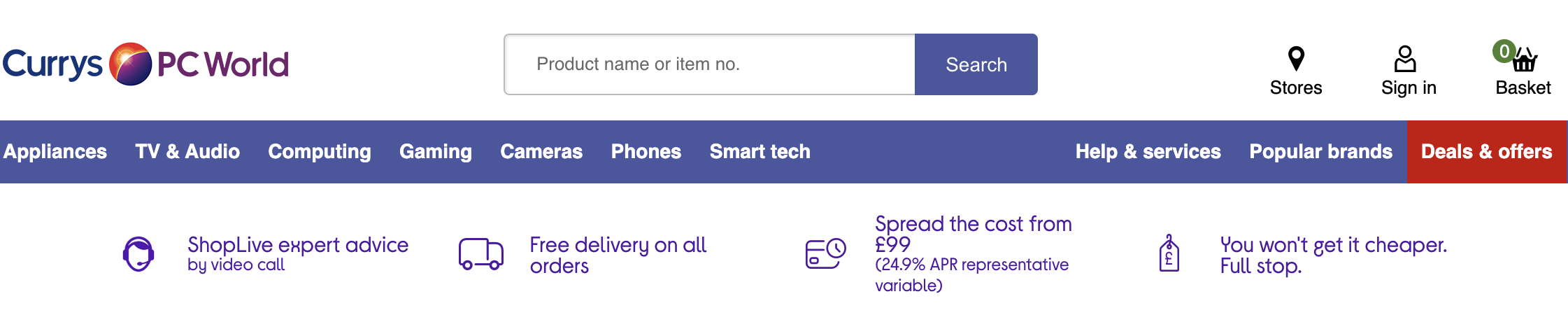
Currys states ‘You won’t get it cheaper. Full stop.’ Said with conviction and customer centricity.

Slightly less compelling than Currys, but AO.com’s price match promise still provides reassurance.
Shipping / delivery and returns proposition
Sometimes these are divided into separate blocks, otherwise the core messaging is free shipping on orders over $x, next day shipping over $y and then information on free or extended returns.
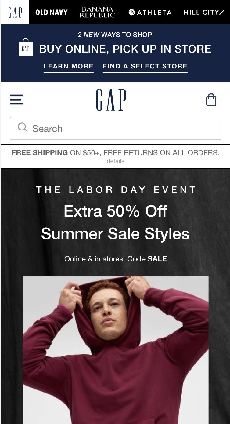
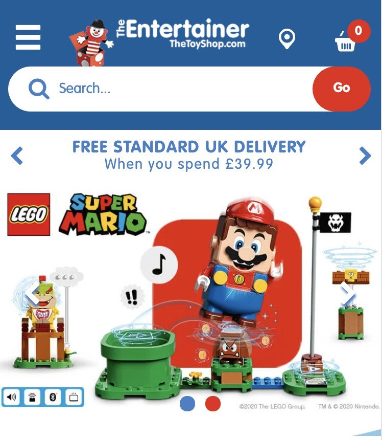
Gap pushes free shipping on orders over $50 and free returns (albeit this messaging is somewhat lost in the Gap Inc. brand push and pick up in store messaging). Nike’s is much clearer and is part of a rotating carousel displaying sale messaging with shipping and returns. TheToyShop has a similar approach to Nike with much more obvious controls encouraging the user to swipe through them.
Click and collect (buy online, pick up in store)
Perhaps currently less useful in a Covid-19 world, but it’s a common tactic for retailers to offer free collection in store. Three common advantages of this are:
- Increasing conversion for impulse purchases where same day collection is possible
- Encouraging store footfall for customers who always or mostly buy online
- For the environmentally conscious, the impact of delivery on their carbon footprint might sway them to come to you.
In Q1 2019, Target saw a 60% increase for in-store pickup, Drive-up grew more than 70% representing an overall 273% uptick for same-day fulfilment.
Ethics
If your products and / or supply chain are a force for good in the world, it’s worth shouting about it.
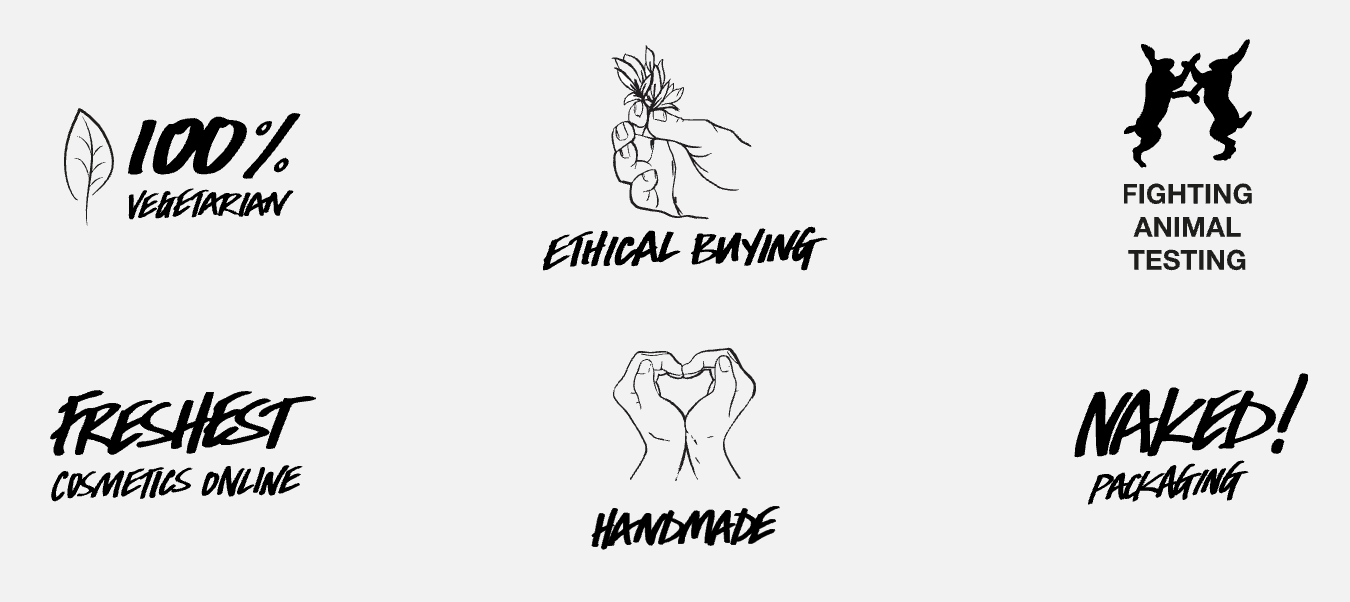
Few retailers do this better than Lush Cosmetics.

Allbirds also does this well, with a GIF explaining its current shoe CO2 emission and nice bit of storytelling on their plans to get that down to zero.
Trustmarks
This has a far bigger impact for emerging brands who may need to do a little more to convince people to part with their money, but it’s become fairly common for UK advertisers to highlight their ratings from various aggregators in TV ads.
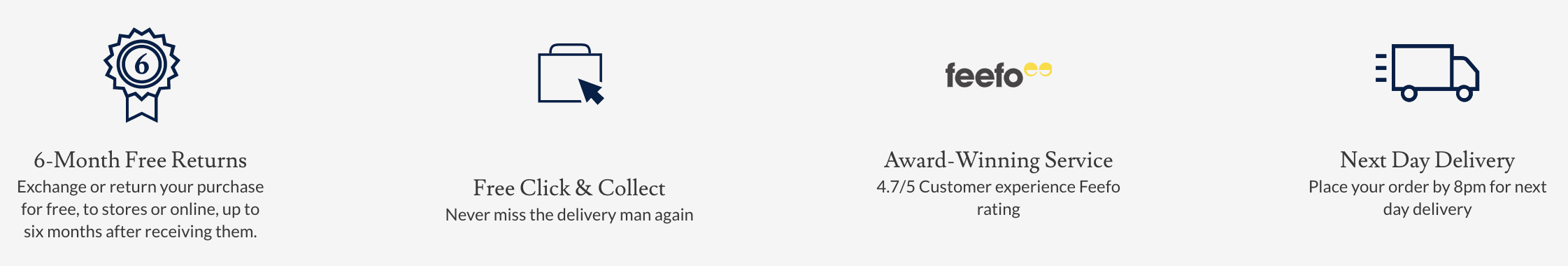
Shirtmaker Charles Tyrwhitt promotes its Feefo rating further down its home page
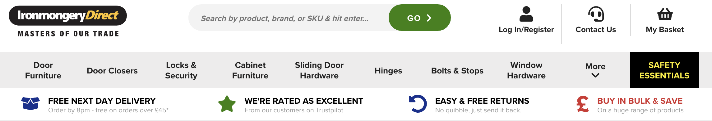
IronmongeryDirect links the user directly to its TrustPilot ratings as part of a 4 factor delivery, returns and pricing proposition.
Auxiliary payment methods
These tend to be Finance Plans with low or no interest monthly repayments. Far more common for ‘big ticket’ purchases such as furniture, household appliances or high-end watches.

Sofa retailer DFS promotes it interest free credit messaging along with its guarantee and craftsmanship below the hero and key category messaging

A similar story for Watches of Switzerland, combining it with product authenticity reassurance and strong delivery messaging
In apparel and fashion retail, there has been significant adoption of services such as ClearPay, Klarna and LayBuy where the customer can pay in monthly installments or in full 30 days after purchase. I’m personally in the Jay-Z school of thought: ‘if you can’t buy it twice, you can’t afford it’, but that’s just me. Whilst these are more commonly found in a retailer’s footer with the full range of accepted payment methods, if it’s something you’ve introduced recently it can be helpful to both new and returning visitors.
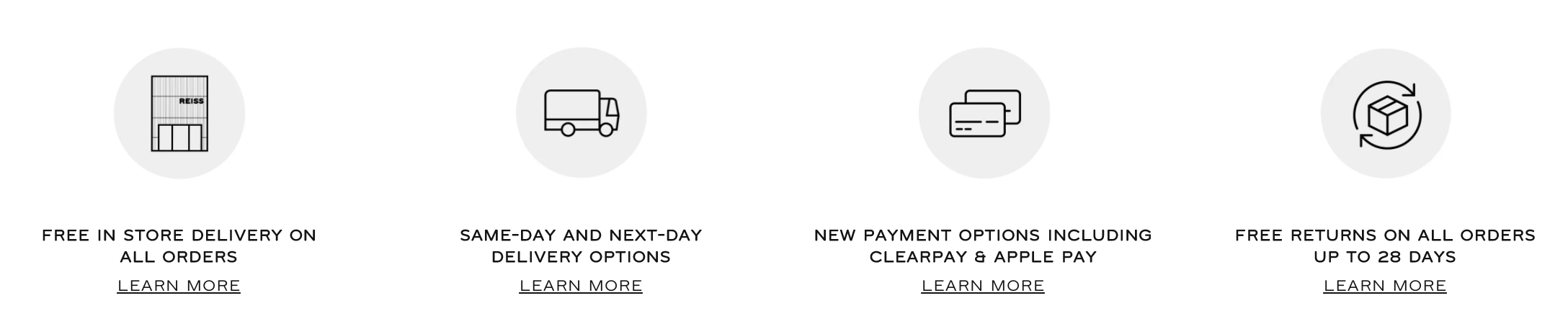
Reiss has recently introduced ClearPay and Apple Pay, communicating this with collection, shipping and returns propositions.
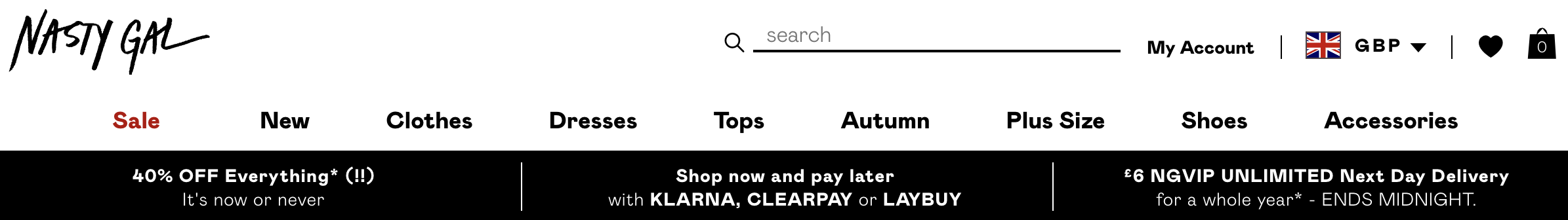
Nasty Gal offers Klarna, ClearPay and LayBuy and gives them a lot of visibility.
Value Proposition presentation
The most common method of displaying these on desktop is in one horizontal bar, typically positioned between the main navigation and ‘hero’ merchandising banner zone or directly above the logo, search and cart masthead.
On mobile devices, these will auto rotate or they’re swipeable through previous / next controls.
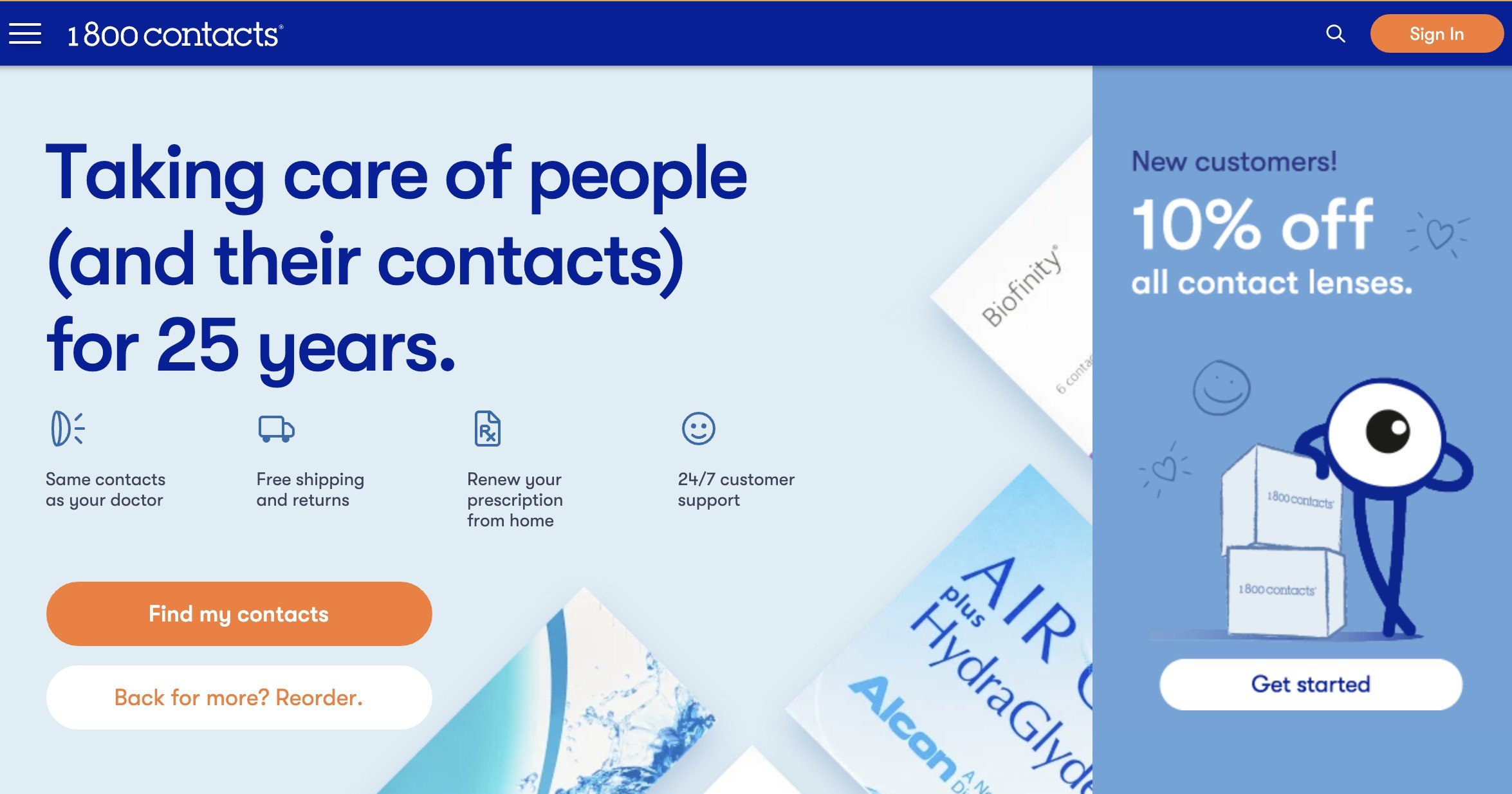
Some retailers are also opting to include them in the hero merchandising zone; an idea I like as they may be seen more clearly in relation to a core call to action. 1800contacts pushes authenticity, shipping and customer support whilst UK Meds emphasizes its Trustpilot ratings, something of vital importance when buying medicine products from both a discretion and trust point of view.

Many of the examples above also list their value propositions further down the home page. If your users land on your homepage and immediately scroll down this can get additional eyeballs on them compared to the typical value proposition placement.
Carousels are a double-edged sword
Many years ago, carousels were the rule rather than the exception on ecommerce homepages. Whilst they have fallen out of favour (driven, in part by the snarky and widely-shared shouldiuseacarousel.com), they can still be effective if a set of specific usability conventions are followed. Three advantages of carousels are:
- Catering to a wider range of users – if the first core message or merchandising promotion isn’t of interest, you have two, three or four further bites of a cherry to meet the user’s needs.
- Aesthetics and brand take precedence over best practice – this is more synonymous with luxury brands, but when you invest a fortune into photography and video that does campaigns and products justice…
- Stakeholder management – it might sound counterintuitive when the user’s goals should come first, but in larger brands with numerous category managers or merchandisers appeasement is vital. So when multiple promotions or offers can occupy one piece of screen real estate it’s a sensible way of mitigating internal friction.
Carousel pitfalls to avoid
Make the whole damn thing clickable
In a previous life, I’d inherited a carousel implementation where a subtle CTA was the only clickable element.
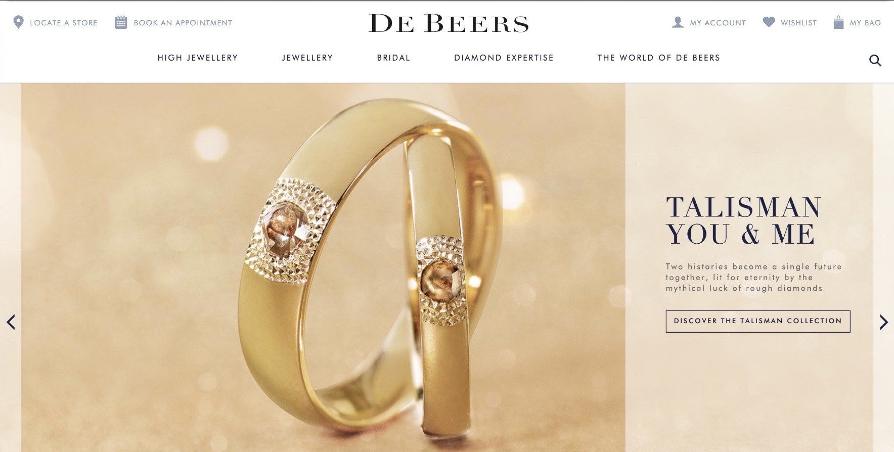
De Beers homepage December 2016 – only the subtle CTA was clickable and my testing showed a significant number of clicks and taps on parts of the banner that weren’t clickable. Don’t do this.
Subtle, hard to click controls
One common frustration with carousels is the lack of intuitive or obvious controls. Not only can subtle previous and next carets at the far left and right corners be easily missed (particularly with carousel slides containing both light and dark content), tiny dots centered and aligned to the bottom are difficult to click.
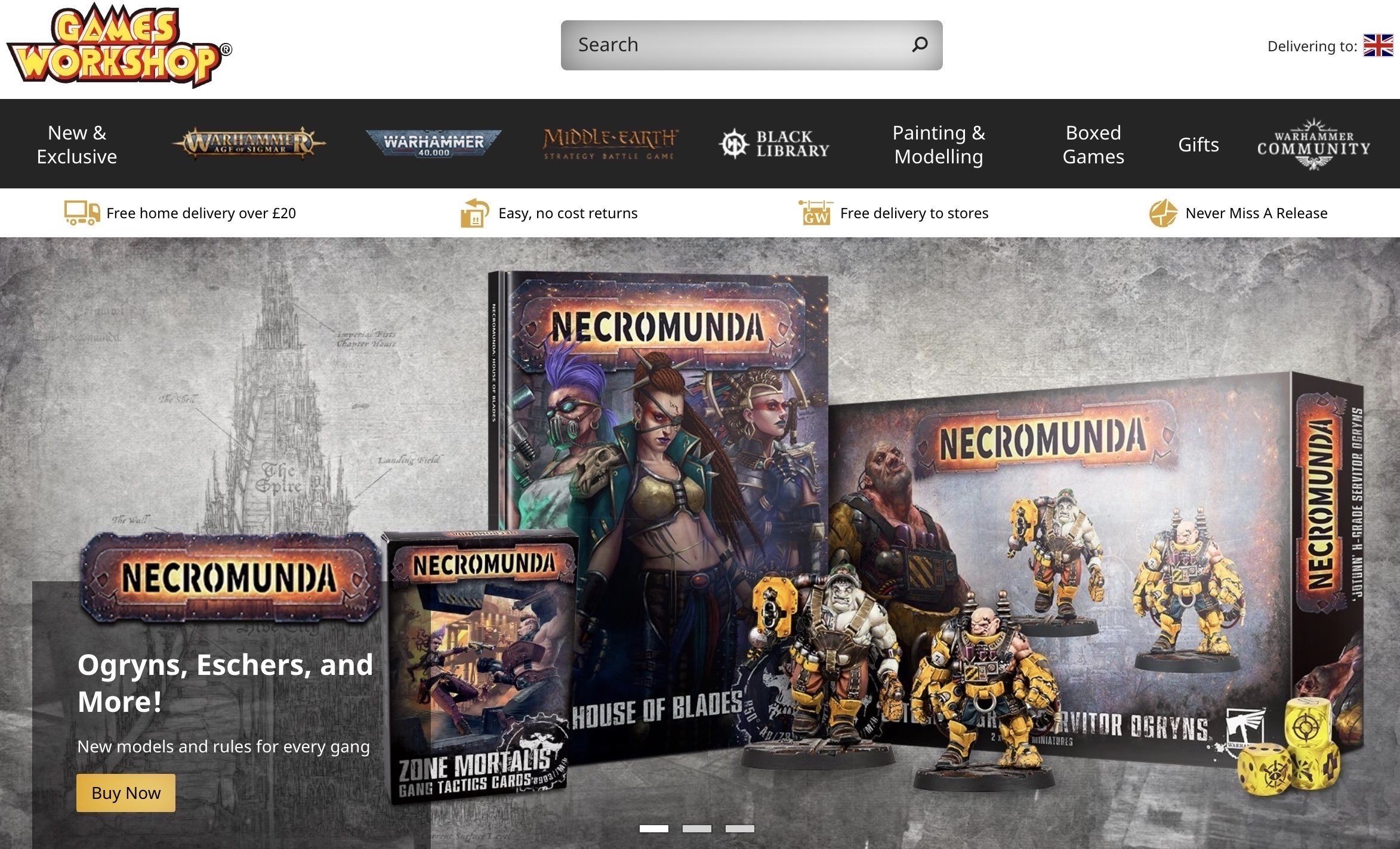
The small height of the Games Workshop carousel controls resulted in me accidentally clicking the main content of the slide on two out of four attempts. It’s worth disabling the click everywhere in the controls container to avoid this frustration.

On the Lanvin carousel, you can’t click the subtle dots at all, nor does it offer previous / next carets.
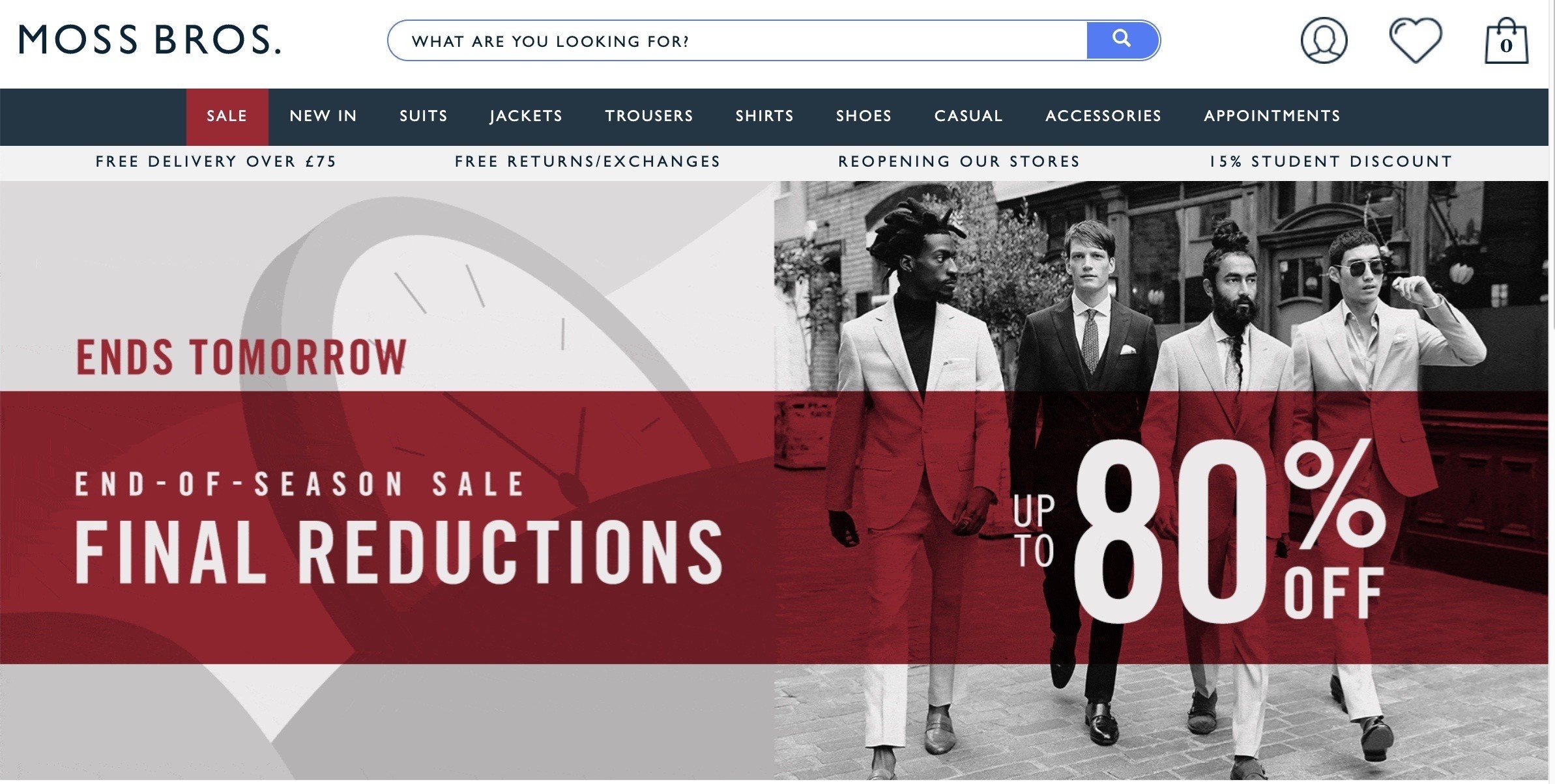
Moss Bros doesn’t offer any controls at all. Wanted to click that last slide you saw? You’ll have to wait for it to come back round.
Reduce the speed at which they rotate
If slides rotate too quickly, you’re not giving your users enough time to determine if the content is interesting or relevant enough to click. If your slides are fairly text-heavy, you will want to extend the time before it rotates.
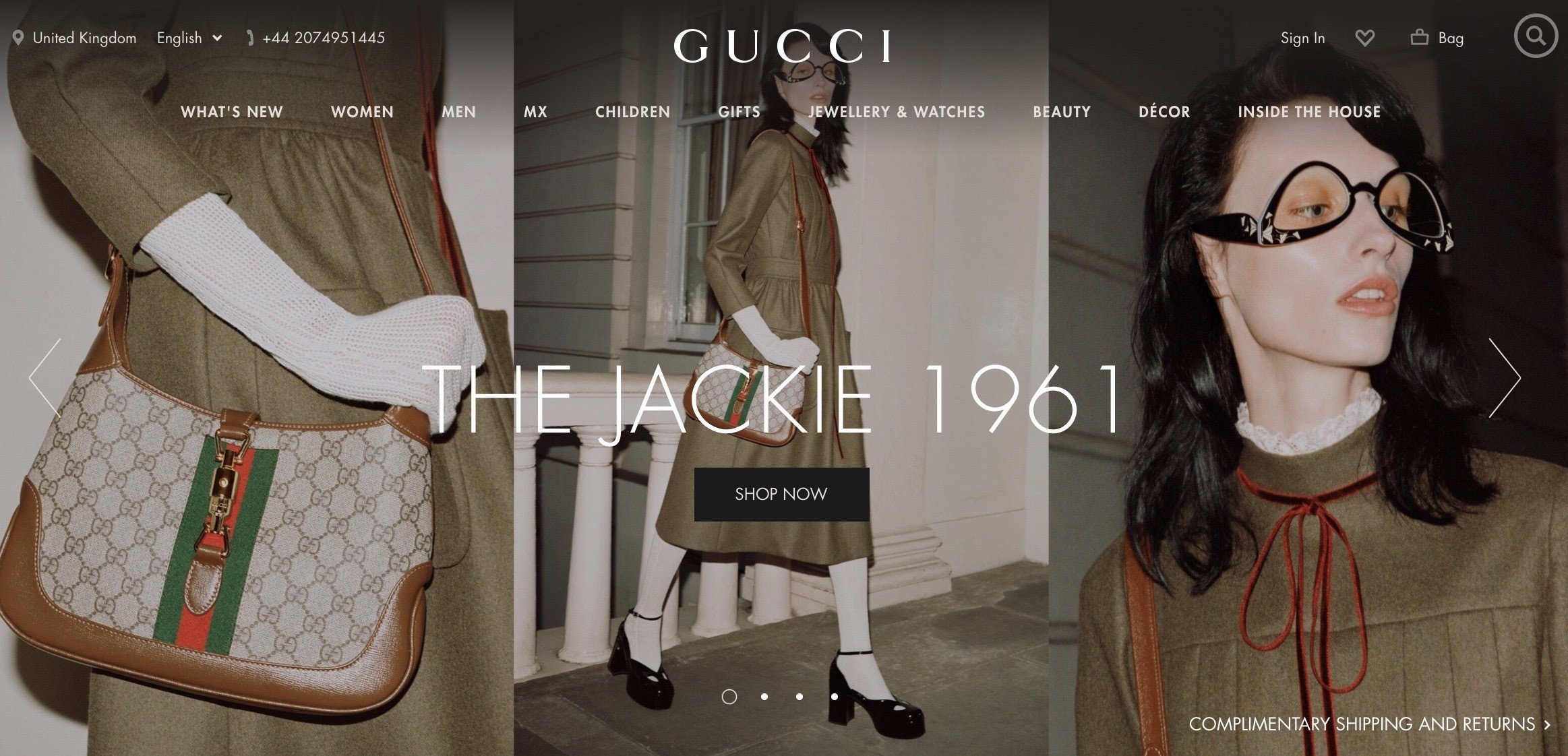
The carousel on the Gucci homepage seems to rotate after about four seconds. Despite having little text, I didn’t have enough time to make a call on if it was content I wanted to explore further.
Show countdown timer indicating the next slide change
It can be beneficial to show your users when the slide is about to change so they have sufficient time to make their next decision.
Bestbuy has a countdown timer indicating when a slide is about to change with pause control as a fallback. It’s also helpful that the controls are set on a white background with slightly reduced opacity.
Pause the carousel completely when it’s out of viewport
It’s not uncommon for users to land on your homepage and quickly scroll down before scrolling back up. More often than not, carousels continue to rotate even when they’re not being seen. Avoid that if you can.
Mobile-specific carousel considerations
Support swipe gestures AND previous / next carets & dots
It goes without saying that your carousel must support previous and next swipe gestures in addition to desktop controls. Offer your users both options; not one or the other.
Give mobile users the ability to pause
There is a strong argument for completely avoiding auto rotation for mobile users, however if this is your preference, it is strongly recommended that you give users the ability to pause.
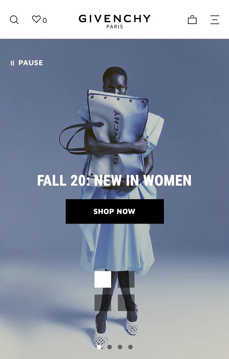
Givenchy provides a nice, obvious Pause control.
Move your supporting text and CTA underneath the carousel slide
The main purpose of hero imagery is to give products or categories absolute clarity, right? Therefore it’s a good idea to move the supporting details underneath the image so it can breathe.

On the Montblanc site, the heading, intro and CTA all sit underneath each slide.
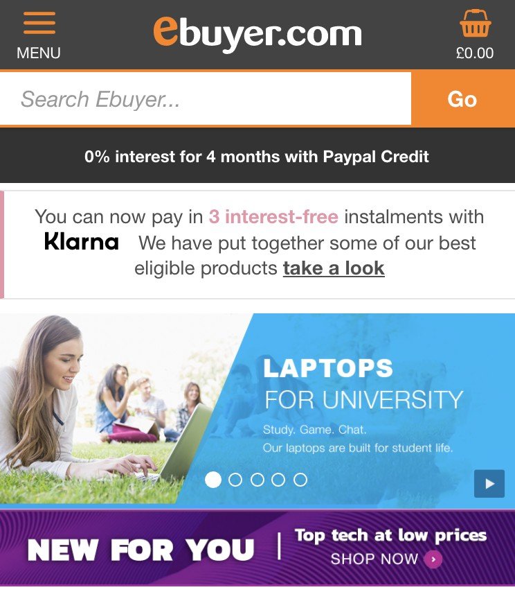
Whilst at the opposite end of the consumer spectrum, Ebuyer crams a lot of hard to read text into the slide itself which poses some accessibility problems.
Measuring carousel effectiveness
With all of this in mind, how can you successfully measure or test carousel success or failure? Here’s some common methods I’ve used previously.
Google Analytics – Internal Promotions
Part of Google Analytics Universal Analytics Enhanced Ecommerce reporting, you can measure:
- Impressions – the number of times a slide was viewed
- Clicks – self-explanatory
- CTR – clicks ÷ impressions = click through rate. If your carousel slide had 10,000 impressions and 500 clicks, your CTR would be 5%.
More helpfully, this report provides you with conversion and revenue data based on those clicks. If one slide has a high CTR but low conversion, chances are the wrong audience is seeing it or there’s something wrong with the landing page those users are being sent to.
Google Analytics – Fire an Event on the carousel controls
Far less helpful, but it is a barometer for understanding how users are interacting with the controls. Used best in conjunction with the Internal Promotions method above.
A/B Test multiple carousel slides vs one static message
A lot of the resources you’ll read will champion that one message always beats multiple assets – perhaps you’ll be an exception.
Usability test – ask users to perform a task relating to the carousel items
Again, a widely-shared but potentially out of date usability test courtesy of Nielsen Norman Group – a user was asked ‘Does Siemens have any special deals on washing machines?
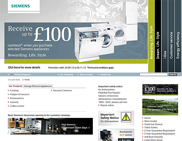
 Image from NNGroup.
The test was a failure, but I’ll let you make up your own mind if this was a design problem rather than a carousel-specific problem. The testing scenario itself is still very much valid; if you have willing participants or a partner to run the tests on your behalf it can reap dividends.
Video – a word of caution
Some brands, particularly in the high end or luxury sector will leverage video for campaign or promotional content in the main hero zone. Some cautions to consider:
- Autoplay with sound = a very bad idea
- Autoplay on mute with the option to unmute = a better idea
- Click to play = by far the most accessible method, but it will result in fewer views
- Have some kind of call to action
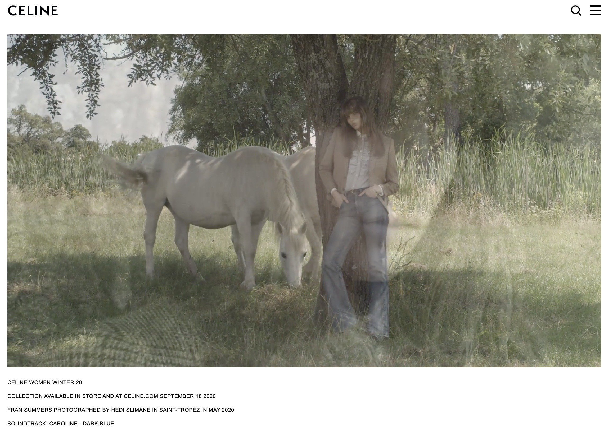
Celine’s campaign video autoplays on mute…but with nowhere for the user to go next. Perhaps a new collection preview landing page would be useful.

The Cartier homepage has a video autoplaying on mute, with the controls hidden. Given the video’s primary purpose is to highlight ambassador partnerships with Rami Malek, Willow Smith and Jackson Wang the audio is probably less important. Users have a CTA that stays on the video.
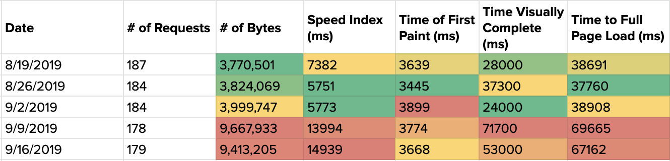
Be mindful of the impact on page load time
When monitoring site speed changes for a client using the Google PageSpeed Insights API, an autoplay video made a big contribution to its homepage slowing down. This brand has 80% of its traffic from mobile visitors making this quite a hindrance to performance.
Communicate your breadth and depth
Please note, this is far more applicable to larger brands with a huge number of SKUs. Wayfair is a good example of this as they are in a relatively early stage of establishing itself in the European market where users are less familiar with the brand.
In order to determine who you are and what you offer, first time visitors to your homepage are heavily reliant upon what they see in your navigation followed by the content that immediately follows. It’s vital that you provide sufficient clues to the depth of your offering or there is a risk that users will think you carry far fewer categories than you actually do.

To support ao.com’s primary navigation, the carousel infers a wide number of products available, whilst the supporting promo strip states that it has 100,000 electricals in stock.
Patagonia repeats its inner Shop Navigation (although if it were me, I’d be far more inclined to call out its main categories rather than burying them under one Shop heading), but what’s smart here is that you see a snippet of the next carousel item in conjunction with the arrow that makes it much more obvious to expect additional categories.

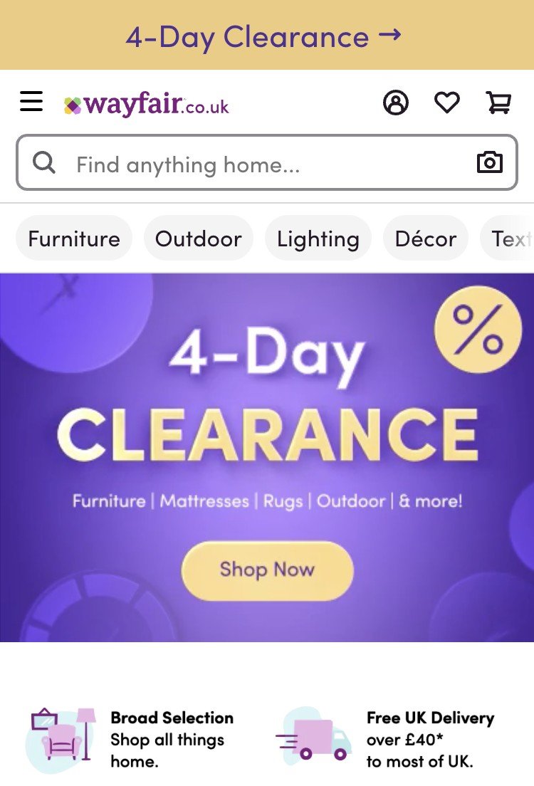
In a slightly more ‘safety first’ approach, Wayfair essentially repeats its entire navigation for desktop visitors but with visual cues for visitors. It might be more advantageous for you to selectively promote a limited number of your best-selling or most-visited categories. That said, its swipeable carousel for the mobile navigation is a tactic worth emulating.
Paths of Curation and Inspiration
At this point in homepage progression, it’s handy that these sections cater to visitors who don’t know exactly what they’re looking for or are simply in a browsing frame of mind. As this content is very much ‘below the fold’, it’s more likely to be discovered and consumed by returning users.
Aligning Content, Community and Commerce
Whilst Amazon is eating more market share just about everywhere, specialty retailers and traditional department stores should be leveraging their expertise in the form of bespoke content and where possible, user-generated content. Historically, retailers siloed these assets under a blog heading in the main navigation where very few people would see it. Smarter retailers integrate it in the path to purchase, but it’s still not common as it should be.
Content
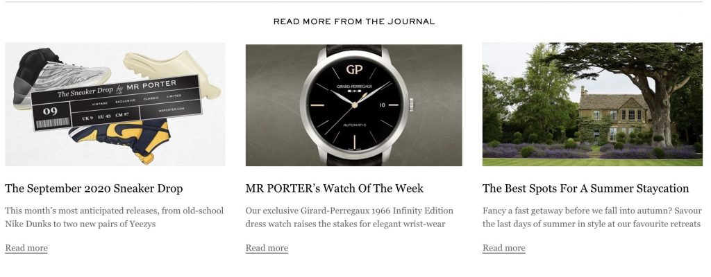
The Mr Porter journal is a combination of product and lifestyle content, featuring product previews / announcements, travel and interviews with various artists, actors and tastemakers.

Lingerie and swimwear retailer Figleaves takes a similar approach with product and influencers, giving the content a more authentic feel.
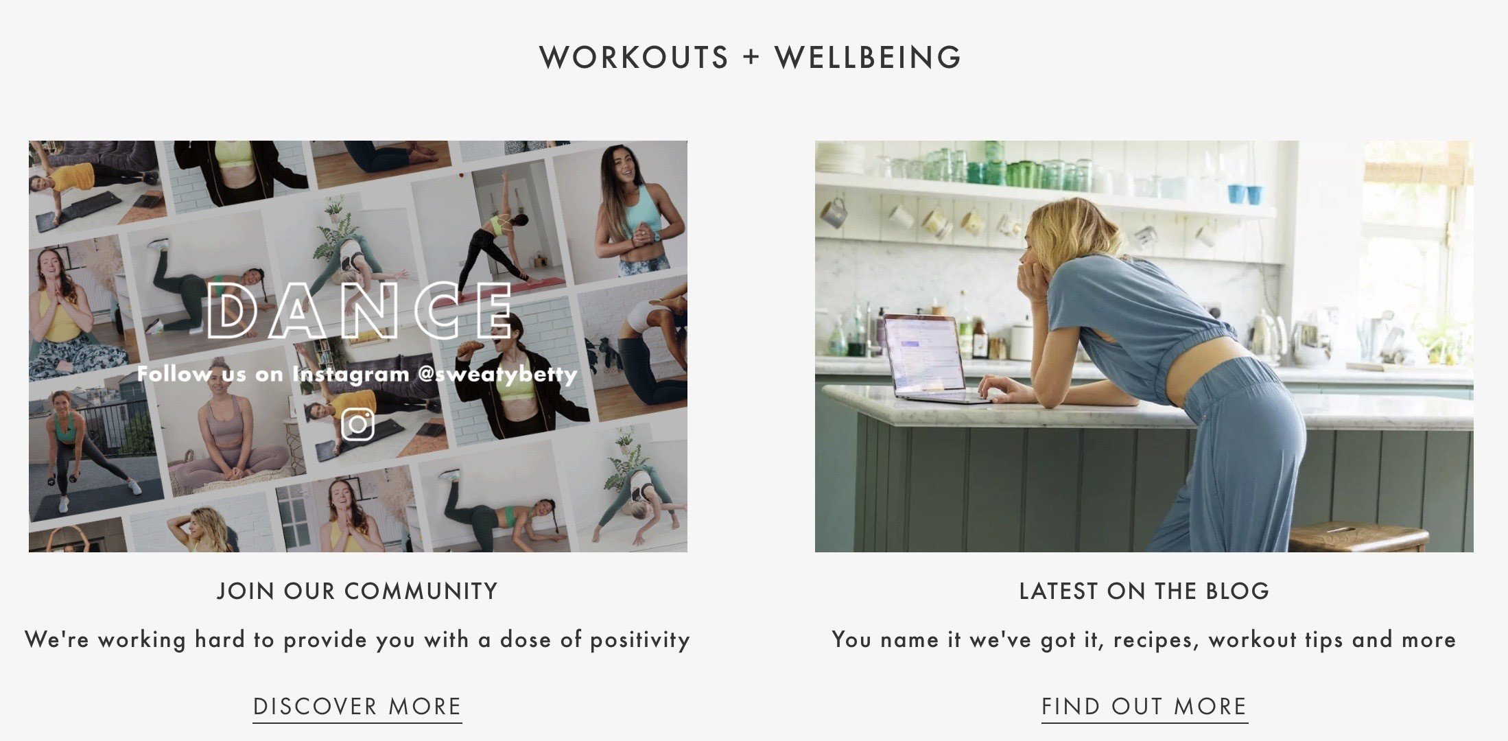
Whilst Sweaty Betty doesn’t embed specific blog content on the homepage, it does link to its blog along with what content to expect. And rather linking out to its Instagram profile, it shows a selection of photos submitted with a link to its community hubpage.
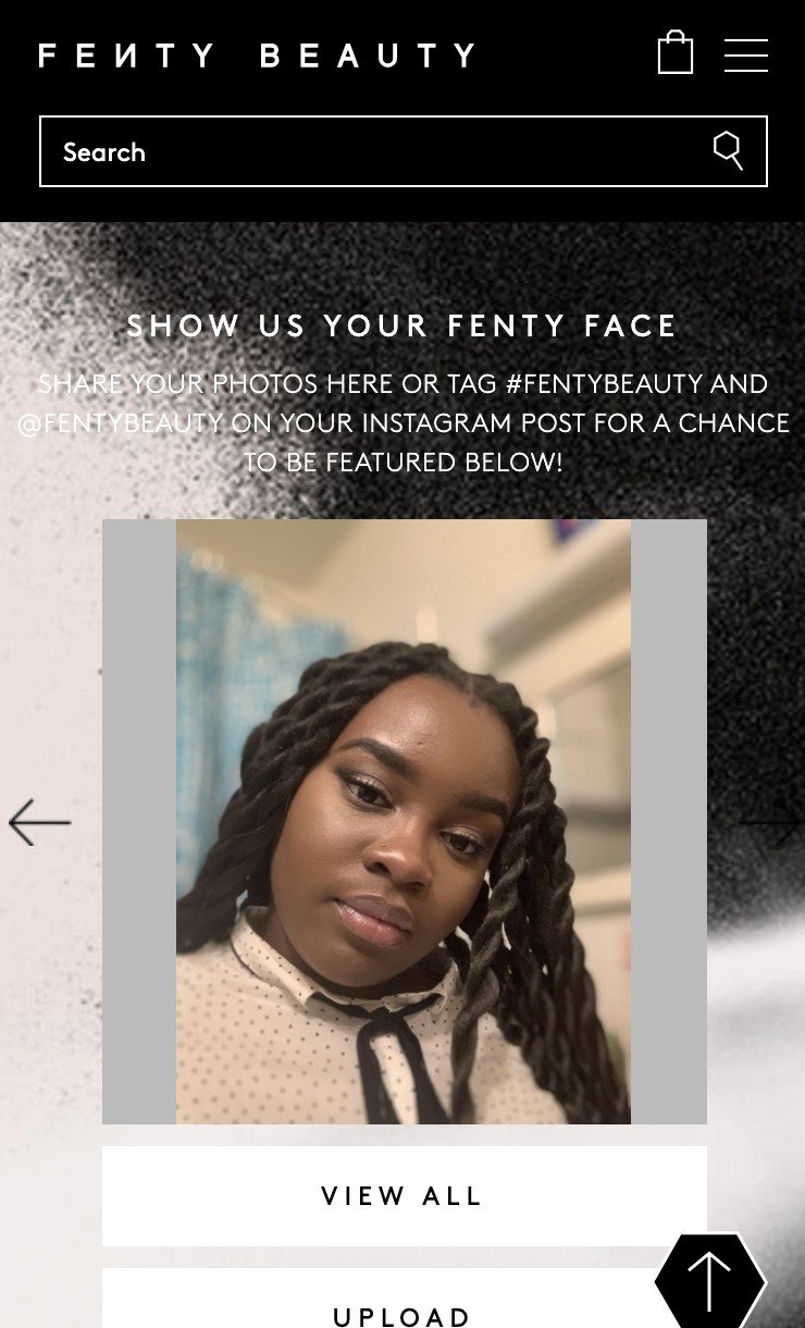
Community – Shop the Feed
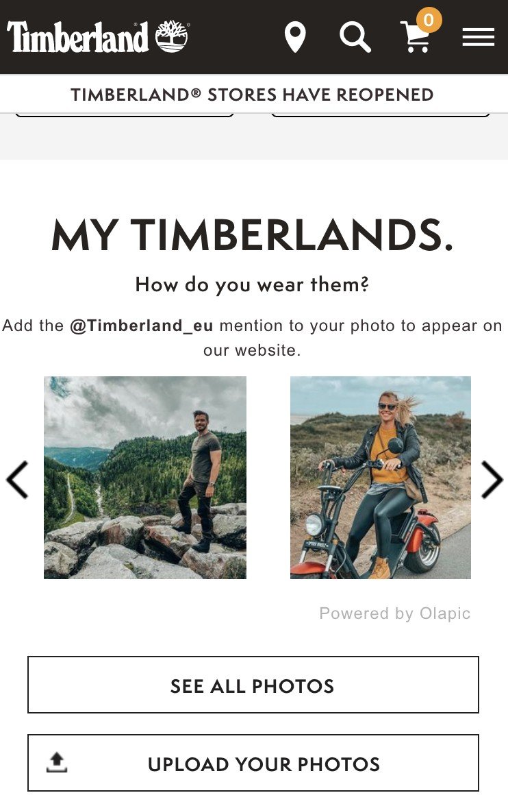
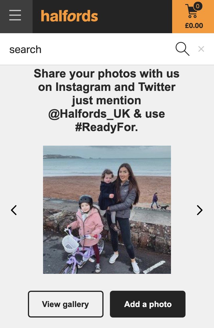
This is something that I would associate with brands catering to more youthful audiences, so Halfords’ homepage took me by surprise. If you have a lot of customers tagging you on Instagram, it would be wise to take advantage. One word of caution: unless your Instagram feed tool of choice embeds the actual product details, it can be a bit of a dead-end. In this case, Timberland, Halfords and Fenty Beauty all have deeplinks to the PDP.
Personalize where possible
This is a great way of improving relevance to suit the needs of the user at a one-to-one level. The more you know about them, the better the experience you can offer.
It’s wise to tell users why certain sections of your site are making specific recommendations where possible so they have context on what they’re seeing.
Personalize based on user purchase history
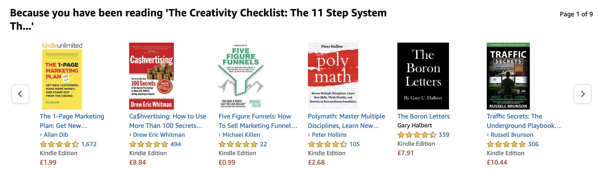
Amazon is the master of this, where it is making specific book recommendations on what I’ve been recently reading on my Kindle.
Personalize based on user browsing history
If you tag or group products based on their type, it can be helpful to recommend other products in this category if the user’s been looking at them.
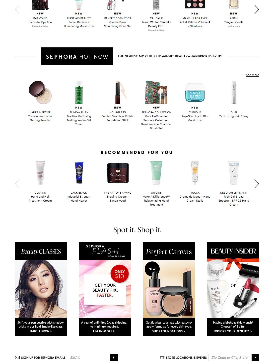
On the Sephora site, a visitor had previously been looking at hand creams. The homepage then recommended other hand creams in a browsing history personalization block.
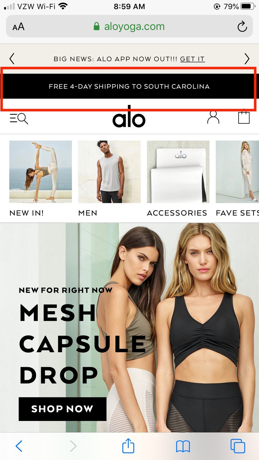
Personalize based on shipping location
More of a site-wide element rather than product-based recommendations, this tactic takes the user’s location and tailors shipping times based on State
In countries with extreme differences in weather, it can also be sensible to personalize the products you merchandise. As a high level example a clothing retailer’s user needs may be somewhat different if one is in Alaska and another is in Miami.
For retailers with a more global footprint, it can also be useful to detect the user’s location so they browse with the correct currency and delivery proposition.

Landing on the JCrew.com homepage, it detects my IP address and when I click Start Shopping, I’m taken to the regional UK site. It’s very helpful to highlight if taxes and duties are included which they do well.
Personalize based on other users’ purchase history
This can be a useful block to promote products that have proved popular in a given timeframe.
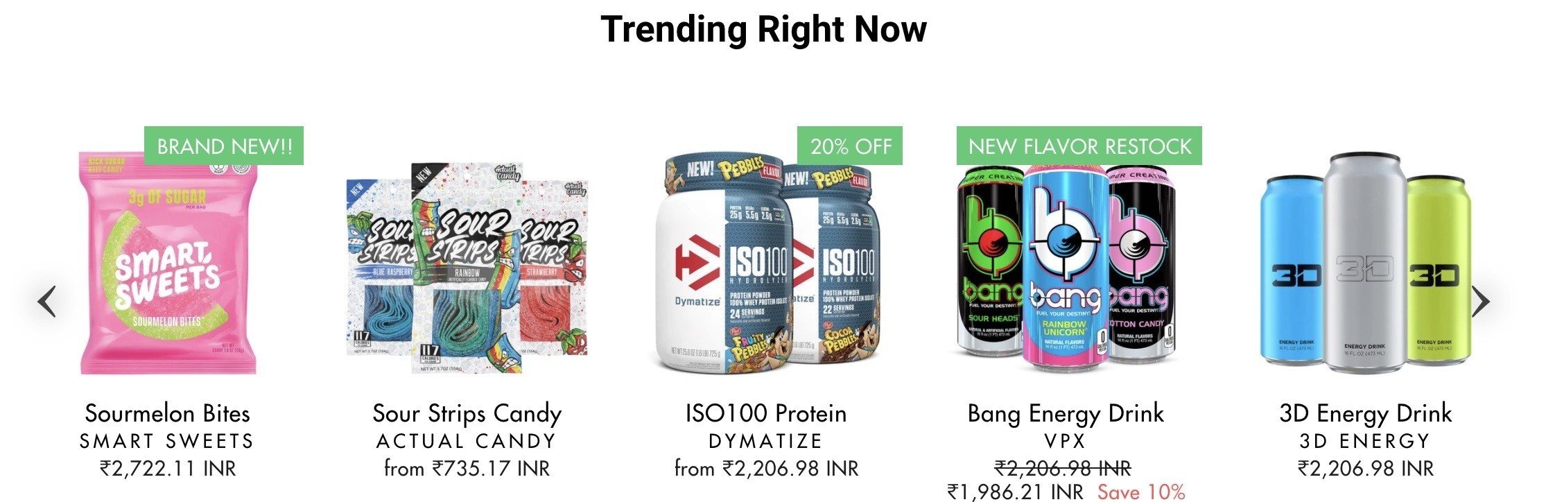
On the Campus Protein homepage, they use a carousel to push products trending right now. Even if you know nothing about this user, this form of ‘what are other people buying?’ can be effective social proof.
For smaller ecommerce pureplays, personalization should be treated as a ‘nice to have’ in the early stages of your brand’s journey. There are a number of third party tools that can help you with this, but they can be quite expensive for the return you’d see.
SEO content
I was reluctant to call it this, but I have little other choice. This used to be extremely common on ecommerce homepages and I use the term ‘SEO content’ as it is absolutely intended for Google rather than users. It still exists in the wild, as you’ll see below:
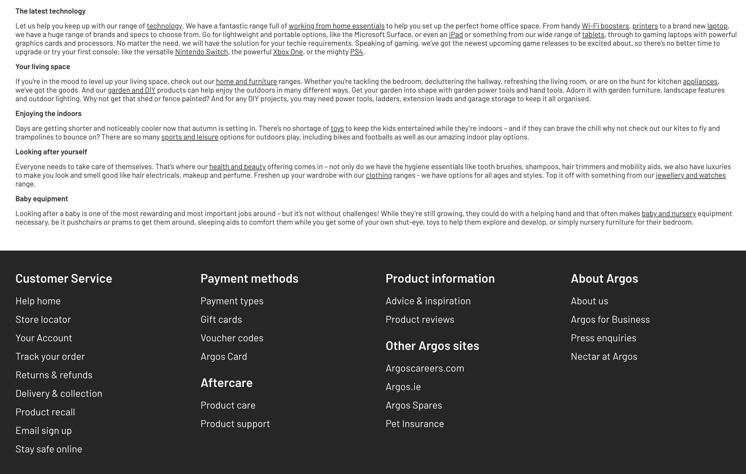
Positioned directly above the footer, Argos crams in tiny 10px text that is highly unlikely to be read by anyone.
Don’t believe me? Check the name of the CSS class applied to the text.
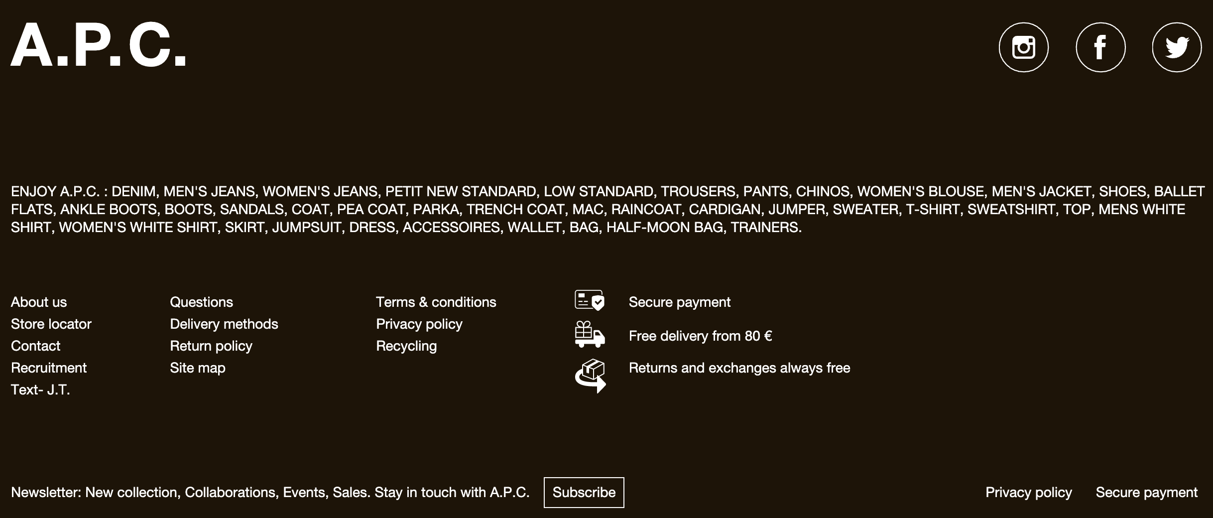
In a slightly more bizarre approach, APC includes the names of all categories and sub-categories but the only link to a landing page is from the Denim text at the beginning.
As seen in – credibility by osmosis
This tactic is more useful for emerging brands where prospects don’t know a great deal about you. Embedding the logos of ‘authority publications’ can influence someone to buy based on their recognition of them alone.
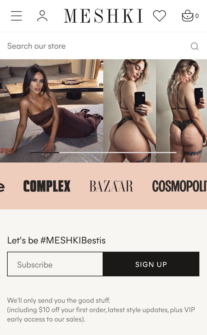
Good: Australian fashion pureplay Meshki embeds the logos of publications where they’ve been featured. If I had one minor criticism there’s no mention of what any of this coverage said.

Better: Birdsong features what Refinery29 had to say, highlighting part of its ethical value proposition.

Best: allbirds embeds a carousel of what each publication had to say about the brand and product. Whilst the brand is at a size and reputation that it’s probably no longer necessary, you may well find this beneficial.
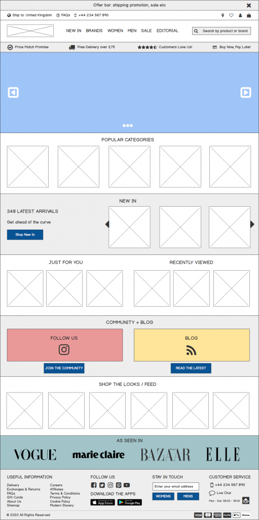
Footer
Your footer is vital for signposting information users need that makes or breaks their purchase decision.

The wireframe above shows most if not all of the elements you’d commonly find in a retailer’s footer along with some common methods of presentation.
One part of footer presentation that retailers get wrong is how this content is divided for easy scanning and selection.
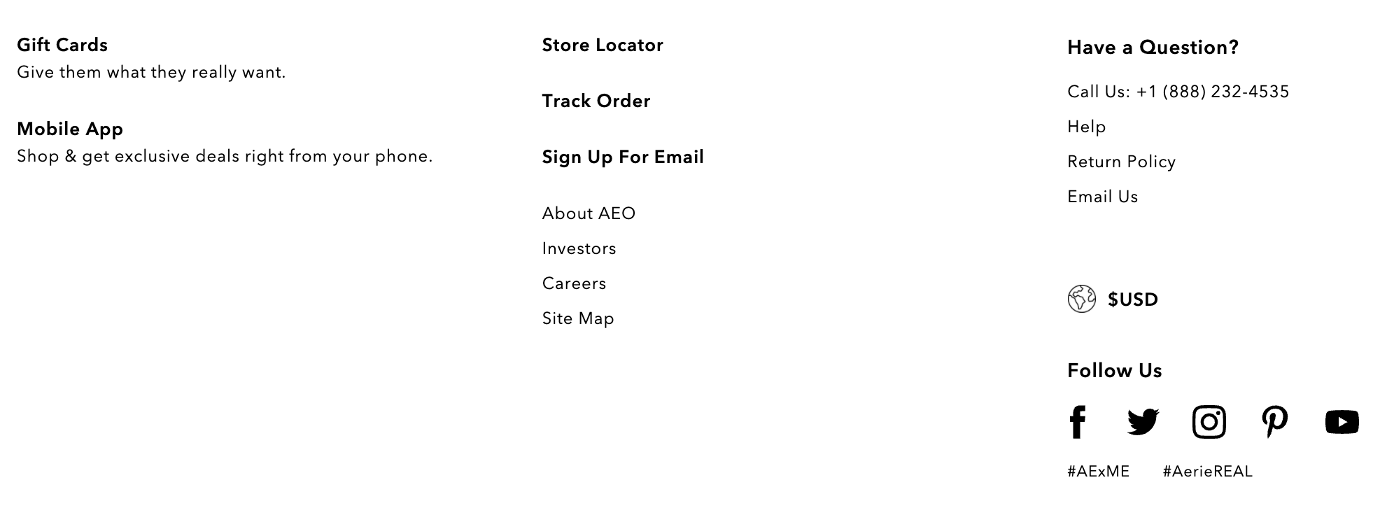
American Eagle’s footer is somewhat disjointed, where some of these options can be better bucketed by user intent. Each of the bold headings are clickable too.
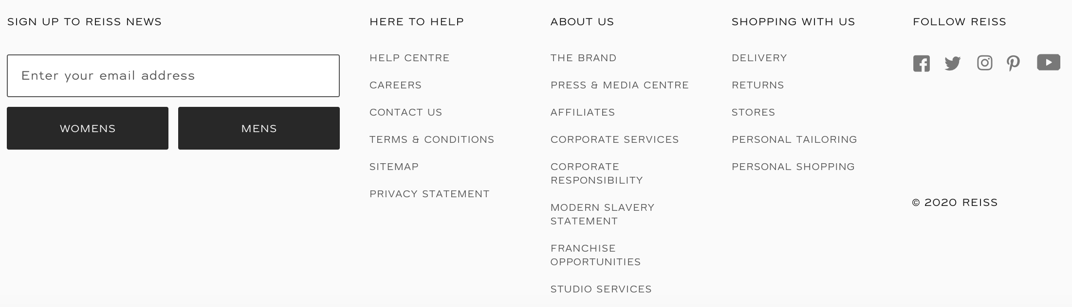
Reiss does this very well, separating each section into pre and post-purchase with additional information about the brand.
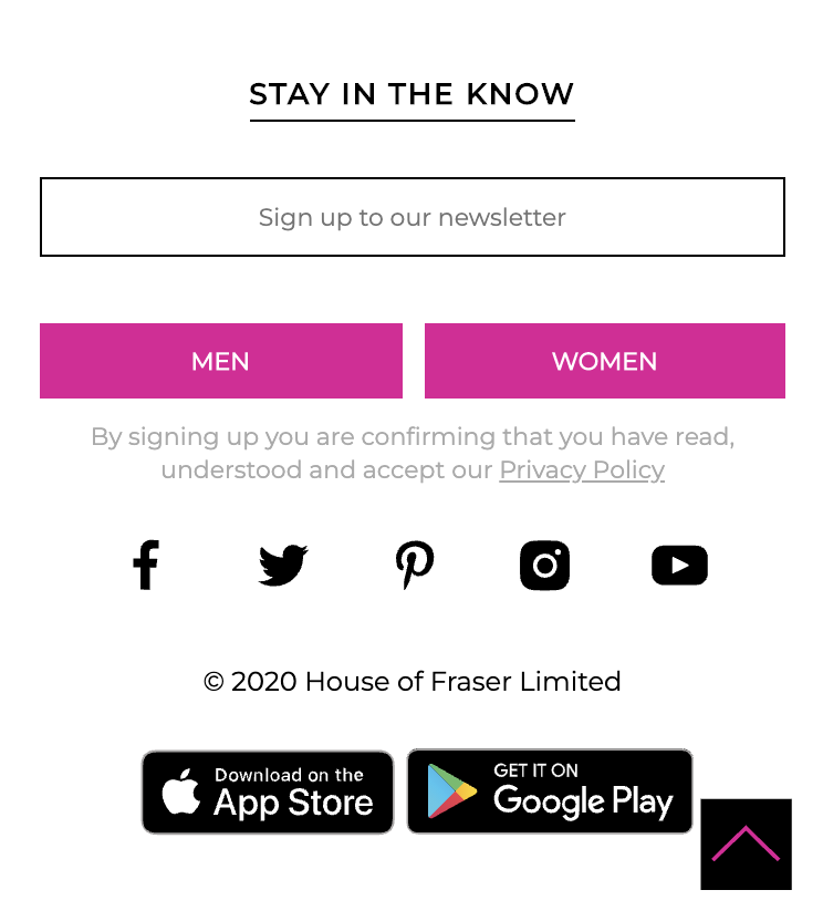
Strangely, House of Fraser suppresses the most useful customer links from its mobile footer so only the newsletter, social channels and app store links are visible. These are useful supplementary actions, but not at the expense of FAQs.
For mobile visitors, it’s a good idea to provide nested lists where related pieces of information are grouped under headings. These should normally be closed by default.
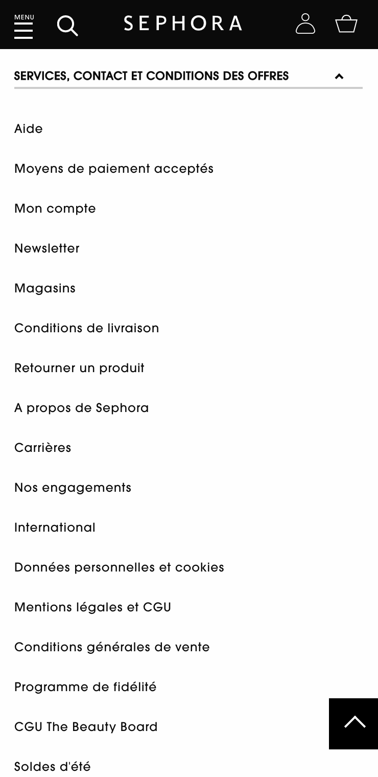
Sephora’s France site is rather unhelpful in that (never mind my limited French) in that everything is bucketed under one heading. Much harder to scan, non?
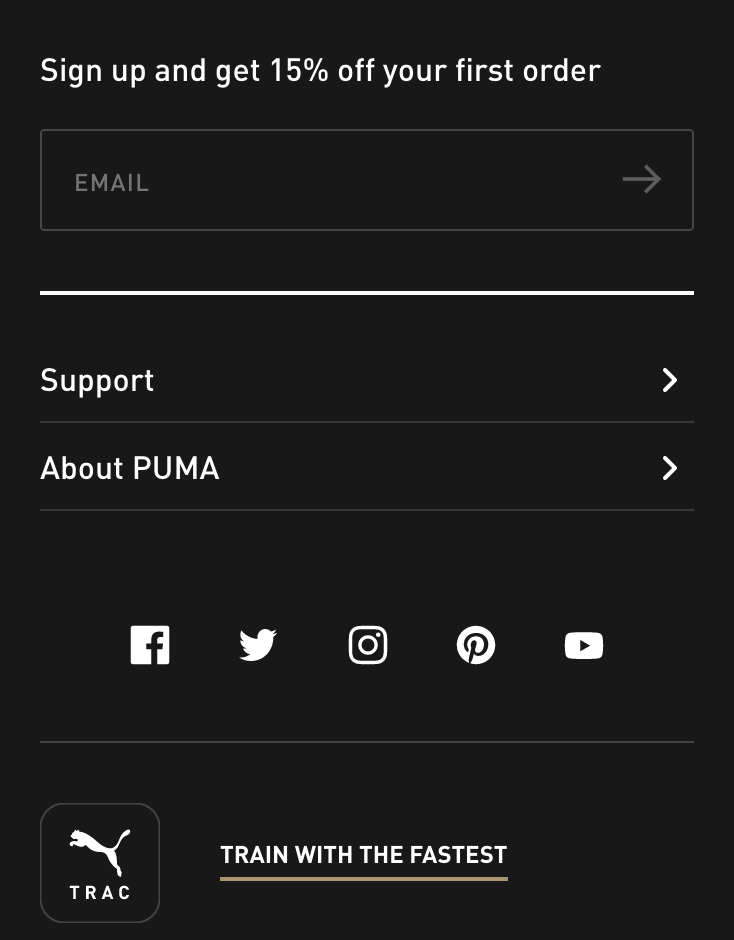
Puma has 2 separate sections – Support and About Puma. When you tap Support you’re given two columns where it’s nice and easy to choose what you need.
Shipping and returns
When your users are in need of crucial information like your shipping and returns policies, they will often turn to your footer for this. If they cannot find it, there’s a very real risk they’ll abandon.
Additional shopping and brand information
This section could cover refund policies, more info about your brand, giftcard, store locator information or a careers section. If you have an affiliate program, this is also a sensible place to link to it. Larger retailers should also have links to Modern Slavery Statements or Supply Chain Transparency documents.
Social media channels
If you don’t include these further up your homepage, it makes perfect sense to include these in your footer.
App availability
Definitely more useful for mobile users interacting with your footer, but it would do little harm showing them to desktop users to educate them on their availability.
It’s also worth bearing in mind that wherever your mobile visitors land, an App Store link at the top of the browser can drive more downloads.
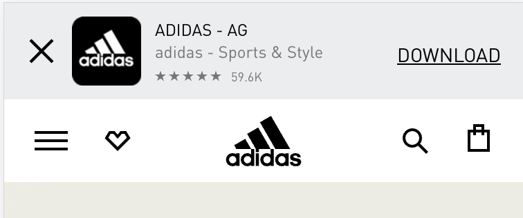
When Adidas detects your user-agent or browser size, it offers a download link for its app.
Newsletter sign-up
Whilst you’ll receive far fewer sign-ups than the more aggressive pop-up, as a supplementary action it’s worth including in your footer. This typically appears in the footer itself, or directly above it.
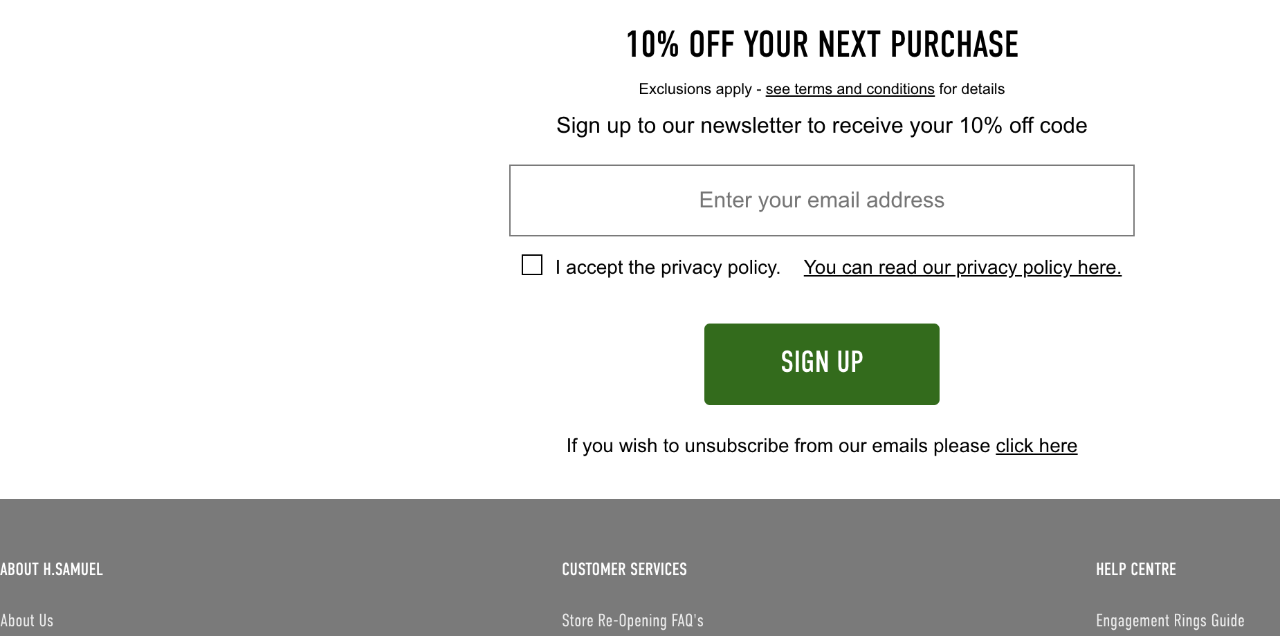
Jeweller H Samuel positions it directly centered above the main footer contents
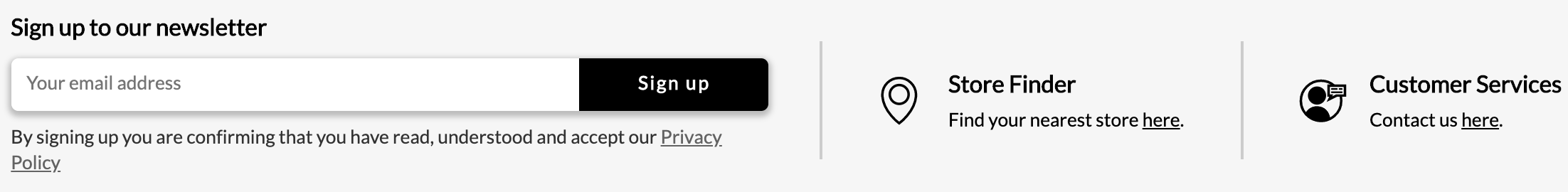
Sports Direct has a 3 column newsletter, store locator and customer services above the main footer links
Customer service channels
These can vary quite wildly on how customer-centric the retailer is, but these are commonly:
- FAQs
- A helpdesk / customer service ‘portal’
- Live chat widget
- Telephone number and the hours of availability
Accepted payment methods
These are normally the logos and little else which is fine as they’re so widely recognised. In a rough order of adoption
- Visa and Mastercard – the absolute bare minimums in the Western world
- PayPal – definitely an expectation
- American Express – desirable for points-hungry purchasers
- Apple and Google Pay – essential for mobile first retailers
- Klarna / ClearPay / Afterpay – as highlighted earlier in this article, for retailers with younger fashion-forward customer bases, expect better conversion when some weeks away from payday
In the East it’s a slightly different story, where the most common methods are WeChat Pay, Alipay and China Union Pay. This probably isn’t applicable to you.